It was interesting that when Safari 15 was dropping at this last WWDC, in my circles at least, I mostly heard enthusiasm. Like the colors-in-the-browser-controls stuff was a neat trick and fun to play with. And there were other more serious features, like iCloud Private Relay, which were near-universally applauded for the security innovation.
But the UX changes in Safari 15 are much more controversial in wider and more generally Apple-related circles.
But I’d say most of the criticism is leveled at the browser controls themselves, regardless of the color trickery. Nick Herr went as far as calling it Chickenshit Minimalism:
Condensing the address bar into each tab is also irksome. It is a clever idea, but it means that everything moves around because tabs move. They scroll left to right; they change size as you open and close other tabs.
The small size of a browser tab also means that many controls are hidden by default, including the reload and share buttons. They are all buried into one of those vague “⋯” controls that Apple is obsessed with these days. If you share web links a lot, there is not even a way to add the button back to the toolbar in a more permanent state. This, I think, continues a worrying pattern of bad UI habits.
In other words, chucking useful buttons under a random kebab menu isn’t something that people who used those buttons are going to be fond of. There’s “Hiding buttons from popular built-in apps is a bad idea.” by Federico Viticci, which goes into similar changes in iOS Safari. Gruber also:
I think the new Safari interface is a noble experiment — intriguing ideas that were worth trying out. But I don’t know anyone who thinks, in practice, that they’re not a huge regression in usability. I’d love it if Apple just went back to the previous Safari interface for tabs and browser chrome. It’s crazy to me that even the Share button is now an extra click or tap away. If Apple ships this design for the Mac it’s going to push a lot of current Safari users to Chrome or other Chromium-based browsers.
Not popular changes. I wonder if people would really jump-ship just for this? My hunch is that Safari users are either Safari users because that’s just what ships on their Mac and they don’t care to think about it much, or are Safari users very much on purpose because of the Apple-ness of it and these changes wouldn’t be enough to force them away.
Others applaud the effort. Jason Snell calls it a self-inflicted wound, but sees the good:
Apple has tried to minimize Safari’s interface as much as possible. Its designers have looked at every single interface element, from the tabs to the URL bar to every single toolbar item, and pondered if they could afford to hide, remove, or minimize those elements to give more space on the screen for the web page itself.
I think that Apple should be applauded for making the effort, not only because the vast majority of its customers are using screens that are at most 13 inches measured diagonally, but because Apple should always be striving to find better ways of doing things. I don’t believe there’s any class of app—from web browsers to email clients to text editors—that’s a solved problem.
What I see in Safari 15 is the first steps into a new design language for iOS, one prioritizing adaptive, contextual interfaces. Ever since the move to the new “all screen” iPhone X design, content has been king on iOS, and Apple has been removing more and more user chrome. This is the next step on that journey.
High five to Luke Channings for looking into this… “Does Safari 15 finally fix viewport height?” The answer is… mostly yes: “if you subtract env(safe-area-inset-bottom) from 100vh you’ll get what you want.”
Walmart’s investments in software and retail technologies it used to transform its business from a brick-and-mortar to one that combines both in-person and online shopping will now be made available to other retailers for the first time, the company announced today. Through a strategic partnership with Adobe, Walmart will integrate access to Walmart’s Marketplace, as well as its various online and in-store fulfillment and pickup technologies, into the Adobe Commerce Platform.
The technologies will be made available to both Adobe Commerce and Magento Open Source customers, Adobe says.
The deal will allow Walmart to potentially reach thousands of small to mid-sized retailers, who will effectively be able to tap into the same tools that one of the largest global retailers is using to run their business.
Through the partnership, Adobe retail customers will be able to do things like show store pickup eligibility and available pickup times online; offer multiple pickup options like curbside and in-store pickup; provide their store associates with mobile tools to pick for orders, validate item selections and handle substitutions; and use tools to communicate with customers about their pickup orders, like those where customers can alert store associates of their ETA or arrival for curbside pickup.
Another aspect of the partnership will allow retailers to syndicate and sell their products across Walmart’s Marketplace.
The arrangement not only aims to benefit Walmart’s bottom line as it offers new revenue streams related to retail technologies, it could also serve as another tool in Walmart’s battle with Amazon for online retail dominance.
Retail businesses will use the Adobe Commerce platform to reach an expanded set of customers by listing products on Walmart’s Marketplace and then leverage Walmart’s Fulfillment Services to offer two-day shopping across the U.S.
And this, in turn, could boost the number of available products sold on Walmart’s Marketplace, which is still largely dwarfed by Amazon.
Walmart’s Marketplace had grown to an estimated 70,000 sellers in 2020, fueled by a surge in online shopping triggered by the pandemic, according to third-party estimates. This was a more than doubling over 2019. Today, the marketplace is topping 100,000 sellers, per Marketplace Pulse data. Amazon’s Marketplace, on the other hand, counts an estimated 6.3 million total sellers worldwide, 1.5 million of which are currently active, per estimates.
Part of Walmart’s problem in scaling its marketplace business could be related to its ease-of-use on the seller side. Many smaller sellers have reported that Walmart’s Marketplace is far more difficult to use than Amazon’s, and they’ve complained about waiting months to hear back from Walmart about whether they were approved to sell on the platform.
Adobe’s partnership could help to address some of those challenges.
Adobe also notes it’s working to consolidate its other channel solutions into a single, unified extension that would allow its retail customers to sell across multiple sales channels — including Amazon’s — using one, integrated tool for easy account setup and catalog syndication.
This is the first time Walmart has made its retail technologies available to other businesses, the company said. And it has yet to forecast what sort of revenue the new partnership could bring in. But it’s a path that Amazon has also been pursuing in recent years to maximize the return on investment from its novel, retail innovations, like its A.I. and computer vision-powered Just Walk Out system that lets customers skip the checkout line.
“The core mission of helping people save money and live better is at the heart of every idea including Scan & Go and checkout technologies, AI-powered smart substitutions and pickup and delivery,” said Suresh Kumar, chief technology officer and chief development officer of Walmart Inc., in a statement. “Combining Adobe’s strength in powering commerce experiences with our unmatched omni-customer expertise, we can accelerate other companies’ digital transformations,” he said.
Adobe’s retail customers in the U.S. will be able to integrate Walmart’s technologies in their own storefronts starting in early 2022, the companies said. Pricing and other details will be provided closer to launch.
While today’s announcement concerns channel partner Adobe, who will help to resell the technologies, Walmart also has a GoToMarket team that will target retailers directly.
from Amazon – TechCrunch https://ift.tt/3iWtI7y
via IFTTT
For quite a while now, the CSS spec has included a lot of really useful mathematical functions, such as trigonometric functions (sin(), cos(), tan(), asin(), acos(), atan(), atan2()), exponential functions (pow(), exp(), sqrt(), log(), hypot()), sign-related functions (abs(), sign()) and stepped value functions (round(), mod(), rem()).
However, these are not yet implemented in any browser, so this article is going to show how, using CSS features we already have, we can compute the values that abs(), sign(), round() and mod() should return. And then we’ll see what cool things this allows us to build today.
A few of the things these functions allow us to make.
Note that none of these techniques were ever meant to work in browsers from back in the days when dinosaurs roamed the internet. Some techniques depend on the browser supporting the ability to register custom properties (using @property), which means they’re limited to Chromium for now.
The computed equivalents
--abs
We can get this by using the new CSS max() function, which is already implemented in the current versions of all major browsers.
Let’s say we have a custom property, --a. We don’t know whether this is positive or negative and we want to get its absolute value. We do this by picking the maximum between this value and its additive inverse:
--abs: max(var(--a), -1*var(--a));
If --a is positive, this means it’s greater than zero, and multiplying it with -1 gives us a negative number, which is always smaller than zero. That, in turn, is always smaller than the positive --a, so the result returned by max() is equal to var(--a).
If --a is negative, this means it’s smaller than zero, and that multiplying it by -1 gives us a positive number, which is always bigger than zero, which, in turn, is always bigger than the negative --a. So, the result returned by max() is equal to -1*var(--a).
--sign
This is something we can get using the previous section as the sign of a number is that number divided by its absolute value:
A very important thing to note here is that this only works if --a is unitless, as we cannot divide by a number with a unit inside calc().
Also, if --a is 0, this solution works only if we register --sign (this is only supported in Chromium browsers at this point) with an initial-value of 0:
@property --sign {
  syntax: '<integer>';
  initial-value: 0;
  inherits: false /* or true depending on context */
}
This is because --a, being 0, also makes --abs compute to 0 — and dividing by 0 is invalid in CSS calc() — so we need to make sure --sign gets reset to 0 in this situation. Keep in mind that this does not happen if we simply set it to 0 in the CSS prior to setting it to the calc() value and we don’t register it:
In practice, I’ve also often used the following version for integers:
--sign: clamp(-1, var(--a), 1);
Here, we’re using a clamp() function. This takes three arguments: a minimum allowed value -1, a preferred value var(--a) and a maximum allowed value, 1. The value returned is the preferred value as long as it’s between the lower and upper bounds and the limit that gets exceeded otherwise.
If --a is a negative integer, this means it’s smaller or equal to -1, the lower bound (or the minimum allowed value) of our clamp() function, so the value returned is -1. If it’s a positive integer, this means it’s greater or equal to 1, the upper bound (or the maximum allowed value) of the clamp() function, so the value returned is 1. And finally, if --a is 0, it’s between the lower and upper limits, so the function returns its value (0 in this case).
This method has the advantage of being simpler without requiring Houdini support. That said, note that it only works for unitless values (comparing a length or an angle value with integers like ±1 is like comparing apples and oranges — it doesn’t work!) that are either exactly 0 or at least as big as 1 in absolute value. For a subunitary value, like -.05, our method above fails, as the value returned is -.05, not -1!
My first thought was that we can extend this technique to subunitary values by introducing a limit value that’s smaller than the smallest non-zero value we know --a can possibly take. For example, let’s say our limit is .000001 — this would allow us to correctly get -1 as the sign for -.05, and 1 as the sign for .0001!
Temani Afif suggested a simpler version that would multiply --a by a very large number in order to produce a superunitary value.
--sign: clamp(-1, var(--a)*10000, 1);
I eventually settled on dividing --a by the limit value because it just feels a bit more intuitive to see what minimum non-zero value it won’t go below.
This is one I was stuck on for a while until I got a clever suggestion for a similar problem from Christian Schaefer. Just like the case of the sign, this only works on unitless values and requires registering the --round variable as an <integer> so that we force rounding on whatever value we set it to:
This builds on the --floor technique in order to get an integer quotient, which then allows us to get the modulo value. This means that both our values must be unitless.
What sort of things can we do with the technique? Let’s take a good look at three use cases.
Effortless symmetry in staggered animations (and not only!)
While the absolute value can help us get symmetrical results for a lot of properties, animation-delay and transition-delay are the ones where I’ve been using it the most, so let’s see some examples of that!
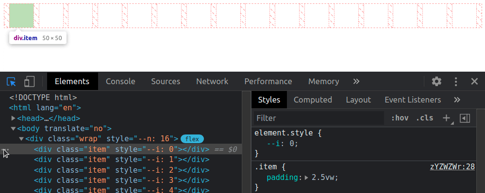
We put --n items within a container, each of these items having an index --i. Both --n and --i are variables we pass to the CSS via style attributes.
- let n = 16;

.wrap(style=`--n: ${n}`)
  - for(let i = 0; i < n; i++)
    .item(style=`--i: ${i}`)
This gives us the following compiled HTML:
<div class='wrap' style='--n: 16'>
  <div class='item' style='--i: 0'></div>
  <div class='item' style='--i: 1'></div>
  <!-- more such items -->
</div>
We set a few styles such that the items are laid out in a row and are square with a non-zero edge length:
Now we add two sets of keyframes to animate a scaling transform and a box-shadow. The first set of keyframes, grow, makes our items scale up from nothing at 0% to full size at 50%, after which they stay at their full size until the end. The second set of keyframes, melt, shows us the items having inset box shadows that cover them fully up to the midway point in the animation (at 50%). That’s also when the items reach full size after growing from nothing. Then the spread radius of these inset shadows shrinks until it gets down to nothing at 100%.
Now comes the interesting part! We compute the middle between the index of the first item and that of the last one. This is the arithmetic mean of the two (since our indices are zero-based, the first and last are 0 and n - 1 respectively):
--m: calc(.5*(var(--n) - 1));
We get the absolute value, --abs, of the difference between this middle, --m, and the item index, --i, then use it to compute the animation-delay:
The absolute value ,--abs, of the difference between the middle, --m, and the item index, --i, can be as small as 0 (for the middle item, if --n is odd) and as big as --m (for the end items). This means dividing it by --m always gives us a value in the [0, 1] interval, which we then multiply with the animation duration $t to ensure every item has a delay between 0s and the animation-duration.
Note that we’ve also set animation-fill-mode to backwards. Since most items will start the animations later, this tells the browser to keep them with the styles in the 0% keyframes until then.
In this particular case, we wouldn’t see any difference without it either because, while the items would be at full size (not scaled to nothing like in the 0% keyframe of the grow animation), they would also have no box-shadow until they start animating. However, in a lot of other cases, it does make a difference and we shouldn’t forget about it.
Another possibility (one that doesn’t involve setting the animation-fill-mode) would be to ensure the animation-delay is always smaller or at most equal to 0 by subtracting a full animation-duration out of it.
Both options are valid, and which one you use depends on what you prefer to happen at the very beginning. I generally tend to go for negative delays because they make more sense when recording the looping animation to make a gif like the one below, which illustrates how the animation-delay values are symmetrical with respect to the middle.
The staggered looping animation.
For a visual comparison between the two options, you can rerun the following demo to see what happens at the very beginning.
A fancier example would be the following:
Navigation links sliding up and then back down with a delay proportional to how far they are from the selected one.
Here, each and every one of the --n navigation links and corresponding recipe articles have an index --idx. Whenever a navigation link is hovered or focused, its --idx value is read and set to the current index, --k, on the body. If none of these items is hovered or focused, --k gets set to a value outside the [0, n) interval (e.g. -1).
The absolute value, --abs, of the difference between --k and a link’s index, --idx, can tell us whether that’s the currently selected (hovered or focused) item. If this absolute value is 0, then our item is the currently selected one (i.e. --not-sel is 0 and --sel is 1). If this absolute value is bigger than 0, then our item is not the currently selected one (i.e. --not-sel is 1 and --sel is 0).
Given both --idx and --k are integers, it results that their difference is also an integer. This means the absolute value, --abs, of this difference is either 0 (when the item is selected), or bigger or equal to 1 (when the item is not selected).
When we put all of this into code, this is what we get:
The --sel and --not-sel properties (which are always integers that always add up to 1) determine the size of the navigation links (the width in the wide screen scenario and the height in the narrow screen scenario), whether they’re greyscaled or not and whether or not their text content is hidden. This is something we won’t get into here, as it is outside the scope of this article and I’ve already explained in a lot of detail in a previous one.
What is relevant here is that, when a navigation link is clicked, it slides out of sight (up in the wide screen case, and left in the narrow screen case), followed by all the others around it, each with a transition-delay that depends on how far they are from the one that was clicked (that is, on the absolute value, --abs, of the difference between their index, --idx, and the index of the currently selected item, --k), revealing the corresponding recipe article. These transition-delay values are symmetrical with respect to the currently selected item.
transition: transform 1s calc(var(--abs)*.05s);
The actual transition and delay are actually a bit more complex because more properties than just the transform get animated and, for transform in particular, there’s an additional delay when going back from the recipe article to the navigation links because we wait for the <article> element to disappear before we let the links slide down. But what were’re interested in is that component of the delay that makes the links is closer to the selected one start sliding out of sight before those further away. And that’s computed as above, using the --abs variable.
You can play with the interactive demo below.
Things get even more interesting in 2D, so let’s now make our row a grid!
We start by changing the structure a bit so that we have 8 columns and 8 rows (which means we have 8·8 = 64 items in total on the grid).
- let n = 8;
- let m = n*n;

style
  - for(let i = 0; i < n; i++)
    | .item:nth-child(#{n}n + #{i + 1}) { --i: #{i} }
    | .item:nth-child(n + #{n*i + 1}) { --j: #{i} }
.wrap(style=`--n: ${n}`)
  - for(let i = 0; i < m; i++)
    .item
The above Pug code compiles to the following HTML:
<style>
  .item:nth-child(8n + 1) { --i: 0 } /* items on 1st column */
  .item:nth-child(n + 1) { --j: 0 } /* items starting from 1st row */
  .item:nth-child(8n + 2) { --i: 1 } /* items on 2nd column */
  .item:nth-child(n + 9) { --j: 1 } /* items starting from 2nd row */
  /* 6 more such pairs */
</style>
<div class='wrap' style='--n: 8'>
  <div class='item'></div>
  <div class='item'></div>
  <!-- 62 more such items -->
</div>
Just like the previous case, we compute a middle index, --m, but since we’ve moved from 1D to 2D, we now have two differences in absolute value to compute, one for each of the two dimensions (one for the columns, --abs-i, and one for the rows, --abs-j).
We use the exact same two sets of @keyframes, but the animation-delay changes a bit, so it depends on both --abs-i and --abs-j. These absolute values can be as small as 0 (for tiles in the dead middle of the columns and rows) and as big as --m (for tiles at the ends of the columns and rows), meaning that the ratio between either of them and --m is always in the [0, 1] interval. This means the sum of these two ratios is always in the [0, 2] interval. If we want to reduce it to the [0, 1] interval, we need to divide it by 2 (or multiply by .5, same thing).
This gives us delays that are in the [0s, $t] interval. We can take the denominator, var(--m), out of the parenthesis to simplify the above formula a bit:
Just like the previous case, this makes grid items start animating later the further they are from the middle of the grid. We should use animation-fill-mode: backwards to ensure they stay in the state specified by the 0% keyframes until the delay time has elapsed and they start animating.
Alternatively, we can subtract one animation duration $t from all delays to make sure all grid items have already started their animation when the page loads.
Let’s now see a few more interesting examples. We won’t be going into details about the “how” behind them as the symmetrical value technique works exactly the same as for the previous ones and the rest is outside the scope of this article. However, there is a link to a CodePen demo in the caption for each of the examples below, and most of these Pens also come with a recording that shows me coding them from scratch.
In the first example, each grid item is made up of two triangles that shrink down to nothing at opposite ends of the diagonal they meet along and then grow back to full size. Since this is an alternating animation, we let the delays to stretch across two iterations (a normal one and a reversed one), which means we don’t divide the sum of ratios in half anymore and we subtract 2 to ensure every item has a negative delay.
In the second example, each grid item has a gradient at an angle that animates from 0deg to 1turn. This is possible via Houdini as explained in this article about the state of animating gradients with CSS.
The third example is very similar, except the animated angle is used by a conic-gradient instead of a linear one and also by the hue of the first stop.
In the fourth example, each grid cell contains seven rainbow dots that oscillate up and down. The oscillation delay has a component that depends on the cell indices in the exact same manner as the previous grids (the only thing that’s different here is the number of columns differs from the number of rows, so we need to compute two middle indices, one along each of the two dimensions) and a component that depends on the dot index, --idx, relative to the number of dots per cell, --n-dots.
In the fifth example, the tiles making up the cube faces shrink and move inwards. The animation-delay for the top face is computed exactly as in our first 2D demo.
The animation-delay isn’t the only property we can set to have symmetrical values. We can also do this with the items’ dimensions. In the seventh example below, the tiles are distributed around half a dozen rings starting from the vertical (y) axis and are scaled using a factor that depends on how far they are from the top point of the rings. This is basically the 1D case with the axis curved on a circle.
The eighth example shows ten arms of baubles that wrap around a big sphere. The size of these baubles depends on how far they are from the poles, the closest ones being the smallest. This is done by computing the middle index, --m, for the dots on an arm and the absolute value, --abs, of the difference between it and the current bauble index, --j, then using the ratio between this absolute value and the middle index to get the sizing factor, --f, which we then use when setting the padding.
Different styles for items before and after a certain (selected or middle) one
Let’s say we have a bunch of radio buttons and labels, with the labels having an index set as a custom property, --i. We want the labels before the selected item to have a green background, the label of the selected item to have a blue background and the rest of the labels to be grey. On the body, we set the index of the currently selected option as another custom property, --k.
- let n = 8;
- let k = Math.round((n - 1)*Math.random());

body(style=`--k: ${k}`)
  - for(let i = 0; i < n; i++)
    - let id = `r${i}`;
    input(type='radio' name='r' id=id checked=i===k)
    label(for=id style=`--i: ${i}`) Option ##{i}
We set a few layout and prettifying styles, including a gradient background on the labels that creates three vertical stripes, each occupying a third of the background-size (which, for now, is just the default 100%, the full element width):
From the JavaScript, we update the value of --k whenever we select a different option:
addEventListener('change', e => {
  let _t = e.target;

  document.body.style.setProperty('--k', +_t.id.replace('r', ''))
})
Now comes the interesting part! For our label elements, we compute the sign, --sgn, of the difference between the label index, --i, and the index of the currently selected option, --k. We then use this --sgn value to compute the background-position when the background-size is set to 300% — that is, three times the label’s width because we may have of three possible backgrounds: one for the case when the label is for an option before the selected one, a second for the case when the label is for the selected option, and a third for the case when the label is for an option after the selected one.
If --i is smaller than --k (the case of a label for an option before the selected one), then --sgn is -1 and the background-position computes to 50%*(1 + -1) = 50%*0 = 0%, meaning we only see the first vertical stripe (the green one).
If --i is equal --k (the case of the label for the selected option), then --sgn is 0 and the background-position computes to 50%*(1 + 0) = 50%*1 = 50%, so we only see the vertical stripe in the middle (the blue one).
If --i is greater than --k (the case of a label for an option after the selected one), then --sgn is 1 and the background-position computes to 50%*(1 + 1) = 50%*2 = 100%, meaning we only see the last vertical stripe (the grey one).
A more aesthetically appealing example would be the following navigation where the vertical bar is on the side closest to the selected option and, for the selected one, it spreads across the entire element.
This uses a structure that’s similar to that of the previous demo, with radio inputs and labels for the navigation items. The moving “background” is actually an ::after pseudo-element whose translation value depends on the sign, --sgn. The text is a ::before pseudo-element whose position is supposed to be in the middle of the white area, so its translation value also depends on --sgn.
Let’s now quickly look at a few more demos where computing the sign (and maybe the absolute value as well) comes in handy.
First up, we have a square grid of cells with a radial-gradient whose radius shrinks from covering the entire cell to nothing. This animation has a delay computed as explained in the previous section. What’s new here is that the coordinates of the radial-gradient circle depend on where the cell is positioned with respect to the middle of the grid — that is, on the signs of the differences between the column --i and row --j indices and the middle index, --m.
Then we have a double spiral of tiny spheres where both the sphere diameter --d and the radial distance --x that contributes to determining the sphere position depend on the absolute value --abs of the difference between each one’s index, --i, and the middle index, --m. The sign, --sgn, of this difference is used to determine the spiral rotation direction. This depends on where each sphere is with respect to the middle – that is, whether its index ,--i, is smaller or bigger than the middle index, --m.
/* relevant styles */
--m: calc(.5*(var(--p) - 1));
--abs: max(calc(var(--m) - var(--i)), calc(var(--i) - var(--m)));
--sgn: clamp(-1, var(--i) - var(--m), 1);
--d: calc(3px + var(--abs)/var(--p)*#{$d}); /* sphere diameter */
--a: calc(var(--k)*1turn/var(--n-dot)); /* angle used to determine sphere position */
--x: calc(var(--abs)*2*#{$d}/var(--n-dot)); /* how far from spiral axis */
--z: calc((var(--i) - var(--m))*2*#{$d}/var(--n-dot)); /* position with respect to screen plane */
width: var(--d); height: var(--d);
transform:
  /* change rotation direction by changing x axis direction */
  scalex(var(--sgn))
  rotate(var(--a))
  translate3d(var(--x), 0, var(--z))
  /* reverse rotation so the sphere is always seen from the front */
  rotate(calc(-1*var(--a)));
  /* reverse scaling so lighting on sphere looks consistent */
  scalex(var(--sgn))
Finally, we have a grid of non-square boxes with a border. These boxes have a mask created using a conic-gradient with an animated start angle, --ang. Whether these boxes are flipped horizontally or vertically depends on where they are with respect to the middle – that is, on the signs of the differences between the column --i and row --j indices and the middle index, --m. The animation-delay depends on the absolute values of these differences and is computed as explained in the previous section. We also have a gooey filter for a nicer “wormy” look, but we won’t be going into that here.
Let’s say we have an element for which we store a number of seconds in a custom property, --val, and we want to display this in a mm:ss format, for example.
We use the floor of the ratio between --val and 60 (the number of seconds in a minute) to get the number of minutes and modulo for the number of seconds past that number of minutes. Then we use a clever little counter trick to display the formatted time in a pseudo-element.
@property --min {
  syntax: '<integer>';
  initial-value: 0;
  inherits: false;
}

code {
  --min: calc(var(--val)/60 - .5);
  --sec: calc(var(--val) - var(--min)*60);
  counter-reset: min var(--min) sec var(--sec);

  &::after {
    /* so we get the time formatted as 02:09 */
    content:
      counter(min, decimal-leading-zero) ':'
      counter(sec, decimal-leading-zero);
  }
}
This works in most situations, but we encounter a problem when --val is exactly 0. In this case, 0/60 is 0 and then subtracting .5, we get -.5, which gets rounded to what’s the bigger adjacent integer in absolute value. That is, -1, not 0! This means our result will end up being -01:60, not 00:00!
Fortunately, we have a simple fix and that’s to slightly alter the formula for getting the number of minutes, --min:
--min: max(0, var(--val)/60 - .5);
There are other formatting options too, as illustrated below:
/* shows time formatted as 2:09 */
content: counter(min) ':' counter(sec, decimal-leading-zero);

/* shows time formatted as 2m9s */
content: counter(min) 'm' counter(sec) 's';
We can also apply the same technique to format the time as hh:mm:ss (live test).
Time isn’t the only thing we can use this for. Counter values have to be integer values, which means the modulo trick also comes in handy for displaying decimals, as in the second slider seen below.
Styled range inputs, one of which has a decimal output (live demo)
A couple more such examples:
Styled range inputs, one of which has a decimal output (live demo)Styled range inputs, one of which has a decimal output (live demo)
Even more use cases
Let’s say we have a volume slider with an icon at each end. Depending on the direction we move the slider’s thumb in, one of the two icons gets highlighted. This is possible by getting the absolute value, --abs, of the difference between each icon’s sign, --sgn-ico (-1 for the one before the slider, and 1 for the one after the slider), and the sign of the difference, --sgn-dir, between the slider’s current value, --val, and its previous value, --prv. If this is 0, then we’re moving in the direction of the current icon so we set its opacity to 1. Otherwise, we’re moving away from the current icon, so we keep its opacity at .15.
This means that, whenever the range input’s value changes, not only do we need to update its current value, --val, on its parent, but we need to update its previous value, which is another custom property, --prv, on the same parent wrapper:
addEventListener('input', e => {
  let _t = e.target, _p = _t.parentNode;

  _p.style.setProperty('--prv', +_p.style.getPropertyValue('--val'))
  _p.style.setProperty('--val', +_t.value)
})
The sign of their difference is the sign of the direction, --sgn-dir, we’re going in and the current icon is highlighted if its sign, --sgn-ico, and the sign of the direction we’re going in, --sgn-dir, coincide. That is, if the absolute value, --abs, of their difference is 0 and, at the same time, the parent wrapper is selected (it’s either being hovered or the range input in it has focus).
Another use case is making property values of items on a grid depend on the parity of the sum of horizontal --abs-i and vertical --abs-j distances from the middle, --m. For example, let’s say we do this for the background-color:
A more interesting variation of the previous demo (live demo)
We could also make both the direction of a rotation and that of a conic-gradient() depend on the same parity of the sum, --sum, of horizontal --abs-i and vertical --abs-j distances from the middle, --m. This is achieved by horizontally flipping the element if the sum, --sum, is even. In the example below, the rotation and size are also animated via Houdini (they both depend on a custom property, --f, which we register and then animate from 0 to 1), and so are the worm hue, --hue, and the conic-gradient() mask, both animations having a delay computed exactly as in previous examples.
Finally, another big use case for the techniques explained so far is shading not just convex, but also concave animated 3D shapes using absolutely no JavaScript! This is one topic that’s absolutely massive on its own and explaining everything would take an article as long as this one, so I won’t be going into it at all here. But I have made a few videos where I code a couple of such basic pure CSS 3D shapes (including a wooden star and a differently shaped metallic one) from scratch and you can, of course, also check out the CSS for the following example on CodePen.
I got together with Tim Kadlec from over at WebPageTest the other day to use do a bit of performance testing on CSS-Tricks. Essentially use the tool, poke around, and identify performance pain points to work on. You can watch the video right here on the site, or over on their Twitch channel, which is worth a subscribe for more performance investigations like these.
Web performance work is twofold:
Step 1) Measure Things & Explore Problems
Step 2) Fix it
Tim and I, through the amazing tool that is WebPageTest, did a lot of Step 1. I took notes as we poked around. We found a number of problem areas, some fairly big! Of course, after all that, I couldn’t get them out of my head, so I had to spring into action and do the Step 2 stuff as soon as I could, and I’m happy to report I’ve done most of it and seen improvement. Let’s dig in!
Identified Problem #1) Poor LCP
Largest Contentful Paint (LCP) is one of the Core Web Vitals (CWV), which everyone is carefully watching right now with Google telling us it’s an SEO factor. My LCP was clocking in at 3.993s which isn’t great.
WebPageTest clearly tells you if there are problems with your CWV.
I also learned from time that it’s ideal if the First Contentful Paint (FCP) contains the LCP. We could see that wasn’t happening through WebPageTest.
Things to fix:
Make sure the LCP area, which was ultimately a big image, is properly optimized, has a responsive srcset, and is CDN hosted. All those things were failing on that particular image despire working elsewhere.
The LCP image had loading="lazy" on it, which we just learned isn’t a good place for that.
Fixing technique and learnings:
All the proper image handling stuff was in place, but for whatever reason, none of it works for .gif files, which is what that image was the day of the testing. We probably just shouldn’t use .gif files for that area anyway.
Turn off lazy loading of LCP image. This is a WordPress featured image, so I essentially had to do <?php the_post_thumbnail('', array('loading' => 'eager')); ?>. If it was an inline image, I’d do <img data-no-lazy="1" ... /> which tells WordPress what it needs to know.
Identified Problem #2) First Byte to Start Render gap
Tim saw this right away as a fairly obvious problem.
In the waterfall above (here’s a super detailed article on reading waterfalls from Matt Hobbs), you can see the HTML arrives in about 0.5 seconds, but the start of rendering (what people see, big green line), doesn’t start until about 2.9 seconds. That’s too dang long.
The chart also identifies the problem in a yellow line. I was linking out to a third-party CSS file, which then redirects to my own CSS files that contain custom fonts. That redirect costs time, and as we dug into, not just first-page-load time, but every single page load, even cached page loads.
Things to fix:
Eliminate the CSS file redirect.
Self-host fonts.
Fixing technique and learnings:
I’ve been eying up some new fonts anyway. I noted not long ago that I really love Mass-Driver’s licensing innovation (priced by # of employees), but I equally love MD Primer, so I bought that. For body type, I stuck with a comfortable serif with Blanco, which mercifully came with very nicely optimized RIBBI1 versions. Next time I swear I’m gonna find a variable font, but hey, you gotta follow your heart sometimes. I purchased these, and am now self-hosting the font-files.
After re-testing with the change in place, you can see on a big article page the start render is a full 2 seconds faster on a 4G connection:
That’s a biiiiiig change. Especially as it affects cached page loads too.
See how the waterfall pulls back to the left without the CSS redirect.
Identified Problem #3) CLS on the Grid Guide is Bad
Tim had a neat trick up his sleeve for measuring Cumulative Layout Shift (CLS) on pages. You can instruct WebPageTest to scroll down the page for you. This is important for something like CLS, because layout shifting might happen on account of scrolling.
The trick is using an advanced setting to inject custom JavaScript into the page during the test:
At this point, we were testing not the homepage, but purposefully a very important page: our Complete Guide to Grid. With this in place, you can see the CWV are in much worse shape:
I don’t know what to think exactly about the LCP. That’s being triggered by what happens to be the largest image pretty far down the page.
I’m not terribly worried about the LCP with the scrolling in place. That’s just some image like any other on the page, lazily loaded.
The CLS is more concerning, to me, because any shifting layout is always obnoxious to users. See all these dotted orange lines? That is CLS happening:
The orange CLS lines correlate with images loading (as the page scrolls down and the lazy loaded images come in).
Things to fix:
CLS is bad because of lazy loaded images coming in and shifting the layout.
Fixing technique and learnings:
I don’t know! All those images are inline <img loading="lazy" ...> elements. I get that lazy loading could cause CLS, but these images have proper width and height attributes, which is supposed to reserve the exact space necessary for the image (even when fluid, thanks to aspect ratio) even before it loads. So… what gives? Is it because they are SVG?
If anyone does know, feel free to hit me up. Such is the nature of performance work, I find. It’s a mixture of easy wins from silly mistakes, little battles you can fight and win, bigger battles that sometimes involves outside influences that are harder to win, and mysterious unknowns that it takes time to heal. Fortunately we have tools like WebPageTest to tell us the real stories happening on our site and give us the insight we need to fight these performance battles.
RIBBI, I just learned, means Regular, Italic, Bold, and Bold Italic. The classic combo that most body copy on the web needs. ⮑
Hemanth HM very succinctly shows off ES2021 features. Gosh it doesn’t feel like that long ago that all we could talk about is ES2015, and now that’s over a half-decade behind us. New things include “arbitrarily chuck underscores in numbers.” I kinda dig that. Like 1_000_000_000 is the same as 1000000000 but more readable. To be honest, I barely even understand the other features. It’s interesting to observe the JavaScript truck moving forward with new features, while also being around people that write Go a lot and how starkly different, philosophically, it seems to me. Like there is only one kind of loop in Go, a for loop, and that’s it. Go doesn’t add syntactic sugar on purpose, while JavaScript feels addicted to it. Sugar is a helluva drug.
Now that cross-browser support is at a tipping point, it’s a good time to take a look at logical properties and values. If you’re creating a website in multiple languages, logical properties and values are incredibly useful. Even if you’re not, there are still some convenient new shorthands it’s worth knowing about.
For example, I’ve lost count of the amount of times I’ve written this to center something:
.thing {
  margin-left: auto;
  margin-right: auto;
}
We could make it a one-liner with something like margin: 0 auto; but then the top and bottom margins get thrown into the mix. Instead, we can select just the left and right margin with the margin-inline logical property.
Start thinking of things as “inline” or “block”
That last demo is pretty neat, right? The margin-inline property sets both margin-left and margin-right. Similarly, the margin-block property sets both margin-top and margin-bottom. And we’re not only talking margins. Logical properties has similar shorthands to set border and padding. So if you have a visual design that calls for borders only on the sides, you can just use border-inline instead of fussing with each physical direction on its own.
Rather than thinking in physical terms, like left and right, we can think of an “inline” direction and a “block” direction.
So, as we move ahead, we now know that we’re dealing with inline and block directions instead of physical directions. Inline handles the left and right directions, while block manages top and bottom.
That is, until things get swapped around when the writing-mode changes.
Pay attention to direction and writing mode
What we’ve seen so far are examples of CSS logical properties. These are versions of CSS properties were used to like margin and padding, but written in a new way that forgoes physical directions (i.e. left, right, top, and bottom).
CSS was developed with the English language in mind and English is written and read from left-to-right. That’s not the case for all languages though. Arabic, for example, is read from right-to-left. That’s why HTML has a dir attribute.
<html dir="rtl">
CSS has an equivalent property (although it’s recommended to use the HTML attribute just in case the CSS fails to load):
Chinese, Japanese, Korean and Mongolian can be written either horizontally from left-to-right, or vertically from top to bottom. The majority of websites in these languages are written horizontally, the same as with English.
Comparatively, vertical writing is more common on Japanese websites. Some sites use a mixture of both vertical and horizontal text.
When written vertically, Chinese, Japanese and Korean are written with the top-right as a starting point, whereas Mongolian reads from left to right. This is exactly why we have the writing-mode property in CSS, which includes the following values:
horizontal-tb: This is the default value, setting the the direction left-to-right for languages like English or French, and right-to-left languages like Arabic. The tb stands for “top-to-bottom.”
vertical-rl: This changes the direction to right-to-left in a vertical orientation for languages like Chinese, Japanese and Korean.
vertical-lr: This is used for vertical left-to-right languages, like Mongolian.
CSS logical properties offer a way to write CSS that is contextual. When using logical properties, spacing and layout are dependent on both the writing-mode and direction (whether set by either CSS or HTML). It therefore becomes possible to reuse CSS styles across different languages. BBC News, for example, rebuild their website in over a dozen languages. That’s a better experience than leaving users to rely on autotranslate. It also means they can better cater specific content to different parts of the world. The visual styling though, remains much the same across regions.
Let’s look at the example below to see the shortcomings of physical properties. Using the physical margin-left property (shown in red), everything looks good in English. If you were to reuse the CSS but change the writing mode to rtl (shown at the bottom) there’s no space between the text and the icon and there’s excess white space on the left of the text. We can avoid this by using a logical property instead.
What makes logical properties and values so useful is that they will automatically cater to the context of the language. In a left-to-right language like English, margin-inline-start will set the left-side margin. For a right-to-left language like Arabic, Urdu, or Hebrew, it will set the right-hand margin — which solves the layout problem in the above example. That’s right-to-left taken care of. If you have vertical text, margin-inline-start will cater to that context to, adding the margin at the top, which is where you would start reading from in any vertical language (that’s why it’s called margin-inline-start — just think about which direction you start reading from). The direction of inline changes based on the element’s writing-mode. When a vertical writing-mode is set, it handles the vertical direction top and bottom. See how things can get switched around?
An example of the writing direction in Mongolian. (Credit: W3C)
A complete list of logical properties and values
There are dozens of CSS properties that have a logical alternative syntax. Adrian Roselli has a handy visualization where you can toggle between the physical CSS properties that we’re all used to and their logical property equivalents. It’s a nice way to visualize logical properties and the physical properties they map to when the direction is ltr and the writing-mode is horizontal-tb.
Let’s break all of those down even further and map each and every physical CSS property to its logical companion, side-by-side. The tables shown throughout this article show traditional physical CSS in the left column and their logical equivalents (using a left-to-right horizontal mapping) in the right column. Remember though, the whole point of logical properties is that they change based on context!
Sizing
In a horizontal writing mode, inline-size sets the width of an element, while block-size sets the height. In a vertical writing mode, the opposite is true: inline-size sets the height and block-size sets the width.
Here’s an example of using border-inline-start shown with English, Arabic, and Chinese.
Here’s an example that sets border-block-start dotted and border-block-end dashed:
There are also logical properties for setting the border color, width, and style individually:
Physical property
Logical property
border-top-color
border-block-start-color
border-top-width
border-block-start-width
border-top-style
border-block-start-style
So, again, it’s about thinking in terms of “inline” and “block” instead of physical directions, like left and top. We also have shorthand logical properties for borders:
Physical property
Logical property
border-top and border-bottom
border-block
border-left and border-right
border-inline
Margin
Here are all the individual logical margin properties:
Physical property
Logical property
margin-top
margin-block-start
margin-bottom
margin-block-end
margin-left
margin-inline-start
margin-right
margin-inline-end
These logical properties has comprehensive modern cross-browser support, including Samsung Internet, and has been supported in Safari since 12.2.
And, remember, we have the shorthands as well:
Physical property
Logical property
margin-top and margin-bottom
margin-block
margin-left and margin-right
margin-inline
Padding
Padding is super similar to margin. Replace margin with padding and we’ve got the same list of properties.
Need to offset an element’s position in a certain direction? We can declare those logically, too.
Physical property
Logical property
top
inset-block-start
bottom
inset-block-end
left
inset-inline-start
right
inset-inline-end
top and bottom
inset-block
left and right
inset-inline
In a horizontal writing mode (either left-to-right, or right-to-left) inset-block-start is equivalent to setting top, and inset-block-end is equivalent to setting bottom. In a horizontal writing mode, with a left-to-right direction, inset-inline-start is equivalent to left, while inset-inline-end is equivalent to right, and vice-versa for right-to-left languages.
Conversely, for a vertical writing mode, inset-inline-start is equivalent to top while inset-inline-end is equivalent to bottom. If writing-mode is set to vertical-rl, inset-block-start is equivalent to right and inset-block-end is equivalent to left. If the writing-mode is set to vertical-lr, the opposite is the case and so inset-block-start is equivalent to left.
Logical property
Writing mode
Equivalent to:
inset-block-start`
Horizontal LTR
top
inset-block-start
Horizontal RTL
top
inset-block-start
Vertical LTR
left
inset-block-start
Vertical RTL
right
Here’s an example of how the same CSS code for absolute positioning looks in each of the four different writing directions:
There’s also a new shorthand for setting all four offsets in one line of code. Here’s an example using inset as a shorthand for setting top, bottom, left, and right in one fell swoop to create a full-page overlay:
I’ve heard inset incorrectly referred to as a logical property. But, a quick look in DevTools shows that it is actually a shorthand for physical values, not logical properties:
What it’s actually doing is defining physical offsets (i.e. left, right, top and bottom) rather than logical ones (i.e. inline, block, start and end). Obviously if you want to set the same value for all four sides, as in the example above, it doesn’t matter.
inset: 10px 20px 5px 8px; /* shorthand for physical properties not logical properties */
Text alignment
Logical values for text alignment enjoy great browser support and have for many years. When working in English, text-align: start is the same as text-align: left, while text-align: end is the same as text-align-right. If you set the dir attribute to rtl, they switch and text-align: start aligns text to the right.
Physical value
Writing mode
Equivalent to:
start
LTR
left
start
RTL
right
end
LTR
right
end
RTL
left
Border radius
So far everything we’ve looked at has decent browser support. However, there are some other logical properties where support is still a work in progress, and border radius is one of them. In other words, we can set a different border-radius value for different corners of an element using logical properties, but browser support isn’t great.
Physical property
Logical property
border-top-left-radius
border-start-start-radius
border-top-right-radius
border-start-end-radius
border-bottom-left-radius
border-end-start-radius
border-bottom-right-radius
border-end-end-radius
It’s worth noting that the spec doesn’t include shorthand properties, like border-start-radius and border-end-radius. But, like I said, we’re still in early days here, so that might be a space to watch.
Floats
Flow-relative values for logical floats have terrible browser support at the time I’m writing this. Only Firefox supports inline-start and inline-end as float values.
Physical value
Logical value
float: left
float: inline-start
float: right
float: inline-end
clear: left
clear: inline-start
clear: right
clear: inline-end
Other logical properties
There are proposed logical properties for overflow and resize, but they currently have horrendous browser support.
Physical
Logical
resize: vertical
resize: block
resize: horizontal
resize: inline
overflow-y
overflow-block
overflow-x
overflow-inline
Digging deeper
We explored what it means for a property to be considered “logical” and then mapped out all of the new logical properties and values to their physical counterparts. That’s great! But if you want to go even deeper into CSS Logical Properties and Values, there are a number of resources worth checking out.
“RTL Styling 101” (Ahmad Shadeed): A great resource if you’re dealing with Arabic or other right-to-left languages. Ahmad covers everything, from logical properties to considerations when working with specific layout techniques, like flexbox and grid.
text-combine-upright (CSS-Tricks): If you’re dealing with vertical text, did you know that this property can rotate text and squeeze multiple characters into the space of a single character? It’s a nice touch of refinement in specific situations where some characters need to go together but still flow with a vertical writing mode.
If you want to view some nice real-world examples of vertical typography from across the web, take a look at the Web Awards for Horizontal and Vertical Writings. There’s a lot of great stuff in there.
Wrapping up
Do you need to rush and swap all of the physical properties out of your codebase? Nope. But it also doesn’t hurt to start using logical properties and values in your work. As we’ve seen, browser support is pretty much there. And even if you’re working on a site that’s just in English, there’s no reason to not use them.