> All in One 586

Ads

Tuesday, August 3, 2021

A Deep Dive on Skipping to Content

While most people browsing the web on a computer use a mouse, many rely on their keyboard instead. Theoretically, using a web page with the keyboard should not be a problem — press the TAB key to move the keyboard focus from one focusable element to the next then press ENTER to activate, easy! However, many (if not most) websites tend to have a menu of links at the top of the page, and it can sometimes take a lot of presses to get to the content that you want. Take the homepage of 20min for example, one of the biggest news sites here in Switzerland. You want to read the top story? That’ll be the best part of 40 key presses — not the best best use of anyone’s time.

So, if you want keyboard users to actually use your website rather than getting bored and going somewhere else, you need to do a bit of work behind the scenes to make skipping straight to your main content quicker and easier. You can find all sorts of techniques for this scattered across the web (including here at CSS-Tricks) but most are missing a trick or two and many recommend using outdated or deprecated code. So, in this article, I’m going to take a deep dive into skipping to content and cover everything in a 2021-friendly fashion.

Two types of keyboard users

Although there are numerous differences in the exact type of keyboard or equivalent switch device that people use to navigate, from a coding point of view, we only need to consider two groups:

  • People who use the keyboard in conjunction with a screen reader — like NVDA or JAWS on a PC, or VoiceOver on a Mac — that reads the content of the screen out loud. These devices are often used by people with more severe visual impairments.
  • All other keyboard users.

Our skip-to-content techniques need to cater to both these groups while not getting in the way of all the mouse users. We will use two complementary techniques to get the best result: landmarks and skip links.

Look at a basic example

I created an example website I’m calling Style Magic to illustrate the techniques we’re covering. We’ll start off with it in a state that works fine for a mouse user but is a bit of a pain for those using a keyboard. You can find the base site and the versions for each of the techniques in this collection over at CodePen and, because testing keyboard navigation is a little tricky on CodePen, you can also find standalone versions here.

Try using the TAB key to navigate this example. (It’s easier on the standalone page; TAB to move from one link to the next, and SHIFT+TAB to go backwards.) You will find that it’s not too bad, but only because there aren’t many menu items.

If you have the time and are on Windows then as I’d also encourage you to download a free copy of the NVDA screen reader and try all the examples with that too, referring to WebAIM’s overview for usage. Most of you on a Mac already have the VoiceOver screen reader available and WebAIM has a great intro to using it as well.

Adding landmarks

One of the things that screen reading software can do is display a list of landmarks that they find on a web page. Landmarks represent significant areas of a page, and the user can pull up that list and then jump straight to one of those landmarks.

If you are using NVDA with a full keyboard, you hit INS+F7 to bring up the “Elements List” then ALT+d to show the landmarks. (You can find a similar list on VoiceOver by using the Web Item Rotor.) If you do that on example site, though, you will only be presented with an unhelpful empty list.

An open dialog with a UI for viewing different types of content on the page in a screen reader, including links, headings, form fields, buttons, and landmarks. Landmarks is selected and there are no results in the window.
A disappointingly empty list of landmarks in NVDA

Let’s fix that first.

Adding landmarks is incredibly easy and, if you are using HTML5, you might already have them on your website without realizing it, as they are directly linked to the HTML5 semantic elements (<header>, <main>, <footer>, and so on).

Here’s a before and after of the HTML used to generate the header section of the site:

<div class="bg-dark">
  <div class="content-width flex-container">
    <div class="branding"><a href="#">Style Magic</a></div>
    <div class="menu-right with-branding">
      <a href="#">Home</a>
      <!-- etc. -->
      </div>
  </div>
</div>

Becomes

<div class="bg-dark">
 <header class="content-width flex-container">    
    <section class="branding"><a href="#">Style Magic</a></section>
    <nav aria-label="Main menu" class="menu-right with-branding">
      <a href="#">Home</a>
      <!-- etc. -->
    </nav>
  </header>
</div>

The classes used remain the same, so we don’t need to make any changes at all to the CSS.

Here’s a full list of the changes we need to make in our example site:

  • The <div> denoting the header at the top of the page is now a <header> element.
  • The <div> containing the branding is now a <section> element.
  • The two <div>s containing menus have been replaced with <nav> elements.
  • The two new <nav> elements have been given an aria-label attribute which describes them: “Main menu” for the menu at the top of the page, and “Utility menu” for the menu at the bottom of the page.
  • The <div> containing the main content of the page is now a <main> element.
  • The <div> denoting the footer at the bottom of the page is now a <footer> element.

You can see the full updated HTML on CodePen.

Let’s try that landmark list trick in NVDA again (INS+F7 then ALT+d — here’s the link to the standalone page so you can test yourself):

Open screen reader dialog window showing the landmarks on the current page, including "banner," "main," and "content info."
Hurrah for landmarks!

Great! We now have the banner landmark (mapped to the <header> element), Main menu; navigation (mapped to the top <nav> element, and displaying our aria-label), main (mapped to <main>) and content info (mapped to footer). From this dialog I can use TAB and the cursor keys to select the main landmark and skip straight to the content of the page, or even better, I can just press the D key when browsing the page to jump from one landmark role directly to the next. Users of the JAWS screen reader have it even easier — they can simply press Q when browsing to jump straight to the main landmark.

As an added bonus, using semantic elements also help search engines understand and index your content better. That’s a nice little side benefit of making a site much more accessible.

I expect you’re sitting back thinking “job done” at this point. Well, I’m afraid there’s always a “but” to consider. Google did some research way back in 2011 on the use of CTRL+f to search within a web page and found that a startling 90% of people either didn’t know it existed, or have never used it. Users with a screen reader behave in much the same way when it comes to landmarks — a large portion of them simply do not use this feature even though it’s very useful. So, we’re going to add a skip link to our site to help out both groups as well as all those keyboard users who don’t use a screen reader.

The basic requirements for what makes a good skip link are:

  • It should be perceivable to all keyboard users (including screen reader users) when it is needed.
  • It should provide enough information to the keyboard user to explain what it does.
  • It should work on as wide a range of current browsers as possible.
  • It should not interfere with the browsing of a mouse user.

Step 1: Improving the keyboard focus appearance

First up, we’re going to improve the visibility of the keyboard focus across the site. You can think of the keyboard focus as the equivalent to the position of the cursor when you are editing text in a word processor. When you use the TAB key to navigate the keyboard focus moves from link to link (or form control).

The latest web browsers do a reasonable job of showing the position of the keyboard focus but can still benefit from a helping hand. There are lots of creative ways to style the focus ring, though our goal is making it stand out more than anything.

We can use the :focus pseudo-class for our styling (and it’s a good idea to apply the same styles to :hover as well, which we’ve already done on the example site — CodePen, live site). That’s the very least we can do, though it’s common to go further and invert the link colors on :focus throughout the page.

Here’s some CSS for our :focus state (a copy of what we already have for :hover):

a:focus { /* generic rule for entire page */
  border-bottom-color: #1295e6;
}
.menu-right a:focus,
.branding a:focus {
  /* inverted colors for links in the header and footer */
  background-color: white;
  color: #1295e6;
}

Step 2: Adding the HTML and CSS

The last change is to add the skip link itself to the HTML and CSS. It consists of two parts, the trigger (the link) and the target (the landmark). Here’s the HTML that I recommend for the trigger, placed right at the start of the page just inside the <header> element:

<header class="content-width flex-container">
  <a href="#skip-link-target" class="text-assistive display-at-top-on-focus">Skip to main content.</a>
  <!-- etc. -->
</header>

And here’s the HTML for the target, placed directly before the start of the <main> content:

<a href="#skip-link-target" class="text-assistive display-at-top-on-focus" id="skip-link-target">Start of main content.</a>

<main class="content-width">
  <!-- etc. -->
</main>

Here’s how the HTML works:

  • The skip link trigger links to the skip link target using a standard page fragment (href="#skip-link-target") which references the id attribute of the target (id="skip-link-target"). Following the link moves the keyboard focus from the trigger to the target.
  • We link to an anchor (<a>) element rather than adding the id attribute directly to the <main> element for two reasons. First, it avoids any issues with the keyboard focus not moving correctly (which can be a problem in some browsers); secondly, it means we can provide clear feedback to the user to show that the skip link worked.
  • The text of the two links is descriptive so as to clearly explain to the user what is happening.

We now have a functioning skip link, but there’s one problem: it’s visible to everyone. We’ll use CSS to hide it from view by default, which keeps it out of the way of mouse users, then have it appear only when it receives the keyboard focus. There are lots of ways to do this and most of them are okay, but there’s a couple of wrong ways that you should avoid:

  • Do: use clip-path to make the link invisible, or use transform: translate or position: absolute to position it off screen instead.
  • Don’t: use display: none, visibility: hidden, the hidden attribute, or set the width or height of the skip link to zero. All of these will make your skip link unusable for one or both classes of keyboard users.
  • Don’t: use clip as it is deprecated.

Here’s the code that I recommend to hide both links. Using clip-path along with its prefixed -webkit- version hits the spot for 96.84% of users at time of writing, which (in my opinion) is fine for most websites and use cases. Should your use case require it, there are a number of other techniques available that are detailed on WebAIM.

.text-assistive {
  -webkit-clip-path: polygon(0 0, 0 0, 0 0, 0 0);
  clip-path: polygon(0 0, 0 0, 0 0, 0 0);
  box-sizing: border-box;
  position: absolute;
  margin: 0;
  padding: 0;
}

And to show the links when they have focus, I recommend using a version of this CSS, with colors and sizing to match your branding:

.text-assistive.display-at-top-on-focus {
  top: 0;
  left: 0;
  width: 100%;  
}
.text-assistive.display-at-top-on-focus:focus {
  -webkit-clip-path: none;
  clip-path: none;
  z-index: 999;
  height: 80px;
  line-height: 80px;
  background: white;
  font-size: 1.2rem;
  text-decoration: none;
  color: #1295e6;
  text-align: center;
}
#skip-link-target:focus {
  background: #084367;
  color: white;
}

This provides for a very visible display of the trigger and the target right at the top of the page where a user would expect to see the keyboard focus directly after loading the page. There is also a color change when you follow the link to provide clear feedback that something has happened. You can fiddle with the code yourself on CodePen (shown below) and test it with NVDA on the standalone page.

Taking this further

Skip links aren’t just for Christmas your main menu, they are useful whenever your web page has a long list of links. In fact, this CodePen demonstrates a good approach to skip links within the content of your pages (standalone page here) using transform: translateY() in CSS to hide and show the triggers and targets. And if you are in the “lucky” position of needing to support older browsers, then you here’s a technique for that on this CodePen (standalone page here).

Let’s check it out!

To finish off, here are a couple of short videos demonstrating how the skip links work for our two classes of keyboard user.

Here’s how the finished skip link works when using the NVDA screen reader:

Here it is again when browsing using the keyboard without a screen reader:


We just looked at what I consider to be a modern approach for accessible skip links in 2021. We took some of the ideas from past examples while updating them to account for better CSS practices, an improved UI for keyboard users, and an improved experience for those using a screen reader, thanks to an updated approach to the HTML.


The post A Deep Dive on Skipping to Content appeared first on CSS-Tricks. You can support CSS-Tricks by being an MVP Supporter.


from CSS-Tricks https://ift.tt/3inCcFT
via IFTTT

Monday, August 2, 2021

Partly Cloudy today!


With a high of F and a low of 58F. Currently, it's 70F and Clear outside.

Current wind speeds: 11 from the South

Pollen: 6

Sunrise: August 2, 2021 at 05:53PM

Sunset: August 3, 2021 at 08:02AM

UV index: 0

Humidity: 45%

via https://ift.tt/2livfew

August 3, 2021 at 10:03AM

Amazon will pay you $10 in credit for your palm print biometrics

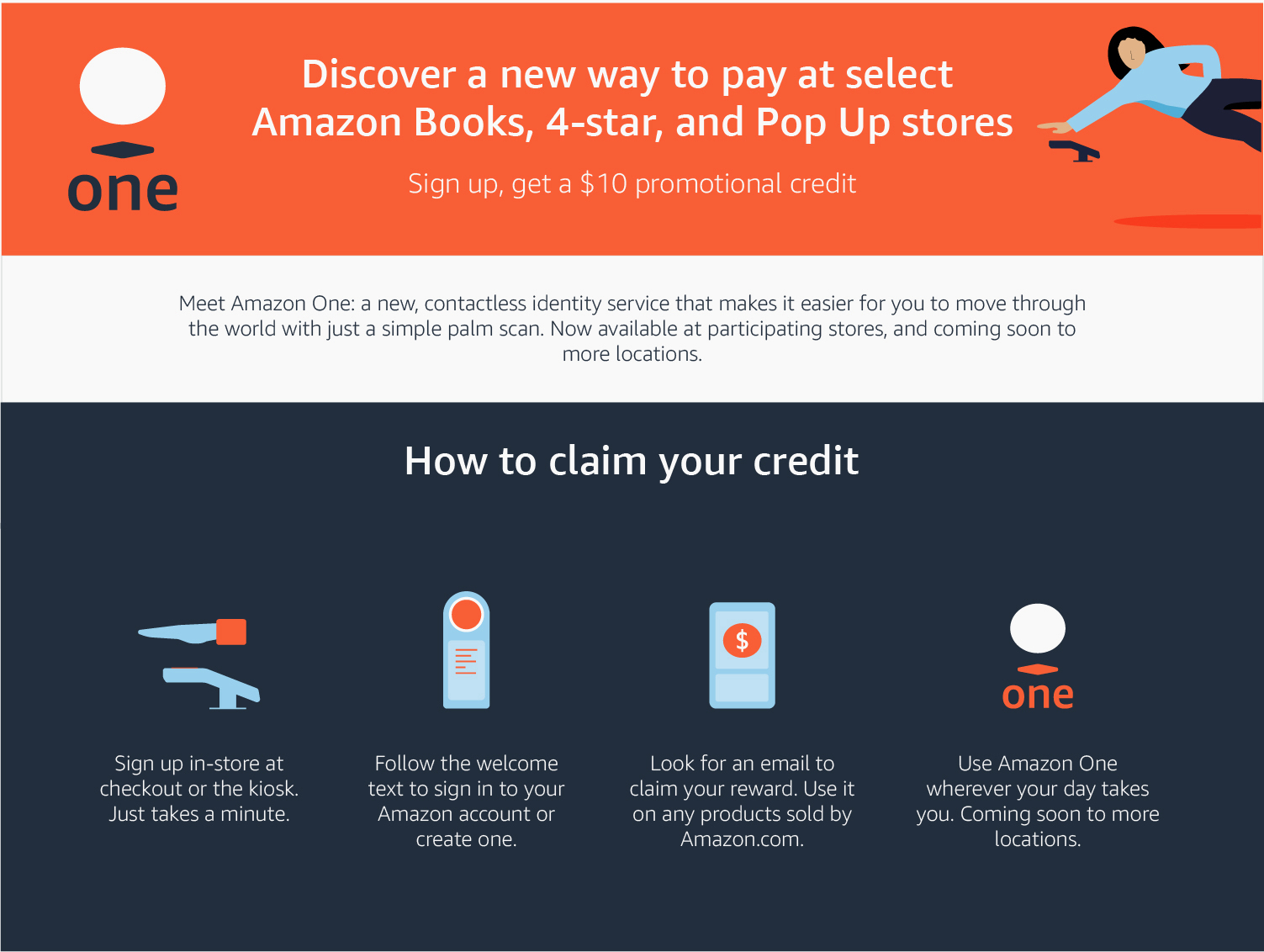
How much is your palm print worth? If you ask Amazon, it’s about $10 in promotional credit if you enroll your palm prints in its checkout-free stores and link it to your Amazon account.

Last year, Amazon introduced its new biometric palm print scanners, Amazon One, so customers can pay for goods in some stores by waving their palm prints over one of these scanners. By February, the company expanded its palm scanners to other Amazon grocery, book and 4-star stores across Seattle.

Amazon has since expanded its biometric scanning technology to its stores across the U.S., including New York, New Jersey, Maryland, and Texas.

The retail and cloud giant says its palm scanning hardware “captures the minute characteristics of your palm — both surface-area details like lines and ridges as well as subcutaneous features such as vein patterns — to create your palm signature,” which is then stored in the cloud and used to confirm your identity when you’re in one of its stores.

Amazon’s latest promotion: $10 promotional credit in exchange for your palm print. (Image: Amazon)

What’s Amazon doing with this data exactly? Your palm print on its own might not do much — though Amazon says it uses an unspecified “subset” of anonymous palm data to improve the technology. But by linking it to your Amazon account, Amazon can use the data it collects, like shopping history, to target ads, offers, and recommendations to you over time.

Amazon also says it stores palm data indefinitely, unless you choose to delete the data once there are no outstanding transactions left, or if you don’t use the feature for two years.

While the idea of contactlessly scanning your palm print to pay for goods during a pandemic might seem like a novel idea, it’s one to be met with caution and skepticism given Amazon’s past efforts in developing biometric technology. Amazon’s controversial facial recognition technology, which it historically sold to police and law enforcement, was the subject of lawsuits that allege the company violated state laws that bar the use of personal biometric data without permission.

“The dystopian future of science fiction is now. It’s horrifying that Amazon is asking people to sell their bodies, but it’s even worse that people are doing it for such a low price,” said Albert Fox Cahn, the executive director of the New York-based Surveillance Technology Oversight Project, in an email to TechCrunch.

“Biometric data is one of the only ways that companies and governments can track us permanently. You can change your name, you can change your Social Security number, but you can’t change your palm print. The more we normalize these tactics, the harder they will be coming to escape. If we don’t try to line in the sand here, I am very fearful what our future will look like,” said Cahn.

When reached, an Amazon spokesperson declined to comment.


from Amazon – TechCrunch https://ift.tt/3xkTxDi
via IFTTT

CSS Modules (The Native Ones)

They are actually called “CSS Module Scripts” and are a native browser feature, as opposed to the popular open-source project that essentially does scoped styles by creating unique class name identifiers in both HTML and CSS.

Native CSS Modules are a part of ES Modules (a lot like JSON modules we recently covered):

// Regular ES Modules
import React from "https://cdn.skypack.dev/react@17.0.1";

// Newfangled JSON Modules
import configData from './config-data.json' assert {type: 'json'};

// Newfangled CSS Modules
import styleSheet from "./styles.css" assert { type: "css" };

I first saw this from Justin’s tweet:

This is a Chrome-thing for now. Relevant links:

As I write, it only works in Chrome Canary with the Experimental Web Platform Features on. If your question is, When can I use this on production projects with a wide variety of users using whatever browser they want? I’d say: I have no idea. Probably years away. Maybe never. But it’s still interesting to check out. Maybe support will move fast. Maybe you’ll work on an Electron project or something where you can count on specific browser features.

This looks like an extension of Constructable Stylesheets, which are also Chrome-only, so browsers that are “behind” on this would have to start there.

I gave Justin’s idea a spin here:

If I log what I get back from the CSS Modules import, it’s a CSSStyleSheet:

Showing a styles tree with nodes for CSS rules, media, rules, and prototype.

If you’re going to actually use the styles… that’s on you. Justin’s idea basically applies the style as a one-liner because it just so happens that lit-html supports CSSStyleSheet (those docs don’t make that clear, but I imagine they will at some point). For native web components, it’s not much different: you import it, get the CSSStyleSheet, then apply it to the web component like:

this.shadowRoot.adoptedStyleSheets = [myCSSStyleSheet];

I would think the point of all this is:

  • we needed a way to import a stylesheet in JavaScript and this is basically the first really clear crack at it that I’m aware of,
  • now we have programatic access to manipulate the CSS before using it, if we wanted, and
  • it looks particularly nice for Web Components usage, but it’s generic. Do whatever you want with the stylesheet once you have it.

The post CSS Modules (The Native Ones) appeared first on CSS-Tricks. You can support CSS-Tricks by being an MVP Supporter.


from CSS-Tricks https://ift.tt/3lrYnMS
via IFTTT

How to Code a Playable Synth Keyboard

With a little knowledge of music theory, we can use regular HTML, CSS and JavaScript — without any libraries or audio samples — to create a simple digital instrument. Let’s put that into practice and explore one method for creating a digital synth that can be played and hosted on the internet.

Here’s what we’re making:

We’ll use the AudioContext API to create our sounds digitally, without resorting to samples. But first, let’s work on the keyboard’s appearance.

The HTML structure

We’re going to support a standard western keyboard where every letter between A and ; corresponds to a playable natural note (the white keys), while the row above can be used for the sharps and flats (the black keys). This means our keyboard covers just over an octave, starting at C₃ and ending at E₄. (For anyone unfamiliar with musical notation, the subscript numbers indicate the octave.)

One useful thing we can do is store the note value in a custom note attribute so it’s easy to access in our JavaScript. I’ll print the letters of the computer keyboard, to help our users understand what to press.

<ul id="keyboard">
  <li note="C" class="white">A</li>
  <li note="C#" class="black">W</li>
  <li note="D" class="white offset">S</li>
  <li note="D#" class="black">E</li>
  <li note="E" class="white offset">D</li>
  <li note="F" class="white">F</li>
  <li note="F#" class="black">T</li>
  <li note="G" class="white offset">G</li>
  <li note="G#" class="black">Y</li>
  <li note="A" class="white offset">H</li>
  <li note="A#" class="black">U</li>
  <li note="B" class="white offset">J</li>
  <li note="C2" class="white">K</li>
  <li note="C#2" class="black">O</li>
  <li note="D2" class="white offset">L</li>
  <li note="D#2" class="black">P</li>
  <li note="E2" class="white offset">;</li>
</ul>

The CSS styling

We’ll begin our CSS with some boilerplate:

html {
  box-sizing: border-box;
}

*,
*:before,
*:after {
  box-sizing: inherit;
  font-family: -apple-system, BlinkMacSystemFont, "Segoe UI", Roboto, Oxygen,
    Ubuntu, Cantarell, "Open Sans", "Helvetica Neue", sans-serif;
}

body {
  margin: 0;
}

Let’s specify CSS variables for some of the colors we’ll be using. Feel free to change them to whatever you prefer!

:root {
  --keyboard: hsl(300, 100%, 16%);
  --keyboard-shadow: hsla(19, 50%, 66%, 0.2);
  --keyboard-border: hsl(20, 91%, 5%);
  --black-10: hsla(0, 0%, 0%, 0.1);
  --black-20: hsla(0, 0%, 0%, 0.2);
  --black-30: hsla(0, 0%, 0%, 0.3);
  --black-50: hsla(0, 0%, 0%, 0.5);
  --black-60: hsla(0, 0%, 0%, 0.6);
  --white-20: hsla(0, 0%, 100%, 0.2);
  --white-50: hsla(0, 0%, 100%, 0.5);
  --white-80: hsla(0, 0%, 100%, 0.8);
}

In particular, changing the --keyboard and --keyboard-border variables will change the end result dramatically.

For styling the keys and the keyboard — especially in the pressed states — I owe a lot of my inspiration to this CodePen by zastrow. First, we specify the CSS shared by all the keys:

.white,
.black {
  position: relative;
  float: left;
  display: flex;
  justify-content: center;
  align-items: flex-end;
  padding: 0.5rem 0;
  user-select: none;
  cursor: pointer;
}

Using a specific border radius on the first and last key helps make the design look more organic. Without rounding, the top left and top right corners of keys look a little unnatural. Here’s a final design, minus any extra rounding on the first and last keys.

Let’s add some CSS to improve this.

#keyboard li:first-child {
  border-radius: 5px 0 5px 5px;
}

#keyboard li:last-child {
  border-radius: 0 5px 5px 5px;
}

The difference is subtle but effective:

Next, we apply the stylings that differentiate the white and black keys. Notice that the white keys have a z-index of 1 and the black keys have a z-index of 2:

.white {
  height: 12.5rem;
  width: 3.5rem;
  z-index: 1;
  border-left: 1px solid hsl(0, 0%, 73%);
  border-bottom: 1px solid hsl(0, 0%, 73%);
  border-radius: 0 0 5px 5px;
  box-shadow: -1px 0 0 var(--white-80) inset, 0 0 5px hsl(0, 0%, 80%) inset,
    0 0 3px var(--black-20);
  background: linear-gradient(to bottom, hsl(0, 0%, 93%) 0%, white 100%);
  color: var(--black-30);
}

.black {
  height: 8rem;
  width: 2rem;
  margin: 0 0 0 -1rem;
  z-index: 2;
  border: 1px solid black;
  border-radius: 0 0 3px 3px;
  box-shadow: -1px -1px 2px var(--white-20) inset,
    0 -5px 2px 3px var(--black-60) inset, 0 2px 4px var(--black-50);
  background: linear-gradient(45deg, hsl(0, 0%, 13%) 0%, hsl(0, 0%, 33%) 100%);
  color: var(--white-50);
}

When a key is pressed, we’ll use JavaScript to add a class of "pressed" to the relevant li element. For now, we can test this by adding the class directly to our HTML elements.

.white.pressed {
  border-top: 1px solid hsl(0, 0%, 47%);
  border-left: 1px solid hsl(0, 0%, 60%);
  border-bottom: 1px solid hsl(0, 0%, 60%);
  box-shadow: 2px 0 3px var(--black-10) inset,
    -5px 5px 20px var(--black-20) inset, 0 0 3px var(--black-20);
  background: linear-gradient(to bottom, white 0%, hsl(0, 0%, 91%) 100%);
  outline: none;
}

.black.pressed {
  box-shadow: -1px -1px 2px var(--white-20) inset,
    0 -2px 2px 3px var(--black-60) inset, 0 1px 2px var(--black-50);
  background: linear-gradient(
    to right,
    hsl(0, 0%, 27%) 0%,
    hsl(0, 0%, 13%) 100%
  );
  outline: none;
}

Certain white keys need to be moved toward the left so that they sit under the black keys. We give these a class of "offset" in our HTML, so we can keep the CSS simple:

.offset {
  margin: 0 0 0 -1rem;
}

If you’ve followed the CSS up to this point, you should have something like this:

Finally, we’ll style the keyboard itself:

#keyboard {
  height: 15.25rem;
  width: 41rem;
  margin: 0.5rem auto;
  padding: 3rem 0 0 3rem;
  position: relative;
  border: 1px solid var(--keyboard-border);
  border-radius: 1rem;
  background-color: var(--keyboard);
  box-shadow: 0 0 50px var(--black-50) inset, 0 1px var(--keyboard-shadow) inset,
    0 5px 15px var(--black-50);
}

We now have a nice-looking CSS keyboard, but it’s not interactive and it doesn’t make any sounds. To do this, we’ll need JavaScript.

Musical JavaScript

To create the sounds for our synth, we don’t want to rely on audio samples — that’d be cheating! Instead, we can use the web’s AudioContext API, which has tools that can help us turn digital waveforms into sounds.

To create a new audio context, we can use:

const audioContext = new (window.AudioContext || window.webkitAudioContext)();

Before using our audioContext it will be helpful to select all our note elements in the HTML. We can use this helper to easily query the elements:

const getElementByNote = (note) =>
  note && document.querySelector(`[note="${note}"]`);

We can then store the elements in an object, where the key of the object is the key that a user would press on the keyboard to play that note.

const keys = {
  A: { element: getElementByNote("C"), note: "C", octaveOffset: 0 },
  W: { element: getElementByNote("C#"), note: "C#", octaveOffset: 0 },
  S: { element: getElementByNote("D"), note: "D", octaveOffset: 0 },
  E: { element: getElementByNote("D#"), note: "D#", octaveOffset: 0 },
  D: { element: getElementByNote("E"), note: "E", octaveOffset: 0 },
  F: { element: getElementByNote("F"), note: "F", octaveOffset: 0 },
  T: { element: getElementByNote("F#"), note: "F#", octaveOffset: 0 },
  G: { element: getElementByNote("G"), note: "G", octaveOffset: 0 },
  Y: { element: getElementByNote("G#"), note: "G#", octaveOffset: 0 },
  H: { element: getElementByNote("A"), note: "A", octaveOffset: 1 },
  U: { element: getElementByNote("A#"), note: "A#", octaveOffset: 1 },
  J: { element: getElementByNote("B"), note: "B", octaveOffset: 1 },
  K: { element: getElementByNote("C2"), note: "C", octaveOffset: 1 },
  O: { element: getElementByNote("C#2"), note: "C#", octaveOffset: 1 },
  L: { element: getElementByNote("D2"), note: "D", octaveOffset: 1 },
  P: { element: getElementByNote("D#2"), note: "D#", octaveOffset: 1 },
  semicolon: { element: getElementByNote("E2"), note: "E", octaveOffset: 1 }
};

I found it useful to specify the name of the note here, as well as an octaveOffset, which we’ll need when working out the pitch.

We need to supply a pitch in Hz. The equation used to determine pitch is x * 2^(y / 12) where x is the Hz value of a chosen note — usually A₄, which has a pitch of 440Hz — and y is the number of notes above or below that pitch.

That gives us something like this in code:

const getHz = (note = "A", octave = 4) => {
  const A4 = 440;
  let N = 0;
  switch (note) {
    default:
    case "A":
      N = 0;
      break;
    case "A#":
    case "Bb":
      N = 1;
      break;
    case "B":
      N = 2;
      break;
    case "C":
      N = 3;
      break;
    case "C#":
    case "Db":
      N = 4;
      break;
    case "D":
      N = 5;
      break;
    case "D#":
    case "Eb":
      N = 6;
      break;
    case "E":
      N = 7;
      break;
    case "F":
      N = 8;
      break;
    case "F#":
    case "Gb":
      N = 9;
      break;
    case "G":
      N = 10;
      break;
    case "G#":
    case "Ab":
      N = 11;
      break;
  }
  N += 12 * (octave - 4);
  return A4 * Math.pow(2, N / 12);
};

Although we’re only using sharps in the rest of our code, I decided to include flats here as well, so this function could easily be re-used in a different context.

For anyone who’s unsure about musical notation, the notes A# and Bb, for example, describe the exact same pitch. We might choose one over another if we’re playing in a particular key, but for our purposes, the difference doesn’t matter.

Playing notes

We’re ready to start playing some notes!

First, we need some way of telling which notes are playing at any given time. Let’s use a Map to do this, as its unique key constraint can help prevent us from triggering the same note multiple times in a single press. Plus, a user can only click one key at a time, so we can store that as a string.

const pressedNotes = new Map();
let clickedKey = "";

We need two functions, one to play a key — which we’ll trigger on keydown or mousedown — and another to stop playing the key — which we’ll trigger on keyup or mouseup.

Each key will be played on its own oscillator with its own gain node (used to control the volume) and its own waveform type (used to determine the timbre of the sound). I’m opting for a "triangle" waveform, but you can use whatever you prefer of "sine", "triangle", "sawtooth" and "square". The spec offers a little more information on these values.

const playKey = (key) => {
  if (!keys[key]) {
    return;
  }

  const osc = audioContext.createOscillator();
  const noteGainNode = audioContext.createGain();
  noteGainNode.connect(audioContext.destination);
  noteGainNode.gain.value = 0.5;
  osc.connect(noteGainNode);
  osc.type = "triangle";

  const freq = getHz(keys[key].note, (keys[key].octaveOffset || 0) + 4);

  if (Number.isFinite(freq)) {
    osc.frequency.value = freq;
  }

  keys[key].element.classList.add("pressed");
  pressedNotes.set(key, osc);
  pressedNotes.get(key).start();
};

Our sound could do with some refinement. At the moment, is has a slightly piercing, microwave-buzzer quality to it! But this is enough to get started. We’ll come back and make some tweaks at the end!

Stopping a key is a simpler task. We need to let each note “ring out” for an amount of time after the user lifts their finger (two seconds is about right), as well as make the necessary visual change.

const stopKey = (key) => {
  if (!keys[key]) {
    return;
  }
  
  keys[key].element.classList.remove("pressed");
  const osc = pressedNotes.get(key);

  if (osc) {
    setTimeout(() => {
      osc.stop();
    }, 2000);

    pressedNotes.delete(key);
  }
};

All that’s left is to add our event listeners:

document.addEventListener("keydown", (e) => {
  const eventKey = e.key.toUpperCase();
  const key = eventKey === ";" ? "semicolon" : eventKey;
  
  if (!key || pressedNotes.get(key)) {
    return;
  }
  playKey(key);
});

document.addEventListener("keyup", (e) => {
  const eventKey = e.key.toUpperCase();
  const key = eventKey === ";" ? "semicolon" : eventKey;
  
  if (!key) {
    return;
  }
  stopKey(key);
});

for (const [key, { element }] of Object.entries(keys)) {
  element.addEventListener("mousedown", () => {
    playKey(key);
    clickedKey = key;
  });
}

document.addEventListener("mouseup", () => {
  stopKey(clickedKey);
});

Note that, while most of our event listeners are added to the HTML document, we can use our keys object to add click listeners to the specific elements we have already queried. We also need to give some special treatment to our highest note, making sure we convert the ";" key into the spelled-out "semicolon" used in our keys object.

We can now play the keys on our synth! There’s just one problem. The sound is still pretty shrill! We might want to knock down the octave of the keyboard by changing the expression that we assign to the freq constant:

const freq = getHz(keys[key].note, (keys[key].octaveOffset || 0) + 3);

You might also be able to hear a “click” at the beginning and end of the sound. We can solve this by quickly fading in and more gradually fading out of each sound.

In music production, we use the term attack to describe how quickly a sound goes from nothing to its maximum volume, and “release” to describe how long it takes for a sound to fade to nothing once it’s no longer played. Another useful concept is decay, the the time taken for sound to go from its peak volume to its sustained volume. Thankfully, our noteGainNode has a gain property with a method called exponentialRampToValueAtTime, which we can use to control attack, release and decay. If we replace our previous playKey function with the following one, we’ll get a much nicer plucky sound:

const playKey = (key) => {
  if (!keys[key]) {
    return;
  }

  const osc = audioContext.createOscillator();
  const noteGainNode = audioContext.createGain();
  noteGainNode.connect(audioContext.destination);

  const zeroGain = 0.00001;
  const maxGain = 0.5;
  const sustainedGain = 0.001;

  noteGainNode.gain.value = zeroGain;

  const setAttack = () =>
    noteGainNode.gain.exponentialRampToValueAtTime(
      maxGain,
      audioContext.currentTime + 0.01
    );
  const setDecay = () =>
    noteGainNode.gain.exponentialRampToValueAtTime(
      sustainedGain,
      audioContext.currentTime + 1
    );
  const setRelease = () =>
    noteGainNode.gain.exponentialRampToValueAtTime(
      zeroGain,
      audioContext.currentTime + 2
    );

  setAttack();
  setDecay();
  setRelease();

  osc.connect(noteGainNode);
  osc.type = "triangle";

  const freq = getHz(keys[key].note, (keys[key].octaveOffset || 0) - 1);

  if (Number.isFinite(freq)) {
    osc.frequency.value = freq;
  }

  keys[key].element.classList.add("pressed");
  pressedNotes.set(key, osc);
  pressedNotes.get(key).start();
};

We should have a working, web-ready synth at this point!

The numbers inside our setAttack, setDecay and setRelease functions may seem a bit random, but really they’re just stylistic choices. Try changing them and seeing what happens to the sound. You may end up with something you prefer!

If you’re interested in taking the project further, there are lots of ways you could improve it. Perhaps a volume control, a way to switch between octaves, or a way to choose between waveforms? We could add reverb or a low pass filter. Or perhaps each sound could be made up of multiple oscillators?

For anyone interested in understanding more about how to implement music theory concepts on the web, I recommend looking at the source code of the tonal npm package.


The post How to Code a Playable Synth Keyboard appeared first on CSS-Tricks. You can support CSS-Tricks by being an MVP Supporter.


from CSS-Tricks https://ift.tt/3jektjd
via IFTTT

BoxGroup closes on $255M across two funds to back startups at their earliest stages

BoxGroup has quietly, yet diligently, been funding companies at the early stage for over a decade. The 11-year-old firm in fact was the first investor in Plaid, a fintech company that nearly got sold to Visa last year for billions of dollars.

It has seen a number of impressive exits over the years, proving an eye that can detect winners before the winners themselves may even realize it. In fact, it’s that early faith in companies that partner David Tisch believes has been key to BoxGroup’s success.

“If you’re starting a company and you’re going to raise money, that first yes is the hardest. And it’s that’s the one that gives you the confidence, the excitement – to know that there’s somebody out there that’s going to believe in this and give you money for it,” Partner David Tisch told TechCrunch. “We really do try to pride ourselves on being that first yes on a regular basis. So the earlier we meet companies, the better.”

Today, BoxGroup is announcing it has beefed up its war chest so that it can be that “first yes” to more companies with the closure of two new funds totaling $255 million of capital. BoxGroup Five is the firm’s fifth early stage fund, and is aimed at investing in emerging tech companies at the pre-seed and seed stages. BoxGroup Strive is its second opportunity fund that will back companies in their subsequent follow-on rounds. Each fund amounts to $127.5 million. 

Over the years, BoxGroup has made over 300 investments including having invested in the earliest rounds of Ro, Plaid, Airtable, Workrise, Scopely, Bowery Farms, Ramp, Titan, Warby Parker, Classpass, Guideline and Glossier. It has had a number of impressive exits in Flatiron Health, PillPack, Matterport, Oscar, Mirror, Bark, Bread and Trello. 

Besides being the first firm to write Plaid a check, BoxGroup was also the first investor in PillPack, which ended up selling to Amazon for just under $1 billion in 2018.

BoxGroup Five – the firm’s early-stage fund – will invest in about 40 to 50 new companies a year with investments ranging from $250,000 to $1 million.

“We want to be the second or third biggest check in a round,” Tisch said.

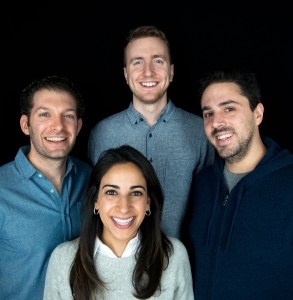
Image Credits: BoxGroup; Adam Rothenberg (left), Nimi Katragadda (bottom), Greg Rosen (top), David Tisch (right)

The opportunity fund occasionally makes later-stage investments in new companies, but mostly just continues to support companies it invested in at an earlier stage. For example, BoxGroup first invested in id.me in 2010.

“The company is sort of an 11-year overnight success that we’ve been backing for over a decade now,” Tisch said. “It’s an example of us just continuing to support companies through their life cycle.”

BoxGroup also pre-seeded digital healthcare startup Ro, but also funded every round it’s raised since, including its most recent $500 million funding at a $5 billion valuation

Tisch describes the BoxGroup six-person team as “generalists” in terms of the spaces it invests in, with a portfolio consisting of startups in the consumer, enterprise, fintech, healthcare, marketplace, synthetic biology and climate sectors.

Interestingly, BoxGroup’s last fund closures – which totaled $165 million – marked the first time the firm had accepted outside capital in nine years. Prior to that point, it had been funded with only personal capital. Its LPs are a mixed group of endowments, foundations and family offices.

For BoxGroup, building authentic relationships with founders is at the root of what the firm does, says Partner Nimi Katragadda. That includes taking bets on founders, sometimes more than once, even if one of their companies didn’t work out. It means backing just ideas in some cases, and people.

“This cannot be transactional, it has to be personal,” she said. “We want to go on a journey with someone for a decade as they build their business…. We’re comfortable with what early means, including a lot of assumptions, more vision than traction, and raw product.”

Partner Adam Rothenberg agrees, saying: “Our goal is to be the friend in the room. We believe in honesty, tough love, and transparency in building relationships with founders. We focus on the “how” more than the “what” — how a founder thinks, how they will build product, and how they think about attracting talent.”

With offices in San Francisco and New York, the firm will likely be growing in the near future as BoxGroup is looking to add on some “first-line investors,” Tisch said.

Recently, Greg Rosen was named a partner at the firm. Rosen originally joined BoxGroup in 2015, where he spent three years before leaving to join Benchmark. He re-joined BoxGroup in early 2020 and joins the firm’s three other partners: Tisch, Rothenberg and Katragadda. 

While the world of venture is crazy hot right now, Tisch said the firm keeps itself grounded with a wisdom that can only be gained with experience and in time.

“There is seemingly infinite capital waiting to be deployed,” he said. “Without calling the cycle, we know that over time markets go up and down…No matter where we are in a given cycle, smart and determined minds will come together to build important technology companies. Our job is to make sure we are meeting those founders and choosing wisely about which ones to partner with for 10+ year journeys.”


from Amazon – TechCrunch https://ift.tt/3A0QoKJ
via IFTTT

Sunday, August 1, 2021

Partly Cloudy today!


With a high of F and a low of 56F. Currently, it's 66F and Fair outside.

Current wind speeds: 9 from the Southeast

Pollen: 6

Sunrise: August 1, 2021 at 05:52PM

Sunset: August 2, 2021 at 08:03AM

UV index: 0

Humidity: 62%

via https://ift.tt/2livfew

August 2, 2021 at 10:03AM

Mostly Cloudy/Wind today!

With a high of F and a low of 55F. Currently, it's 79F and Fair outside. Current wind speeds: 18 from the Northeast Pollen: 3 Su...