In the past few years, we’ve seen a lot of change and diversion in regard to web technologies. In 2020, I foresee us as a web community heading toward two major trends/goals: extensibility and interoperability. Let’s break those down.
Extensibility
Extensibility describes how much someone can take a particular technology and extend it to their own needs. We’ve built a component-based web over the last few years in terms of both development (React components! Vue components! Svelte components! Web components!) and design (Design systems!). Interesting how form follows function, isn’t it?
Now we’re trying to make that component system look and feel more unique. Extensibility on the web allows us to tailor the platform to our own needs, and experiment with outcomes.
CSS itself is becoming much more extensible…
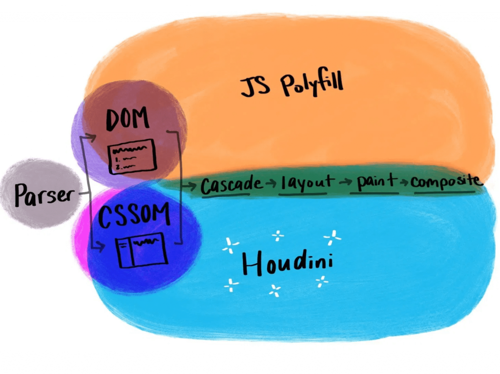
CSS Houdini
With CSS Houdini, developers will be able to extend what’s currently possible in the CSS Object Model and teach the browser how they want it to read and render their CSS.

That means that things that weren’t previously possible on the web, like angled corners or round layout, now become possible.
If you’re not yet familiar with Houdini, it’s an umbrella term that describes a few different browser APIs, intended to improve browser performance. It makes styling more extensible and lets users dictate their own CSS features. Houdini’s current APIs include:
With these APIs, users can tap into meaningful semantic CSS (thanks to the Typed Object Model), and even apply semantics to their CSS variables (Properties and Values). With the Paint API, you can draw a canvas and have it applied as a border image (hello, gradient borders), or create animated sparkles (link) that accept dynamic arguments and are implemented with a single line of CSS.
.sparkles {
  background: paint(sparkles)
}
You can build round menus without placing the items manually through margins (via the Layout API), and you can integrate your own interactions that live off of the main thread (using the Animation Worklet).
Houdini is definitely one to watch in the new year, and now is a great time to start experimenting with it if you haven’t yet.
Variable fonts
Another technology that falls in line with the goal of making websites more performant while offering more user extensibility is variable fonts. With so many new variable fonts popping up — and Google Fonts’ recent beta launch — variable fonts are now more available and easy to use than ever.
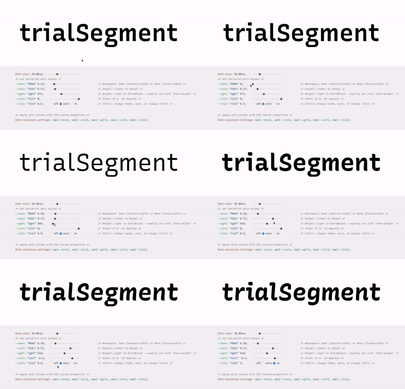
Variable fonts are vector-based and allow for a broad range of values to be set for various font axes, like weight and slant. The interpolation of these axes allows fonts to transition smoothly between points.
Here’s an example:

Variable fonts also allow for new axes to help designers and developers be even more creative with their work. Here’s an example of some of those from an excellent resource called v-fonts:

Variable fonts are relatively well supported, with 87% of modern browsers supporting the required font format.
Custom Properties
Custom properties, like variable fonts, are also well supported. While they’re not new, we’re still discovering all of the things we can do with custom properties.
Custom properties allow for truly dynamic CSS variables, meaning we can adjust them in JavaScript, separating logic and style. A great example of this comes from David Khourshid, who shows us how to create reactive animations and sync up the styling without sweating it.
We’re also starting to experiment with more logic in our stylesheets. I recently published a blog post that explains how to create dynamic color themes using the native CSS calc() function, along with custom properties.

This eliminates the need for additional tools to process our CSS, and ensures that this technique for theming works across any technology stack — which brings me to my next 2020 vision: interoperability.
Interoperability
Interoperability, by my definition in this post, means the ability to work between technologies and human needs. From a technical perspective, with the fragmented web, a lot of companies have migrated stacks in the recent past, or have multiple internal stacks, and are now likely interested in safeguarding their technology stack against future changes to maintain some semblance of uniformity.
Web components
Web components try to solve this problem by attacking the problem of component-based architecture from a web-standards perspective. The vision is to introduce a standard format that can be used with or without a library, benefiting the developer experience and establishing uniformity between components.
Each web component is encapsulated and works in modern browsers without dependencies. This technology is still evolving and I think we’ll see a lot of growth in 2020.
Logical properties
Logical properties challenge us to adjust our mental model of how we apply layout sizing on a page in order for us to make our pages more friendly across languages and reading modes. They allow for our layouts to be interoperable with user experiences.
In English, and other left-to-right languages, we think of the layout world in terms of height and width, and use a compass-type expression for margins, border, and padding (top, left, bottom, right). However if we style this way and then adjust the language to a right-to-left language, like Arabic, the padding-left of our paragraphs no longer means padding from the beginning of where we would read. This breaks the layout.
If you were to write padding-inline-start instead of padding-left, the padding would correctly swap to the other side of the page (the start of where one would be reading) when switching to the right-to-left language, maintaining layout integrity.

Preference media queries
Preference media queries are also on the rise, with more capability coming in 2020. They allow us to tailor our sites to work with people who prefer high contrast or dark mode, as well as people who prefer a less animation-heavy experience.
The upcoming preference media queries include:
In this video, I go over how to create a preference media query for dark mode, using custom properties for styling:
Runner up: Speed
Speed is also a topic I see as a big focus of the web world in 2020. Several of the technologies I mentioned above have the benefit of improving web performance, even if it isn’t the main focus (e.g. how variable fonts may reduce the total weight of fonts downloaded). Performance becomes increasingly important when we think about the next billion users coming online in areas where network speeds may be lacking.
In addition, Web Assembly, which is a wrapper that lets users write closer to the browser metal, is gaining popularity. I also foresee a lot more work with WebGL in the coming year, which uses similar techniques for advanced and speedy graphics rendering. Writing lower-level code allows for speedier experiences, and in some cases of WebGL, may be required to prevent advanced visualization from crashing our browsers. I think we’ll see these two technologies grow and see more WebGL demos in 2020.
The web is constantly evolving and that's what makes it so exciting to be a part of. What do you see as a goal or technology to watch in 2020? Tell us in the comments!
The post The Web in 2020: Extensibility and Interoperability appeared first on CSS-Tricks.
from CSS-Tricks https://ift.tt/36lVdiy
via IFTTT

No comments:
Post a Comment