I just need to put two boxes side-by-side and I hear flexbox is good at stuff like that.
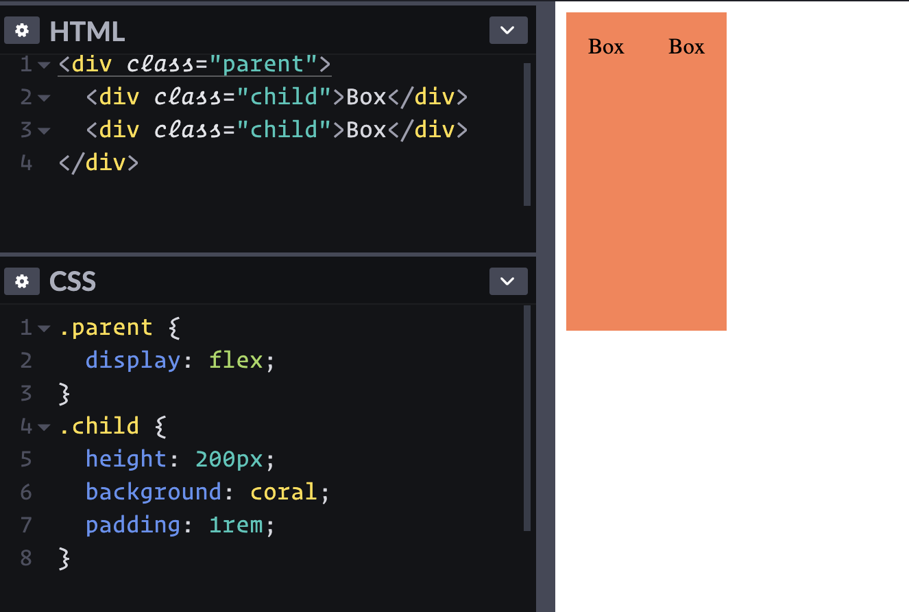
display: flex; to the parent element lays out the children in a row.Well, that's cool. I guess I could have floated them, but this is easier.
They should probably take up the full space they have though. Can I just stretch the parent to 100% wide? Well, I can, but that's apparently not going to affect the child elements.
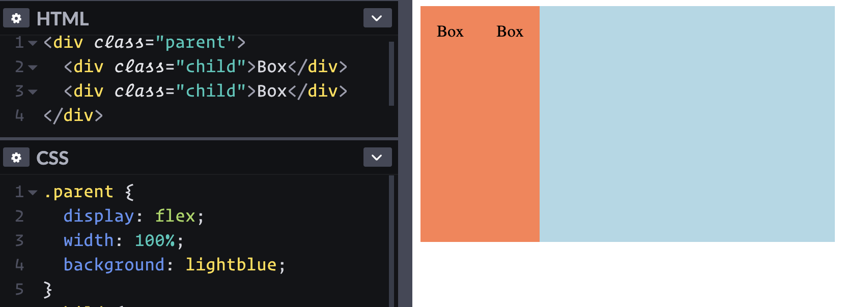
Maybe I can use width: 50%; on the children? That works, but I thought the point of flexbox is that you don't have to be all specific about width. Ah yes, flexbox has all of these ways of expressing the growy-shrinky-initial behavior of children. Looks like flex: 1; is about as easy as it gets here.
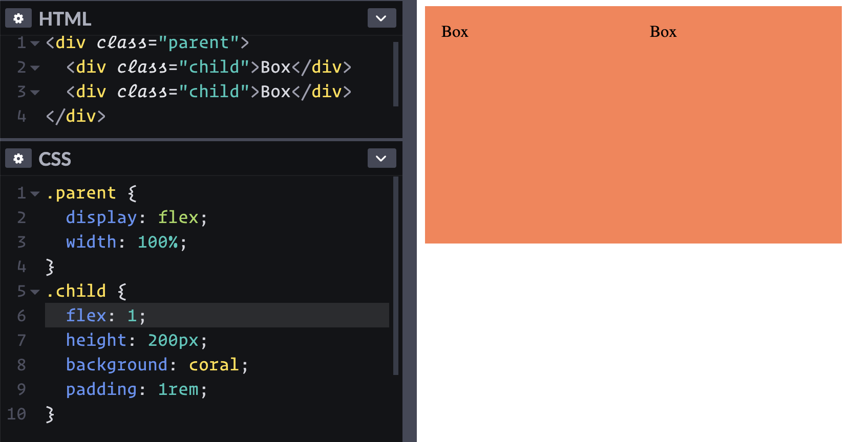
flex: 1; to the children allow them to grow and fill the space.I like how I haven't had to do any math or hard code values so far. Can I make it a three-up pattern without touching CSS?
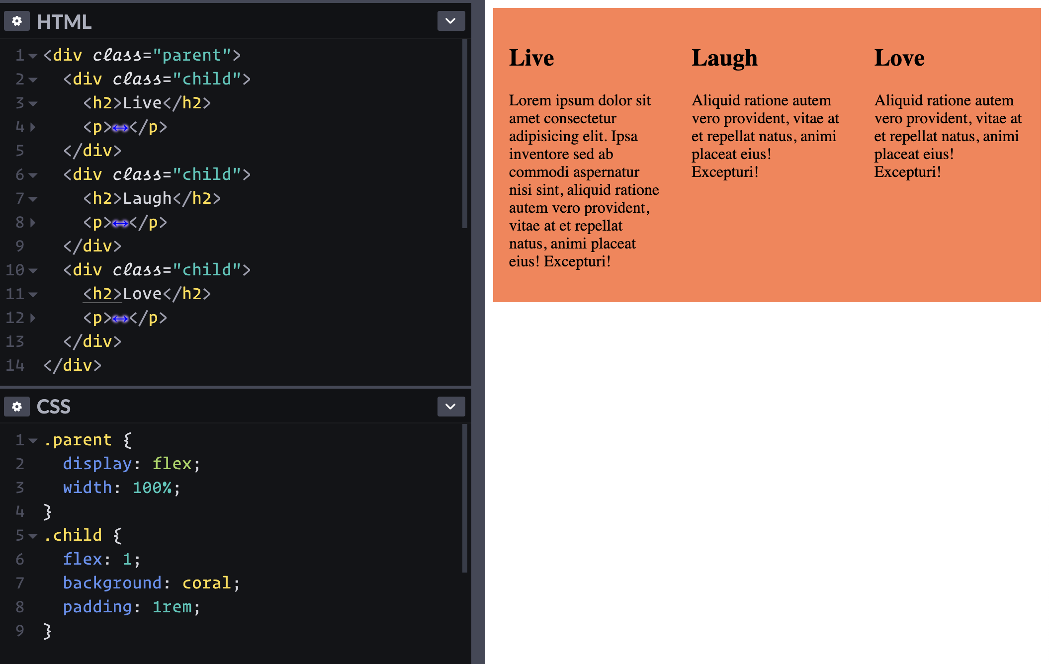
Nice.
Hmmm, wait. The sizing is a bit, uhhhh, flexy? Nothing is forcing these boxes to be one-third of the container all the time.
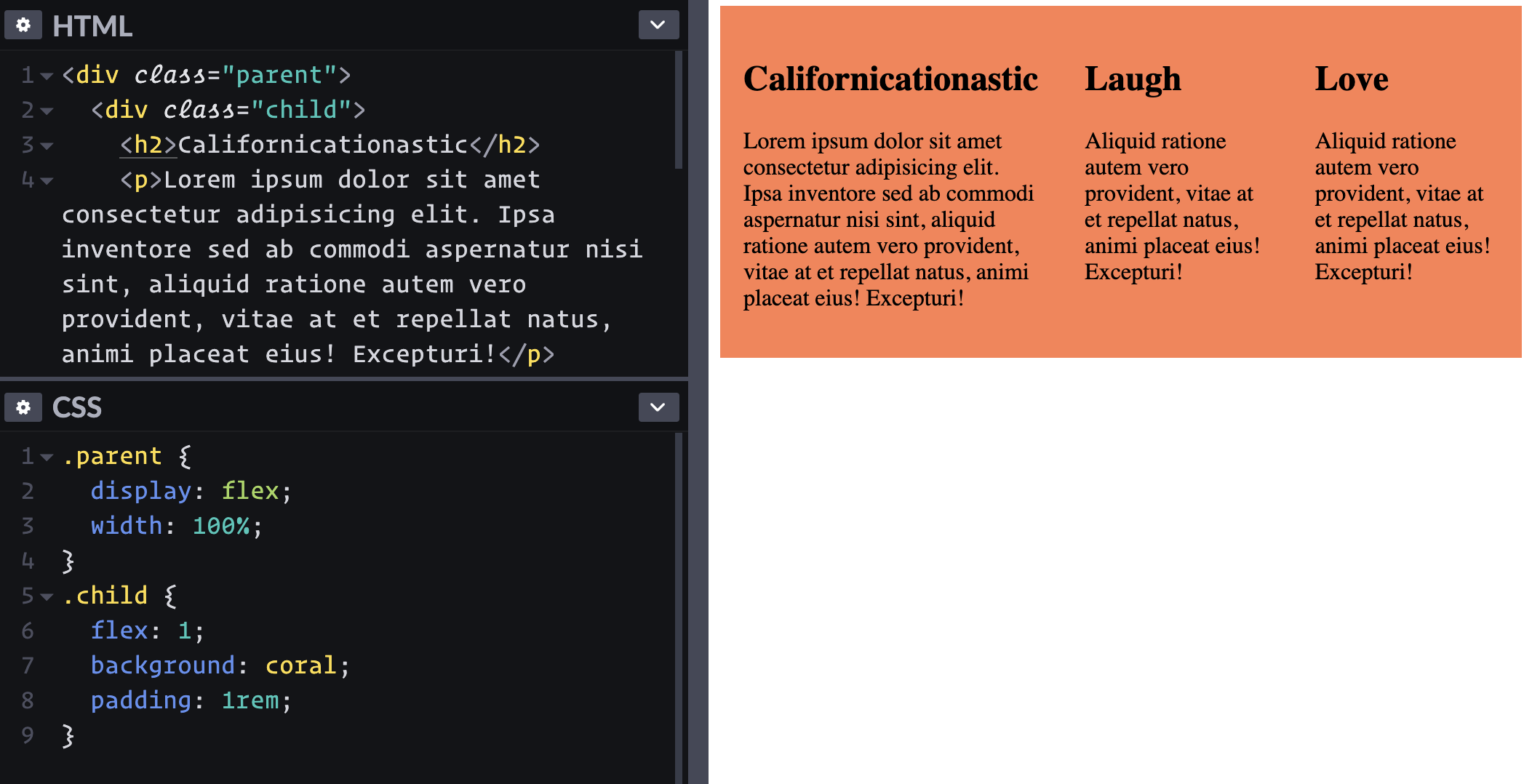
Looks like flex-basis: 33% doesn't fix this. flex: 0 0 33%; also doesn't do the trick. Looks like width: 33%; flex-shrink: 0; does though, if we're really wanting to strongarm it.
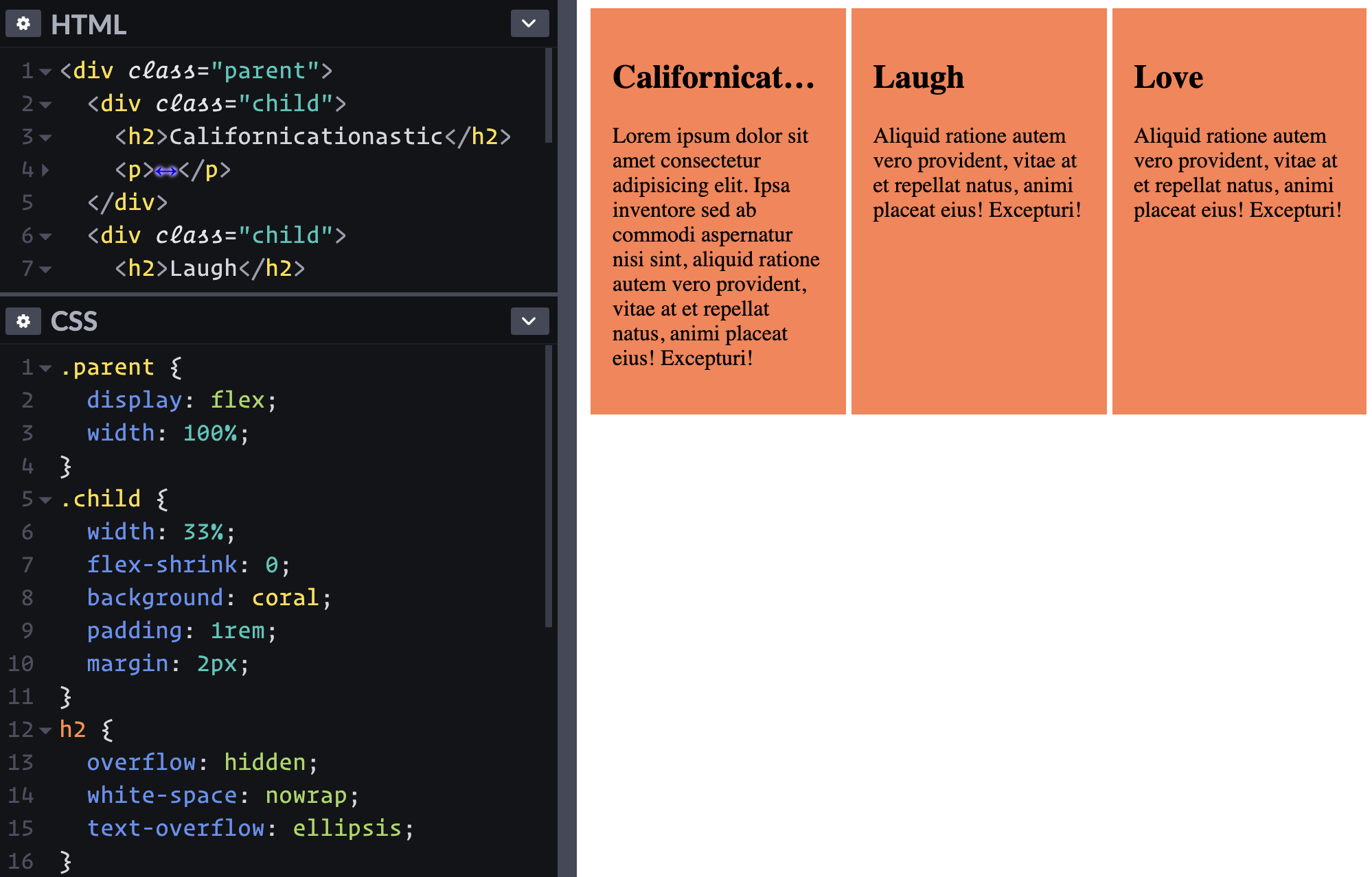
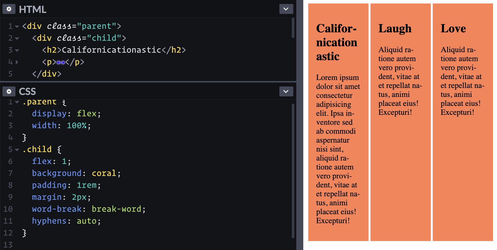
The long word forcing that sizing behavior at narrow widths is perhaps an uncommon scenario. We could have also solved it with word-break: break-word; hyphens: auto; on the child.
Another thing we could do it just let the dang items wrap instead of being so strict about it. Flexbox can do that, right?
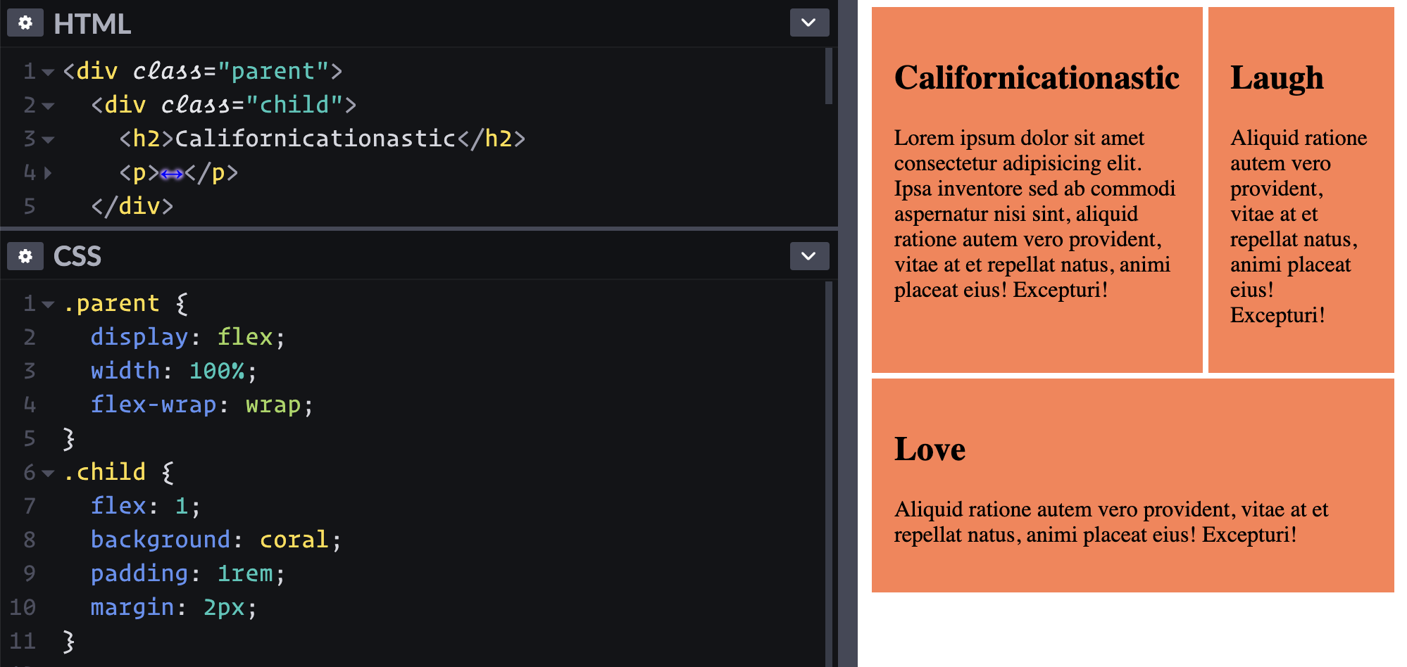
Oh hey, that reminds me how cool it is that those first two items are the same height. That's the default stretch behavior, but it can be controlled as well. And it's by row, which is why the second row has its own different height.
What if I want that first "Love" block to be on top instead? Looks like I can re-order it, eh? Let's see, the default order is 0, so to be first, I do order: -1;.
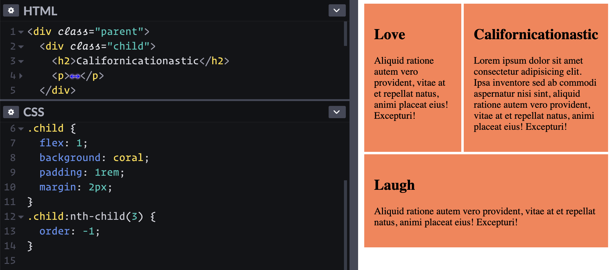
Ha! That kinda worked. But I meant that I want it to take up the full width on the top row. I guess I can just kick it up to flex-basis: 100%; and the others will wrap accordingly.
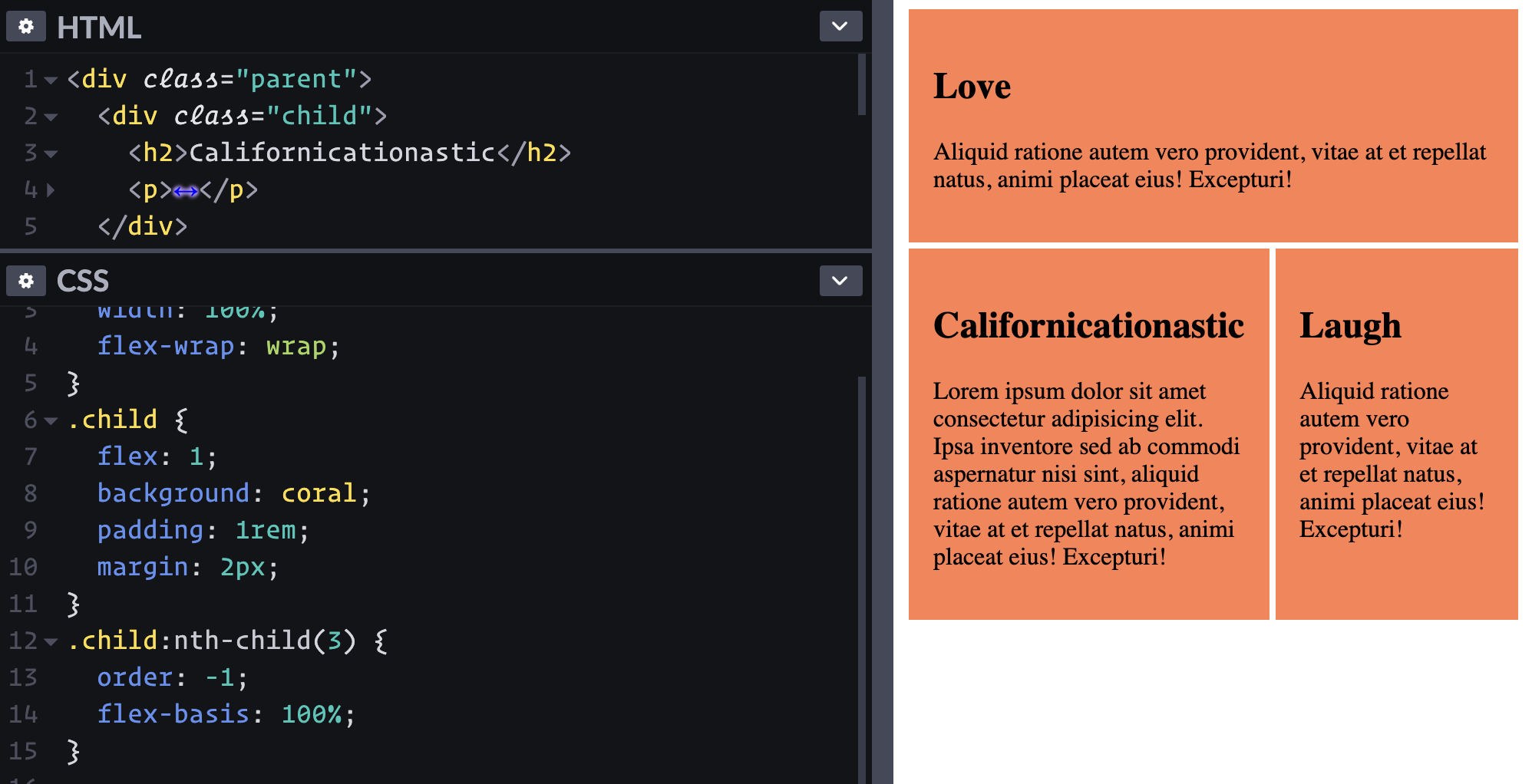
It's pretty weird to have the source order and visual order different like this. Maybe that should go in the "don't ever do this" category.
What if I wanna bail on the whole flexbox thing at a certain point? Part of me wants to change the direction to go vertical with flex-direction: column; and force the children to be full-width. Ah, a simple display: block; on the parent does that in one swoop.
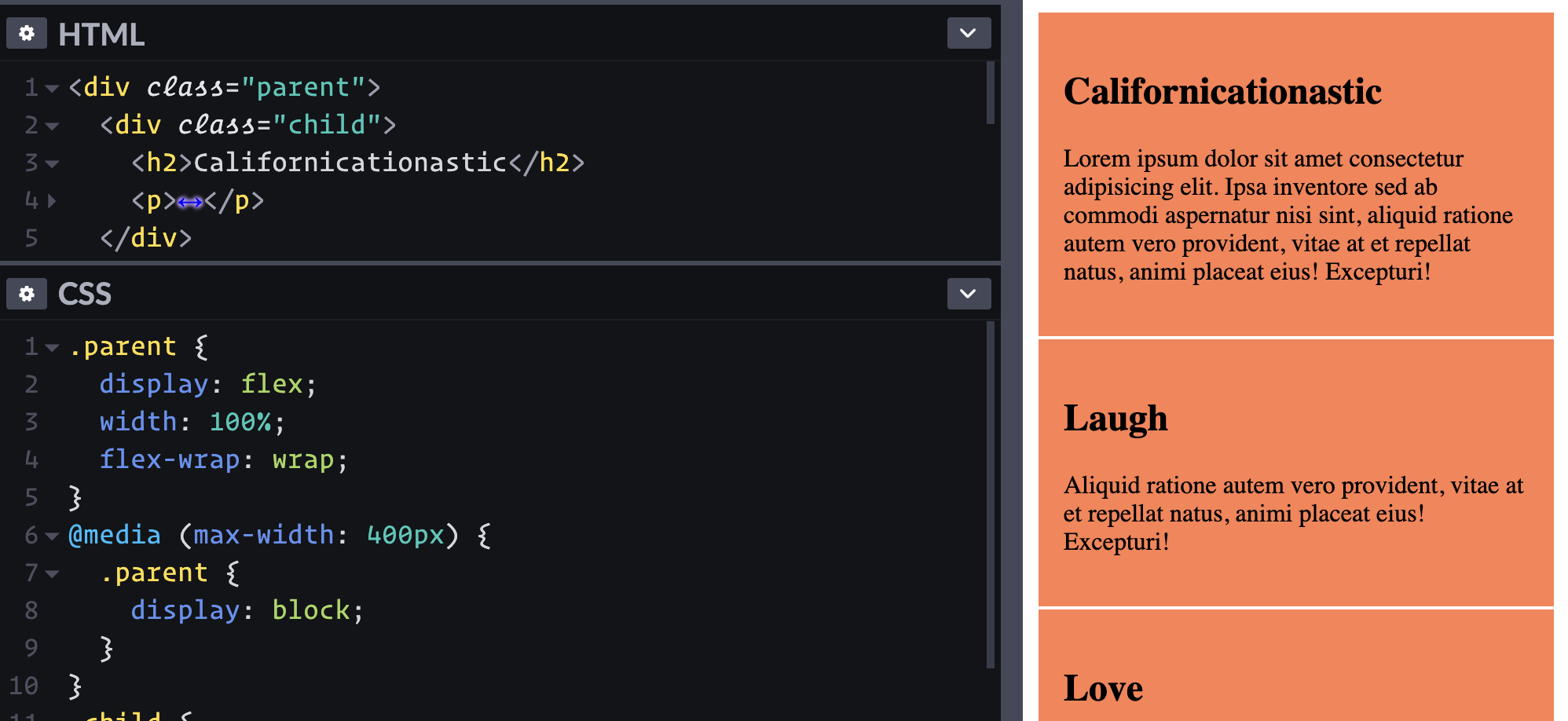
Flexbox can do way more stuff! One of my favorites is how auto margins work to "push" other elements away when there is space. This is just one little journey playing with some UI and seeing the useful things flexible does along with things that can make it confusing.
The post The Thought Process Behind a Flexbox Layout appeared first on CSS-Tricks.
from CSS-Tricks https://ift.tt/2OL5Nck
via IFTTT

No comments:
Post a Comment