I needed to select some elements between two fixed indexes the other day — like literally the second through fifth elements. Ironically, I have a whole post on “Useful :nth-child Recipes” but this wasn’t one of them.
The answer, it turns out, isn’t that complicated. But it did twist my brain a little bit.
Say you want to select all divs from the second one and beyond:
That makes logical sense to me. If n is 0, the expression is 2, and n increments upwards from there and selects everything beyond it.
But then how do you “stop” the selecting at a specific index? Like…
/* Not real */
div:nth-child(minmax(2, 5)) {

}
/* [ ]  [x]  [x]  [x]  [x]  [x]  [ ]  [ ], etc. */
Well, we can do the opposite thing, selecting only the first set of elements then stopping (constraining in the other direction) by reversing the value of n.
The part that twisted my brain was thinking about “additive” pseudo-selectors. I was thinking that selecting “2 and up” would do just that, and “5 and under” would do just that, and those things combined meant “all elements.” But that’s just wrong thinking. It’s the conditions that are additive, meaning that every element must meet both conditions.
If you found this confusing like I did, wait until you check out Quanity Queries. By nesting a lot of nth-style pseudo-selectors, you can build logic that, for example, only selects elements depending on how many of them are in the DOM.
div:nth-last-child(n+2):nth-last-child(-n+5):first-child,
div:nth-last-child(n+2):nth-last-child(-n+5):first-child ~ div {
  /* Only select if there are at least 2 and at most 5 */
}
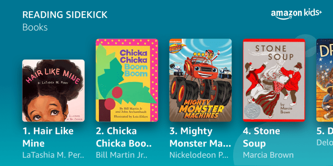
Amazon today announced a new feature that will turn Alexa into a reading companion for children as well as new support for Alexa Voice Profiles for Kids, which personalize the child’s Alexa experience across all Echo devices in the household. The two features go hand in hand, as the Voice Profile allows Alexa to identify who’s speaking, so the device can appropriately respond to a request like “Alexa, let’s read.” Alexa will then start the reading companion experience, which Amazon is calling Reading Sidekick.
This feature isn’t available to all Alexa device owners, as it requires an Amazon Kids+ subscription. This is the $2.99 per month subscription service that also provides families with children access to thousands of kid-friendly books, TV shows, movies, educational apps and games, in addition to premium content for Echo devices, like ad-free radio stations and playlists, Audible books, and exclusive Alexa skills.
Image Credits: Amazon
Once subscribed, the child can then direct Alexa to read with them and they’ll pick up a compatible book or ebook to get started. Alexa will ask what book they’re reading and how much does the child want to read: a lot, a little, or taking turns? The feature works with the hundreds of children’s books for ages 6 to 9 that are included as part of the Amazon Kids+ subscription, including both the print or digital versions. When it’s the child’s turn reading. Alexa will listen and provide encouragement when the child is doing well, and will offer support when the child is struggling.
Meanwhile, support for new Alexa Voice Profiles for Kids will also begin rolling out, starting today. This opt-in feature allows parents or guardians to create a voice profile for each child in their family (up to 4 kids). When enabled, the Alexa experience will be personalized to the individual speaking. That means Alexa will automatically apply the appropriate parental controls that have been configured, automatically filter explicit music, limit calls and messages sent through Alexa only to approved contacts, and restrict the child only to the Alexa skills parents have pre-approved. Alexa will also provide the child with access to kid-friendly games, skills, music, and videos and will provide kid-friendly responses to kids’ inquiries.
While features like these can make the Alexa experience more fun and useful for families, parents have to weigh their comfort with having their children’s voices recorded and analyzed and determine how long they would want such recordings stored. Today, Amazon uses kids’ voice recordings to train its speech recognition and natural language understanding systems in order to improve Alexa’s ability to understand children’s questions and requests. In some number of cases, these recordings are also manually reviewed. Parents who don’t want to participate can delete recordings associated with their child’s history either one-by-one or all at once via the Alexa app Settings. They can also set recordings to automatically delete on an ongoing 3-month or 18-month basis and can delete recordings via voice requests.
However, if the parent chooses not to save the child’s recordings, they’ll not be able to go back through the history to see the requests their child has made over time from the Parent Dashboard.
Every parent will need to make a decision about what’s right for their own household before enabling features like Reading Sidekick or Voice Profiles, or, more broadly about whether they want to bring a smart speaker of any kind into their home.
Amazon says the new Alexa Voice Profiles for Kids should reach all Amazon customers by Friday, July 2. Reading Sidekick is available today.
from Amazon – TechCrunch https://ift.tt/3617T0E
via IFTTT
Those aren’t the only kind of named colors there are though. Some of them are a bit more fluid. Jim Nielsen was blowin’ minds the other day when he blogged about System Colors.
What I need is a way to say “hey browser, for my dropdown, use the same black (or white if in light mode) that you’re using for the background color of the document”. I need access to a variable of sorts that references the exact “black” the browser is using.
Then, via Thomas Steiner, I discovered there are literally CSS system colors. These aren’t colors that are (or at least attempt to be) the same across all browsers, but they are allowed to be set by “choices made by the user, the browser, or the OS.” So for example, Canvas is the “background of application content or documents.” Case in point: the background-color for dark mode is #1e1e1e in Safari and #121212 in Chrome. If you like that, meaning you’re leaning into what the browser thinks is a good color for things, then you can now access it through that Canvas keyword.
Not only do they change across browsers, they change when toggling between dark and light mode as long as you have CSS in place to support them…
html {
  color-scheme: light dark;
}
You’ll see them change when modes change. And you don’t have to use them for what they were designed for, I suppose:
So those are the system colors, but you can see right in that Pen that I’ve also used a system font: system-ui. Same vibe! It’s purposely fluid. It’s not going to be the same typeface across browsers and operating systems. Jim also covered this a while back. We used to replicate the idea with a big long stack of named fonts, but now CSS helps with it (in supporting browsers).
Support seems scattered. For example, I could set this:
p {
  font-family: ui-monospace, system-ui, fantasy;
}
On my Mac, in Safari, I’d get SF Mono (ui-monospace). But in Chrome, ui-monospace doesn’t work so it would fall back to SF Pro (system-ui). In Firefox neither ui-monospace or system-ui work and I’d get Papyrus (fantasy). So font stacks are still important. It’s just funny to think about because these new system font keywords are almost like font stacks in and of themselves.
So there are system colors and system fonts — doesn’t that beg the question of what other system things there are?
Well, there are named font weights — like how font-weight: bold; is the same as 700, and bolder is just a bit more bold than the parent. But that doesn’t feel like a system-level thing where the system would want to take hold of that and do different things. But hey, maybe.
There are also named font sizes, like font-size: xx-small;. I could see systems wanting to get their hands on those values and adjust them to sizes that make sense contextually, but in a quick glance (comparing Chrome and iOS Safari), they compute to the same sizes.
Those named font size values don’t travel, either. I can’t do margin: large;. Well, I can, but it doesn’t do anything. So no real universal system sizes.
What about system icons? We do kinda have those in the form of emoji! We use the emoji knowing that different systems will render it differently and are generally fine with that as we know it will look consistent with that user’s platform.
We could sort of think of inputs as “system inputs.” We know different browsers and platforms render input controls in very different ways, and that is how the spec intends it. To each their own.
Sara digs into a bug I happened to have mentioned back in 2012 where fluid type didn’t resize when the browser window resized. Back then, it affected Chrome 20 and Safari 6, but the bug still persists today in Safari when a calc() involves viewport units.
Sara credits Martin Auswöger for a super weird and clever trick using -webkit-marquee-increment: 0vw; (here’s the documentation) to force Safari into the correct behavior. I’ll make a screencast just to document it:
I randomly happened to have Safari Technology Preview open, which at the moment is Safari 15, and I see the bug is fixed. So I wouldn’t rush out the door to implement this.
Both are essentially database-backed systems for managing data. HubSpot is both, and much more. Where a CMS might be very focused on content and the metadata around making content useful, a CRM is focused on leads and making communicating with current and potential customers easier.
They can be brothers-in-arms. We’ll get to that.
Say a CRM is set up for people. You run a Lexus dealership. There is a quote form on the website. People fill it out and enter the CRM. That lead can go to your sales team for taking care of that customer.
But a CRM could be based on other things. Say instead of people it’s based on real estate listings. Each main entry is a property, with essentially metadata like photos, address, square footage, # of bedrooms/baths, etc. Leads can be associated with properties.
That would be a nice CRM setup for a real estate agency, but the data that is in that CRM might be awfully nice for literally building a website around those property listings. Why not tap into that CRM data as literal data to build website pages from?
That’s what I mean by a CRM and CMS being brothers-in-arms. Use them both! That’s why HubSpot can be an ideal home for websites like this.
To keep that tornado of synergy going, HubSpot can also help with marketing, customer service, and integrations. So there is a lot of power packed into one platform.
And with that power, also a lot of comfort and flexibility.
You’re still developing locally.
You’re still using Git.
You can use whatever framework or site-building tools you want.
You’ve got a CLI to control things.
There is a VS Code Extension for super useful auto-complete of your data.
There is a staging environment.
And the feature just keep coming. HubSpot really has a robust set of tools to make sure you can do what you need to do.
Do you have to use some third-party thing for search? Nope, they got it.
As developer-rich as this all is, it doesn’t mean that it’s developer-only. There are loads of tools for working with the website you build that require no coding at all. Dashboard for content management, data wrangling, style control, and even literal drag-and-drop page builders.
It’s all part of a very learnable system.
Themes, templates, modules, and fields are the objects you’ll work with most in HubSpot CMS as a developer. Using these different objects effectively lets you give content creators the freedom to work and iterate on websites independently while staying inside style and layout guardrails you set.
Not news to any web developer in 2021: CSSGrid is an incredibly powerful tool for creating complex, distinct two-dimensional modern web layouts.
Recently, I have been experimenting with CSS Grid and alignment properties to create component layouts that contain multiple overlapping elements. These layouts could be styled using absolute positioning and a mix of offset values (top, right, bottom, left), negative margins, and transforms. But, with CSS Grid, positioning overlay elements can be built using more logical, readable properties and values. The following are a few examples of where these grid properties come in handy.
In the demo, there is a checkbox that toggles the overflow visibility so that we can see where the image dimensions expand beyond the container on larger viewport widths.
Here’s a common hero section with a headline overlapping an image. Although the image is capped with a max-width, it scales up to be quite tall on desktop. Because of this, the content strategy team has requested that some of the pertinent page content below the hero remain visible in the viewport as much as possible. Combining this layout technique and a fluid container max-height using the CSS clamp() function, we can develop something that adjusts based on the available viewport space while anchoring the hero image to the center of the container.
CSS clamp(), along with the min() and max() comparison functions, are well-supported in all modern browsers. Haven’t used them? Ahmad Shadeed conducts a fantastic deep dive in this article.
Open this Pen and resize the viewport width. Based on the image dimensions, the container height expands until it hits a maximum height. Notice that the image continues to grow while remaining centered in the container. Resize the viewport height and the container will flex between its max-height’s lower and upper bound values defined in the clamp() function.
Prior to using grid for the layout styles, I might have tried absolute positioning on the image and title, used an aspect ratio padding trick to create a responsive height, and object-fit to retain the ratio of the image. Something like this could get it there:
Maybe it’s possible to whittle the code down some more, but there’s still a good chunk of styling needed. Managing the same responsive layout with CSS Grid will simplify these layout style rules while making the code more readable. Check it out in the following iteration:
place-content: center instructs the image to continue growing out from the middle of the container. Remove this line and see that, while the image is still vertically centered via place-items, once the max-height is reached, the image will stick to the top of the container block and go on scaling beyond its bottom. Set place-content: end center and you’ll see the image spill over the top of the container.
This behavior may seem conceptually similar to applying object-fit: cover on an image as a styling method for preserving its intrinsic ratio while resizing to fill its content-box dimensions (it was utilized in the absolute position iteration). However, in this grid context, the image element governs the height of its parent and, once the parent’s max-height is reached, the image continues to expand, maintaining its ratio, and remains completely visible if the parent overflow is shown. object-fit could even be used with the aspect-ratio property here to create a consistent aspect ratio pattern for the hero image:
Moving on to the container’s direct children, grid-area arranges each of them so that they overlap the same space. In this example, grid-template-areas with the named grid area makes the code a little more readable and works well as a pattern for other overlay-style layouts within a component library. That being said, it is possible to get this same result by removing the template rule and, instead of grid-area: container, using integers:
.container > * {
  grid-area: 1 / 1;
}
This is shorthand for grid-row-start, grid-column-start, grid-row-end, and grid-column-end. Since the siblings in this demo all share the same single row/column area, only the start lines need to be set for the desired result.
Setting place-self to place itself
Another common overlay pattern can be seen on image carousels. Interactive elements are often placed on top of the carousel viewport. I’ve extended the first demo and replaced the static hero image with a carousel.
Same story as before: This layout could fall back on absolute positioning and use integer values in a handful of properties to push and pull elements around their parent container. Instead, we’ll reuse the grid layout rulesets from the previous demo. Once applied, it appears as you might expect: all of the child elements are centered inside the container, overlapping one another.
With place-items: center declared on the container, all of its direct children will overlap one another.
The next step is to set alignment values on individual elements. The place-self property—shorthand for align-self and justify-self—provides granular control over the position of a single item inside the container. Here are the layout styles altogether:
There’s just one small problem: The title and carousel dot indicators get pulled out into the overflow when the image exceeds the container dimensions.
To properly contain these elements within the parent, a grid-template-row value needs to be 100% of the container, set here as one fractional unit.
For this demo, I leaned into the the grid-template shorthand (which we will see again later in this article).
.container {
  grid-template: "container" 1fr;
}
After providing that little update, the overlay elements stay within the parent container, even when the carousel images spread beyond the carousel’s borders.
Alignment and named grid-template-areas
Let’s use the previous overlay layout methods for one more example. In this demo, each box contains elements positioned in different areas on top of an image.
For the first iteration, a named template area is declared to overlay the children on the parent element space, similar to the previous demos:
The image and semi-transparent overlay now cover the box area, but these style rules also stretch the other items over the entire space. This seems like the right time for place-self to pepper these elements with some alignment magic!
That‘s looking great! Every element is positioned in their defined places over the image as intended. Well, almost. There’s a bit of nuance to the bottom area where the tagline and action buttons reside. Hover over an image to reveal the tagline. This might look fine with a short string of text on a desktop screen, but if the tagline becomes longer (or the boxes in the viewport smaller), it will eventually extend behind the action buttons.
Note how the tagline in the first box on the second row overlaps the action buttons.
To clean this up, the grid-template-areas use named areas for the tagline and actions. The grid-template-columns rule is introduced so that the actions container only scales to accommodate the size of its buttons while the tagline fills in the rest of the inline area using the 1fr value.
Everything should look the way it did before. Now for the finishing touch. The tagline and actions keywords are set as their respective element grid-area values:
Now, when hovering over the cards in the demo, the tagline wraps to multiple lines when the text becomes too long, rather than pushing past the action buttons like it did before.
Named grid lines
Looking back at the first iteration of this code, I really liked having the default grid-area set to the box keyword. There’s a way to get that back.
I’m going add some named grid lines to the template. In the grid-template rule below, the first line defines the named template areas, which also represents the row. After the slash are the explicit column sizes (moved to a new line for readability). The [box-start] and [box-end] custom identifiers represent the box area.
One of the really interesting parts to observe in this last example is the use of logical values, like start and end, for placing elements. If the direction or writing-mode were to change, then the elements would reposition accordingly.
When the “right to left” direction is selected from the dropdown, the inline start and end positions are reversed. This layout is ready to accommodate languages, such as Arabic or Hebrew, that read from right to left without having to override any of the existing CSS.
Wrapping up
I hope you enjoyed these demos and that they provide some new ideas for your own project layouts—I’ve compiled a collection of examples you can check out over at CodePen. The amount of power packed into the CSS Grid spec is incredible. Take a minute to reflect on the days of using floats and a clearfix for primitive grid row design, then return to the present day and behold the glorious layout and display properties of today‘s CSS. To make these things work well is no easy task, so let’s applaud the members of the CSS working group. The web space continues to evolve and they continue to make it a fun place to build.
Now let’s release container queries and really get this party started.


