> All in One 586

Ads

Thursday, January 2, 2020

Google has little choice to be evil or not in today’s fractured internet

Well, we got to January 2nd before the latest angry resignation published by a tech executive on Medium.

Today’s installment comes from Ross LaJeunesse, who was head of international relations at Google and served for more than a decade in various roles at the company. He denounces what he sees as Google’s increasingly failed ambitions to be a company principled on human rights, and poses a series of questions about the future of tech and capitalism:

I think the important question is what does it mean when one of America’s marque’ companies changes so dramatically. Is it the inevitable outcome of a corporate culture that rewards growth and profits over social impact and responsibility? Is it in some way related to the corruption that has gripped our federal government? Is this part of the global trend toward “strong man” leaders who are coming to power around the globe, where questions of “right” and “wrong” are ignored in favor of self-interest and self-dealing? Finally, what are the implications for all of us when that once-great American company controls so much data about billions of users across the globe?

The whole read is interesting, and covers Google’s China operations, its Project Dragonfly censored search crisis, Saudi Arabia’s apps in Google Cloud, and his own personal experience with Google HR.

It’s a manifesto of sorts, and perhaps that isn’t surprising given that LaJeunesse is also running for the Democratic primary in Maine’s senatorial election to compete against Republican incumbent Susan Collins. His critiques of Big Tech seem to be channeling Missouri Republican senator Josh Hawley, and that makes it a fascinating political strategy.

But let’s focus in on the key question at the heart of this debate: does Google have the ability to be “good” or “evil” when it comes to tech’s influence on society? Does it have agency to make a difference on human rights in countries around the world?

My answer is: Google used to have a lot of agency, which is unfortunately declining very, very rapidly.

I’ve talked about the fracturing of the internet into different spheres of influence for quite literally years. Countries like China in particular, but also Russia, Iran and others are seizing more and more exacting control of the internet’s plumbing and applications, subsuming the original internet’s spirit of openness and freedom and placing this communications medium under their iron fists.

As this fracturing has occurred, companies like Google, or Shutterstock, or even the NBA have increasingly faced what I’ve called an “authoritarian straddle” — they can either work with these countries and follow the local rules, or they can just get out, with serious ramifications for their home markets.

Those are the extent of the choices these companies have. Shutterstock is not going to change China’s policy toward photos of the Tiananmen Square protests, any more than Google can try to launch a search engine on the mainland or change Saudi Arabia’s deplorable women’s rights.

To have any agency here at all, you need a monopoly on a product or service so important that the dictatorship has to accept the terms you offer. In other words, these companies need extreme leverage, essentially the ability to go to the regimes and say, “No, fuck you, here’s how it is going to work, we’re going to follow human rights, and you have no choice in the matter.”

What tech companies are discovering — even massive giants like Google, Facebook, Apple, Amazon, and Microsoft — is that they really, truly don’t have that kind of leverage in these countries anymore. Not even Apple, which employs hundreds of thousands of manufacturing workers through its subcontractors in China, can move the needle in that country anymore. Iran shut off the internet for a period of time to dampen the intensity of political protests in that country. Russia last week tested shutting off the internet to make sure it can just pull the plug when it wants.

If whole countries can just flip the switch and turn off “tech,” exactly what leverage do any of these companies have in the first place?

And that diminution of power is a trend that tech companies, and particularly American tech companies, haven’t fully grappled with. They don’t really get a choice anymore in the decisions here. China has its own search engine, and increasingly, its own mobile phone ecosystem unencumbered by U.S. patents and therefore U.S. policy. If Azure leaves Saudi Arabia, Alibaba Cloud is more than willing to step into the gap and make the money instead.

So when you get to LaJeunesse’s comments that he pushed Google internally to formalize some of its values:

My solution was to advocate for the adoption of a company-wide, formal Human Rights Program that would publicly commit Google to adhere to human rights principles found in the UN Declaration of Human Rights, provide a mechanism for product and engineering teams to seek internal review of product design elements, and formalize the use of Human Rights Impact Assessments for all major product launches and market entries.

… one can’t help but feel solace for an optimistic world where a better product design review process might have once improved global human rights.

The issue is far simpler though than it was in the past. You don’t need a human rights protocol, or some sort of review process for market entry. You are either in, or you are out. You either launch in these countries and deal with the inevitable human rights abuses and concomitant consumer protests in the home market, or you maintain your values and you walk away, ignoring the profit mirage from these regimes in the process.

That’s why I recently argued that Google and the NBA should just walk away. I still hold that belief. It’s also why I called on Shutterstock to leave China and return to its more open and free values. No U.S. tech company today has the leverage to make a dent on human rights the way that they did a decade ago. The internet has fractured, data sovereignty is on the rise, and there’s a binary choice to be made whether to engage or to flee. Ultimately, I take LaJeunesse’s side — these companies should walk, because there really isn’t much choice otherwise.


from Amazon – TechCrunch https://ift.tt/2QFMOAQ
via IFTTT

Jumia, DHL, and Alibaba will face off in African ecommerce 2.0

The business of selling consumer goods and services online is a relatively young endeavor across Africa, but ecommerce is set to boom.

Over the last eight years, the sector has seen its first phase of big VC fundings, startup duels and attrition.

To date, scaling e-commerce in Africa has straddled the line of challenge and opportunity, perhaps more than any other market in the world. Across major African economies, many of the requisites for online retail — internet access, digital payment adoption, and 3PL delivery options — have been severely lacking.

Still, startups jumped into this market for the chance to digitize a share of Africa’s fast growing consumer spending, expected to top $2 billion by 2025.

African e-commerce 2.0 will include some old and new players, play out across more countries, place more priority on internet services, and see the entry of China.

But before highlighting several things to look out for in the future of digital-retail on the continent, a look back is beneficial.

Jumia vs. Konga

The early years for development of African online shopping largely played out in Nigeria (and to some extent South Africa). Anyone who visited Nigeria from 2012 to 2016 likely saw evidence of one of the continent’s early e-commerce showdowns. Nigeria had its own Coke vs. Pepsi-like duel — a race between ventures Konga and Jumia to out-advertise and out-discount each other in a quest to scale online shopping in Africa’s largest economy and most populous nation.

Traveling in Lagos traffic, large billboards for each startup faced off across the skyline, as their delivery motorcycles buzzed between stopped cars.

Covering each company early on, it appeared a battle of VC attrition. The challenge: who could continue to raise enough capital to absorb the losses of simultaneously capturing and creating an e-commerce market in notoriously difficult conditions.

In addition to the aforementioned challenges, Nigeria also had (and continues to have) shoddy electricity.

Both Konga — founded by Nigerian Sim Shagaya — and Jumia — originally founded by two Nigerians and two Frenchman — were forced to burn capital building fulfillment operations most e-commerce startups source to third parties.

That included their own delivery and payment services (KongaPay and JumiaPay). In addition to sales of goods from mobile-phones to diapers, both startups also began experimenting with verticals for internet based services, such as food-delivery and classifieds.

While Jumia and Konga were competing in Nigeria, there was another VC driven race for e-commerce playing out in South Africa — the continent’s second largest and most advanced economy.

E-tailers Takealot and Kalahari had been jockeying for market share since 2011 after raising capital in the hundreds of millions of dollars from investors Naspers and U.S. fund Tiger Global Management.

So how did things turn out in West and Southern Africa? In 2014, the lead investor of a flailing Kalahari — Naspers — facilitated a merger with Takealot (that was more of an acquisition). They nixed the Kalahari brand in 2016 and bought out Takelot’s largest investor, Tiger Global, in 2018. Takealot is now South Africa’s leading e-commerce site by market share, but only operates in one country.

In Nigeria, by 2016 Jumia had outpaced its rival Konga in Alexa ratings (6 vs 14), while out-raising Konga (with backing of Goldman Sachs) to become Africa’s first VC backed, startup unicorn. By early 2018, Konga was purchased in a distressed acquisition and faded away as a competitor to Jumia.

Jumia went on to expand online goods and services verticals into 14 Africa countries (though it recently exited a few) and in April 2019 raised over $200 million in an NYSE IPO — the first on a major exchange for a VC-backed startup operating in Africa.

Jumia’s had bumpy road since going public — losing significant share-value after a short-sell attack earlier in 2019 — but the continent’s leading e-commerce company still has heap of capital and generates $100 million in revenues (even with losses).


from Amazon – TechCrunch https://ift.tt/39xfKUg
via IFTTT

Wednesday, January 1, 2020

Partly Cloudy today!


With a high of F and a low of 25F. Currently, it's 32F and Partly Cloudy outside.

Current wind speeds: 8 from the West

Pollen: 0

Sunrise: January 1, 2020 at 08:11PM

Sunset: January 2, 2020 at 05:39AM

UV index: 0

Humidity: 70%

via https://ift.tt/2livfew

January 2, 2020 at 10:00AM

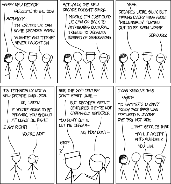
I Love the 20s

Billboard's "Best of the 80s" chart includes Blondie's 1980 hit "Call Me." QED.

from xkcd.com https://xkcd.com/2249/
via IFTTT

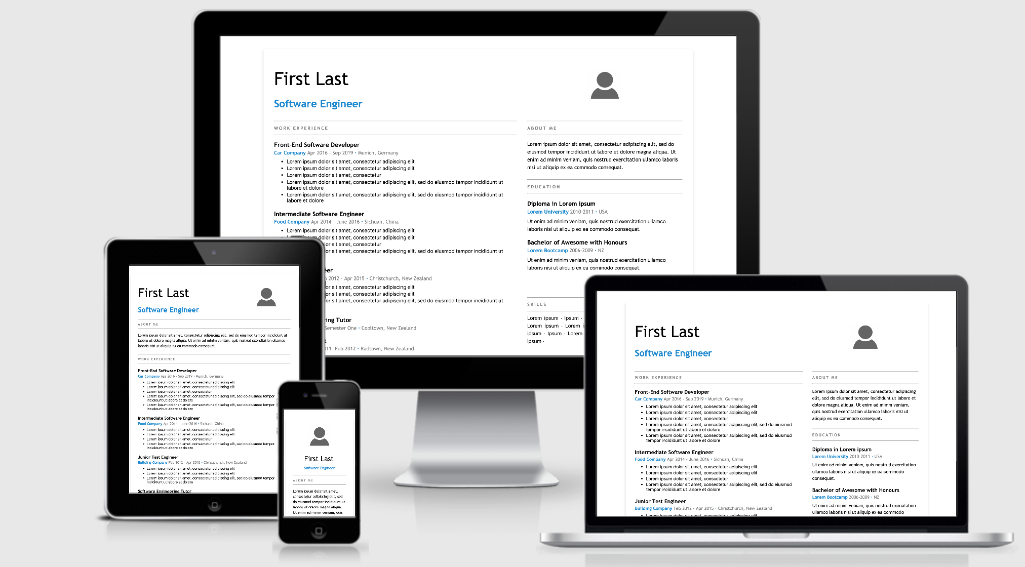
New Year, New Job? Let’s Make a Grid-Powered Resume!

Many popular resume designs are making the most of the available page space by laying sections out in a grid shape. Let’s use CSS Grid to create a layout that looks great when printed and at different screen sizes. That way, we can use the resume online and offline, which might come in handy during the new year!

First, we will create a resume container, and our resume sections.

<article class="resume">
  <section class="name"></section>
  <section class="photo"></section>
  <section class="about"></section>
  <section class="work"></section>
  <section class="education"></section>
  <section class="community"></section>
  <section class="skills"></section>
</article>

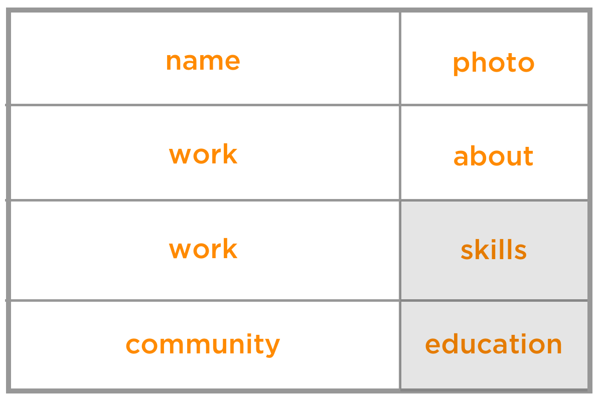
To start using Grid, we add display: grid to our outer resume element. Next, we describe how things should be placed on the grid. In this case, we will specify two columns and four rows.

We are using the CSS Grid’s fr unit to specify how many fractions on the available space to give. We will give the rows equal space (1fr each), and make the first column two times wider than the second (2fr).

.resume {
  display: grid;
  grid-template-columns: 2fr 1fr;
  grid-template-rows: 1fr 1fr 1fr 1fr;
}

Next we will describe how these elements should be placed on the grid by using the grid-template-area property. First we need to define a named grid-area for each of our sections. You can use any name but here we will use the same name as our sections:

.name {
  grid-area : name;
}

.photo {
  grid-area : photo;
}

/* define a grid-area for every section */

Now comes the fun part, and one that makes changing the design a breeze. Place the grid areas in the grid-template-areas property how you want them to be laid out. For example, here we will add the name section at the top left of the the grid-template-area to place our name at the top left of the resume. Our work section has a lot of content so we add it twice, meaning that it will stretch over two of the grid cells.

.resume {
  grid-template-areas:
    "name photo"
    "work about"
    "work education"
    "community skills";
}

Here’s what we have so far:

See the Pen
grid resume lines
by Ali C (@alichur)
on CodePen.

The CSS Grid specification provides many useful properties for sizing and laying things out on the grid and well as some shorthand properties. We are keeping things simple in this example by showing one possible method. Be sure to check out some of the great resources out there to learn how best to incorporate CSS Grid in your project.

Adjusting layout

grid-template-areas make it very easy to change your layout. For example, if you think an employer will be more interested in your skills section than your education you can switch the names in grid-template-areas and they will swap places in your layout, with no other changes required.

.resume {
  grid-template-areas:
    "name photo"
    "work about"
    "work skills"  /* skills now moved above education */
    "community education";
}

See the Pen
grid resume swapping sections
by Ali C (@alichur)
on CodePen.

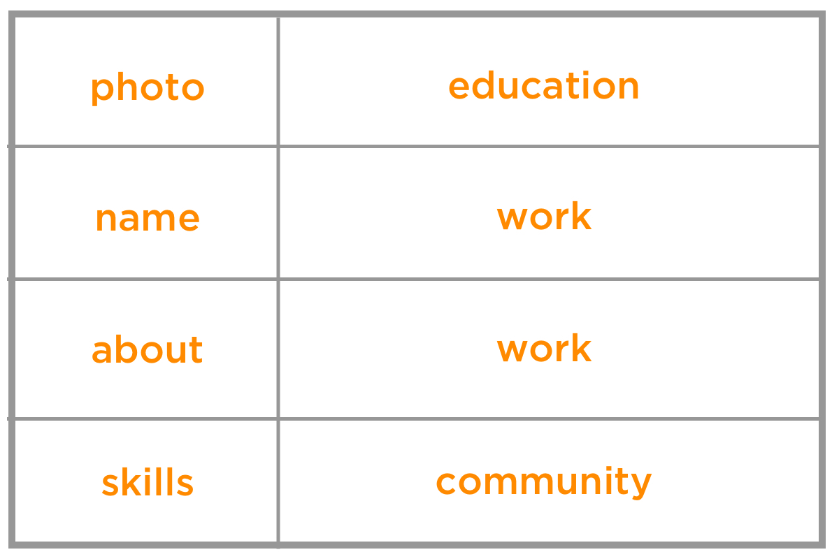
We can achieve a popular resume design where the thin column is on the left with minimal CSS changes. That’s one of the nice things about grid: We can rearrange the named grid areas to shift things around while leaving the source order exactly where it is!

.resume {
  grid-template-columns: 1fr 2fr;
  grid-template-areas:
    "photo education"
    "name work"
    "about work"
    "skills community";
}

See the Pen
grid resume left design
by Ali C (@alichur)
on CodePen.

Dividing columns

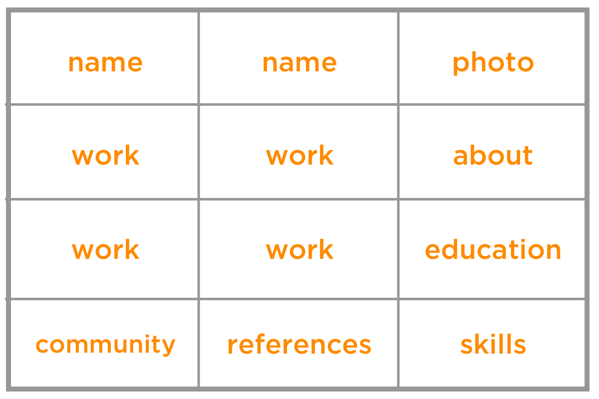
Perhaps you want to add personal references to the mix. We can add a third column to the grid template and slip those into the bottom row. Note that we also need to change the column units to equal fractions then update the template areas so that certain elements span two columns in order to keep our layout in place.

.resume {
  grid-template-columns: 1fr 1fr 1fr;
  grid-template-areas:
    "name name photo"
    "work work about"
    "work work education"
    "community references skills";
}

See the Pen
grid resume split columns
by Ali C (@alichur)
on CodePen.

The gap between sections can be controlled with the grid-gap property.

Making it responsive

For small screens, such as a mobile device, we can display the resume sections in a single full-width column.

grid-template-columns: 1fr;
grid-template-areas:
  "photo"
  "name"
  "about"
  "work"
  "education"
  "skills"
  "community"
  "references"
}

Then we can use a media query to change the layout for wider screens.

@media (min-width: 1200px) {
  .resume {
    grid-template-areas:
      "name photo"
      "work about"
      "work education"
      "community skills";
  }
}

Additional breakpoints can be added in between. For example, on medium screens like a tablet, we might want everything in a single column, but the personal and image sections to sit side-by-side at the top.

@media (min-width: 900px) {
  .resume {
      grid-template-columns: 2fr 1fr;
      grid-template-areas:
        "name image"
        "about about"
        "work work"
        "education education"
        "skills skills"
        "community community"
        "references references"
  }
}

Planning for single-page printing

If you want your resume to print nicely to a single piece of physical paper, there are a few things to keep in mind. The hardest challenge is often cutting down the number of words so that it fits on one page.

Avoid reducing the font size to squeeze more information, as it may become hard to read. One trick is to add a temporary size constraint to your resume element just while while you are developing.

.resume {
  /* for development only */
  width : 210mm;
  height: 297mm;
  border: 1px solid black;
}

By making this A4 paper-sized border it will be clearer to see if the sizes are too small, or the content spills out of the border, indicating it would print onto a second page.

You can provide printing CSS to hide things, like the date and page numbers, that the browser may insert.

@media print {
  /* remove any screen only styles, for example link underline */
}

@page {
  padding: 0;
  margin: 0cm;
  size: A4 portrait;
}

One thing to note is that different browsers may render your resume with different fonts that can vary slightly in size. If you want a very precise printed resume, another option is to save it as a PDF and provide a download link on your site.

Browser support

CSS Grid has good support in modern browsers.

Internet Explorer (IE) supports an older version of the CSS Grid specification using prefixes. For example grid-template-columns is written as -ms-grid-columns. Running the code through an Autoprefixer can help with adding these prefixes, but manual changes and thorough testing will be required because in the old specification some properties behave differently and some do not exist. It’s worth checking out Daniel Tonon’s article on how Autoprefixer can be configured to make things work as well as possible.

An alternative approach to autoprefixer is to provide a fallback, for example by using a float layout. Browsers that don't recognize CSS Grid properties will display using this fallback. Regardless of whether you need to support IE, a fallback is sensible for ensuring (potentially unknown) browsers that don't support CSS Grid still display your content.


Even if you’re not ready to host an online resume, it is still fun to play around with CSS Grid, explore different layouts, generate a great looking PDF, and learn an awesome part of CSS at the same time.

Happy job hunting!

The post New Year, New Job? Let’s Make a Grid-Powered Resume! appeared first on CSS-Tricks.


from CSS-Tricks https://ift.tt/2MMG96A
via IFTTT

PSA: It’s That Time to Update the Copyright Year on Your Site

Every year about this time I see articles going around reminding people how to update the copyright on their websites. Usually somewhere in the footer. You know, a line like:

© Copyright 2007-2019 CSS-Tricks

I am very absolutely not a lawyer, but this is how I understand it:

  • You don't actually need that if your goal is copyrighting blog posts. Blog posts are copyrighted (in the United States) the second you publish them, with or without a copyright notice. You just can't sue anybody over infringement unless you register the copyright.
  • People say it may "defer" infringements (but I don't buy it).
  • People say it may win you greater settlements should you sue and win (but I wouldn't even know where to begin fact-checking that).

Personally, I usually don't bother with it, but don't take that advice. I feel like it's usually included for a bit of swagger like, "lookie how long we've been around." In that same tune, if you're doing it, it makes a lot of sense to keep it up to date because having the incorrect or an outdated date definitely makes your site look stale.

So, sure, rock your <?php echo date("Y"); ?> or whatever you need to do to keep it up to date. Just be careful: I just saw a site going around that recommended an inline JavaScript document.write() technique. That's probably not the worst thing in the world since it's just injecting a string, but it's usually something to avoid for various reasons, and I'd way rather see you do it server-side or pre-rendered.

The post PSA: It’s That Time to Update the Copyright Year on Your Site appeared first on CSS-Tricks.


from CSS-Tricks https://ift.tt/2MM0aKO
via IFTTT

Tuesday, December 31, 2019

A Recap of Frontend Development in 2019

I noted Trey Huffine’s 2018 version of this article in The Great Divide.

To put a point on this divide a bit more, consider this article by Trey Huffine, "A Recap of Frontend Development in 2018." It's very well done! It points to big moments this year, shows interesting data, and makes predictions about what we might see next year. But it's entirely based around the JavaScript ecosystem.

My point was (and still is) that front-end development is more than the JavaScript ecosystem. However, I certainly admit the movings-and-shakings of the JavaScript world is a big deal and probably generally more interesting to watch for most devs.

What happened this year outside of JavaScript land? Well it's weird. Things move slower, so it's harder to pin things — even to years — quite as easily. For example, there was plenty of talk and usage of prefers-reduced-motion in CSS, but we kinda "got" that in 2017. Lots of people have gotten excited about variable fonts this year, but that's also been years in the making. Subgrid recently dropped in Firefox, so I guess that's a 2019 thing, but we'll see slow adoption of it for years to come. For more of this exciting (but not necessarily brand new) stuff, check out Adam Argyle and Una Kravets Chrome Dev Summit 2019 presentation.

HTML is evolving at an even slower pace. Occasionally, something will feel new. I got excited about <dialog> this year, even though it first appeared in 2014, but the experts are saying we probably shouldn't use it. Elements like <details> are getting more exciting as Edge-goes-Chromium because they'll be getting more cross-browser support, but it's no picnic. There's just not much exciting to talk about in HTML, at least to me, aside from sort of philosophical approaches to it, like JAMstack.

The two most exciting HTML things to me: native lazy loading and no-jank fluid image loading.

But back to Trey’s post, the highlights are:

  • React is huge. jQuery isn’t falling.
  • Hooks was a huge release and change for React, and React is generally pushing fast on lots of big stuff.
  • TypeScript continues to grow.
  • Vue 3 is a long time coming and a bit controversial.
  • Svelte 3 is a small player but has lots of interest.
  • Angular 9 is almost here and has a strong base.
  • JavaScript itself continues to have yearly releases. ES2019 has nice stuff and ES2020 is even better.
  • Flutter is challenging React Native for cross-platform development, an impressive feat since there are so many more React devs than Dart devs.
  • JAMstack, PWAs, GraphQL, and CSS-in-JS are all growing in usage and developer sentiment.
  • VS Code is dominant.

Trey also picked out some really great blog posts and presentations from the year at the end, so don’t miss those!

If you dig predictions, then you might be interested in Sean Goresht's big one for 2020.

Direct Link to ArticlePermalink

The post A Recap of Frontend Development in 2019 appeared first on CSS-Tricks.


from CSS-Tricks https://ift.tt/2P7LtDr
via IFTTT

What Can We Actually Do With corner-shape?

When I first started messing around with code, rounded corners required five background images or an image sprite likely created in Photosh...