I always see this Google Gemini button up in the corner in Gmail. When you hover over it, it does this cool animation where the little four-pointed star spins and the outer shape morphs between a couple different shapes that are also spinning.
I challenged myself to recreate the button using the new CSS shape() function sprinkled with animation to get things pretty close. Let me walk you through it.
Drawing the Shapes
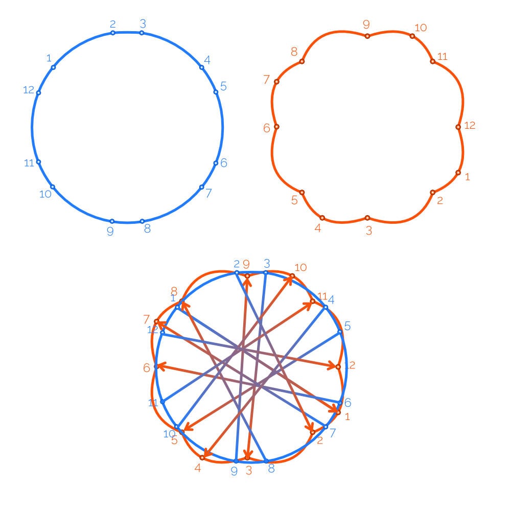
Breaking it down, we need five shapes in total:
Four-pointed star
Flower-ish thing (yes, that’s the technical term)
Cylinder-ish thing (also the correct technical term)
Rounded hexagon
Circle
I drew these shapes in a graphics editing program (I like Affinity Designer, but any app that lets you draw vector shapes should work), outputted them in SVG, and then used a tool, like Temani Afif’s generator, to translate the SVG paths the program generated to the CSS shape() syntax.
Now, before I exported the shapes from Affinity Designer, I made sure the flower, hexagon, circle, and cylinder all had the same number of anchor points. If they don’t have the same number, then the shapes will jump from one to the next and won’t do any morphing. So, let’s use a consistent number of anchor points in each shape — even the circle — and we can watch these shapes morph into each other.
I set twelve anchor points on each shape because that was the highest amount used (the hexagon had two points near each curved corner).
Something related (and possibly hard to solve, depending on your graphics program) is that some of my shapes were wildly contorted when animating between shapes. For example, many shapes became smaller and began spinning before morphing into the next shape, while others were much more seamless. I eventually figured out that the interpolation was matching each shape’s starting point and continued matching points as it followed the shape.
The result is that the matched points move between shapes, so if the starting point for one shape is on opposite side of the starting point of the second shape, a lot of movement is necessary to transition from one shape’s starting point to the next shape’s starting point.
Luckily, the circle was the only shape that gave me trouble, so I was able to spin it (with some trial and error) until its starting point more closely matched the other starting points.
Another issue I ran into was that the cylinder-ish shape had two individual straight lines in shape() with line commands rather than using the curve command. This prevented the animation from morphing into the next shape. It immediately snapped to the next image without animating the transition, skipping ahead to the next shape (both when going into the cylinder and coming out of it).
I went back into Affinity Designer and ever-so-slightly added curvature to the two lines, and then it morphed perfectly. I initially thought this was a shape() quirk, but the same thing happened when I attempted the animation with the path() function, suggesting it’s more an interpolation limitation than it is a shape() limitation.
Once I finished adding my shape() values, I defined a CSS variable for each shape. This makes the later uses of each shape() more readable, not to mention easier to maintain. With twelve lines per shape the code is stinkin’ long (technical term) so we’ve put it behind an accordion menu.
View Shape Code
:root {
  --hexagon: shape(
    evenodd from 6.47% 67.001%,
    curve by 0% -34.002% with -1.1735% -7.7% / -1.1735% -26.302%,
    curve by 7.0415% -12.1965% with 0.7075% -4.641% / 3.3765% -9.2635%,
    curve by 29.447% -17.001% with 6.0815% -4.8665% / 22.192% -14.1675%,
    curve by 14.083% 0% with 4.3725% -1.708% / 9.7105% -1.708%,
    curve by 29.447% 17.001% with 7.255% 2.8335% / 23.3655% 12.1345%,
    curve by 7.0415% 12.1965% with 3.665% 2.933% / 6.334% 7.5555%,
    curve by 0% 34.002% with 1.1735% 7.7% / 1.1735% 26.302%,
    curve by -7.0415% 12.1965% with -0.7075% 4.641% / -3.3765% 9.2635%,
    curve by -29.447% 17.001% with -6.0815% 4.8665% / -22.192% 14.1675%,
    curve by -14.083% 0% with -4.3725% 1.708% / -9.7105% 1.708%,
    curve by -29.447% -17.001% with -7.255% -2.8335% / -23.3655% -12.1345%,
    curve by -7.0415% -12.1965% with -3.665% -2.933% / -6.334% -7.5555%,
    close
  );

  --flower: shape(
    evenodd from 17.9665% 82.0335%,
    curve by -12.349% -32.0335% with -13.239% -5.129% / -18.021% -15.402%,
    curve by -0.0275% -22.203% with -3.1825% -9.331% / -3.074% -16.6605%,
    curve by 12.3765% -9.8305% with 2.3835% -4.3365% / 6.565% -7.579%,
    curve by 32.0335% -12.349% with 5.129% -13.239% / 15.402% -18.021%,
    curve by 20.4535% -0.8665% with 8.3805% -2.858% / 15.1465% -3.062%,
    curve by 11.58% 13.2155% with 5.225% 2.161% / 9.0355% 6.6475%,
    curve by 12.349% 32.0335% with 13.239% 5.129% / 18.021% 15.402%,
    curve by 0.5715% 21.1275% with 2.9805% 8.7395% / 3.0745% 15.723%,
    curve by -12.9205% 10.906% with -2.26% 4.88% / -6.638% 8.472%,
    curve by -32.0335% 12.349% with -5.129% 13.239% / -15.402% 18.021%,
    curve by -21.1215% 0.5745% with -8.736% 2.9795% / -15.718% 3.0745%,
    curve by -10.912% -12.9235% with -4.883% -2.2595% / -8.477% -6.6385%,
    close
  );

  --cylinder: shape(
    evenodd from 10.5845% 59.7305%,
    curve by 0% -19.461% with -0.113% -1.7525% / -0.11% -18.14%,
    curve by 10.098% -26.213% with 0.837% -10.0375% / 3.821% -19.2625%,
    curve by 29.3175% -13.0215% with 7.2175% -7.992% / 17.682% -13.0215%,
    curve by 19.5845% 5.185% with 7.1265% 0% / 13.8135% 1.887%,
    curve by 9.8595% 7.9775% with 3.7065% 2.1185% / 7.035% 4.8195%,
    curve by 9.9715% 26.072% with 6.2015% 6.933% / 9.4345% 16.082%,
    curve by 0% 19.461% with 0.074% 1.384% / 0.0745% 17.7715%,
    curve by -13.0065% 29.1155% with -0.511% 11.5345% / -5.021% 21.933%,
    curve by -26.409% 10.119% with -6.991% 6.288% / -16.254% 10.119%,
    curve by -20.945% -5.9995% with -7.6935% 0% / -14.8755% -2.199%,
    curve by -8.713% -7.404% with -3.255% -2.0385% / -6.1905% -4.537%,
    curve by -9.7575% -25.831% with -6.074% -6.9035% / -9.1205% -15.963%,
    close
  );

  --star: shape(
    evenodd from 50% 24.787%,
    curve by 7.143% 18.016% with 0% 0% / 2.9725% 13.814%,
    curve by 17.882% 7.197% with 4.171% 4.2025% / 17.882% 7.197%,
    curve by -17.882% 8.6765% with 0% 0% / -13.711% 4.474%,
    curve by -7.143% 16.5365% with -4.1705% 4.202% / -7.143% 16.5365%,
    curve by -8.6115% -16.5365% with 0% 0% / -4.441% -12.3345%,
    curve by -16.4135% -8.6765% with -4.171% -4.2025% / -16.4135% -8.6765%,
    curve by 16.4135% -7.197% with 0% 0% / 12.2425% -2.9945%,
    curve by 8.6115% -18.016% with 4.1705% -4.202% / 8.6115% -18.016%,
    close
  );

  --circle: shape(
    evenodd from 13.482% 79.505%,
    curve by -7.1945% -12.47% with -1.4985% -1.8575% / -6.328% -10.225%,
    curve by 0.0985% -33.8965% with -4.1645% -10.7945% / -4.1685% -23.0235%,
    curve by 6.9955% -12.101% with 1.72% -4.3825% / 4.0845% -8.458%,
    curve by 30.125% -17.119% with 7.339% -9.1825% / 18.4775% -15.5135%,
    curve by 13.4165% 0.095% with 4.432% -0.6105% / 8.9505% -0.5855%,
    curve by 29.364% 16.9% with 11.6215% 1.77% / 22.102% 7.9015%,
    curve by 7.176% 12.4145% with 3.002% 3.7195% / 5.453% 7.968%,
    curve by -0.0475% 33.8925% with 4.168% 10.756% / 4.2305% 22.942%,
    curve by -7.1135% 12.2825% with -1.74% 4.4535% / -4.1455% 8.592%,
    curve by -29.404% 16.9075% with -7.202% 8.954% / -18.019% 15.137%,
    curve by -14.19% -0.018% with -4.6635% 0.7255% / -9.4575% 0.7205%,
    curve by -29.226% -16.8875% with -11.573% -1.8065% / -21.9955% -7.9235%,
    close
  );
}
If all that looks like gobbledygook to you, it largely does to me too (and I wrote the shape() Almanac entry). As I said above, I converted them from stuff I drew to shape()s with a tool. If you can recognize the shapes from the custom property names, then you’ll have all you need to know to keep following along.
Breaking Down the Animation
After staring at the Gmail animation for longer than I would like to admit, I was able to recognize six distinct phases:
First, on hover:
The four-pointed star spins to the right and changes color.
The fancy blue shape spreads out from underneath the star shape.
The fancy blue shape morphs into another shape while spinning.
The purplish color is wiped across the fancy blue shape.
Then, after hover:
The fancy blue shape contracts (basically the reverse of Phase 2).
The four-pointed star spins left and returns to its initial color (basically the reverse of Phase 1).
That’s the run sheet we’re working with! We’ll write the CSS for all that in a bit, but first I’d like to set up the HTML structure that we’re hooking into.
The HTML
I’ve always wanted to be one of those front-enders who make jaw-dropping art out of CSS, like illustrating the Sistine chapel ceiling with a single div (cue someone commenting with a CodePen doing just that). But, alas, I decided I needed two divs to accomplish this challenge, and I thank you for looking past my shame. To those of you who turned up your nose and stopped reading after that admission: I can safely call you a Flooplegerp and you’ll never know it.
(To those of you still with me, I don’t actually know what a Flooplegerp is. But I’m sure it’s bad.)
Because the animation needs to spread out the blue shape from underneath the star shape, they need to be two separate shapes. And we can’t shrink or clip the main element to do this because that would obscure the star.
So, yeah, that’s why I’m reaching for a second div: to handle the fancy shape and how it needs to move and interact with the star shape.
<div id="geminianimation">
  <div></div>
</div>
The Basic CSS Styling
Each shape is essentially defined with the same box with the same dimensions and margin spacing.
We can clip the box to a particular shape using a pseudo-element. For example, let’s clip a star shape using the CSS variable (--star) we defined for it and set a background color on it:
We can hook into the container’s child div and use it to establish the animation’s starting shape, which is the flower (clipped with our --flower variable):
What we get is a star shape stacked right on top of a flower shape. We’re almost done with our initial CSS, but in order to recreate the animated color wipes, we need a much larger surface that allows us to “change” colors by moving the background gradient’s position. Let’s move the gradient so that it is declared on a pseudo element instead of the child div, and size it up by 400% to give us additional breathing room.
Now we can clearly see how the shapes are positioned relative to each other:
Animating Phases 1 and 6
Now, I’ll admit, in my own hubris, I’ve turned up my very own schnoz at the humble transition property because my thinking is typically, Transitions are great for getting started in animation and for quick things, but real animations are done with CSS keyframes. (Perhaps I, too, am a Flooplegerp.)
But now I see the error of my ways. I can write a set of keyframes that rotate the star 180 degrees, turn its color white(ish), and have it stay that way for as long as the element is hovered. What I can’t do is animate the star back to what it was when the element is un-hovered.
I can, however, do that with the transition property. To do this, we add transition: 1s ease-in-out; on the ::before, adding the new background color and rotating things on :hover over the #geminianimation container. This accounts for the first and sixth phases of the animation we outlined earlier.
We can do something similar for the second and fifth phases of the animation since they are mirror reflections of each other. Remember, in these phases, we’re spreading and contracting the fancy blue shape.
We can start by shrinking the inner div’s scale to zero initially, then expand it back to its original size (scale: 1) on :hover (again using transitions):
#geminianimation {
  div {
    scale: 0;
    transition: 1s ease-in-out;
  }
  &:hover {
    div {
      scale: 1;
  }
}
Animating Phase 3
Now, we very well could tackle this with a transition like we did the last two sets, but we probably should not do it… that is, unless you want to weep bitter tears and curse the day you first heard of CSS… not that I know from personal experience or anything… ha ha… ha.
What we’re basically doing is animating between different shapes that we’ve already defined as CSS variables that clip the shapes. The browser will handle interpolating between the shapes, so all we need is to tell CSS which shape we want clipped at each phase (or “section”) of this set of keyframes:
Yes, we could combine the first and last keyframes (0% and 100%) into a single step, but we’ll need them separated in a second because we also want to animate the rotation at the same time. We’ll set the initial rotation to 0turn and the final rotation 1turn so that it can keep spinning smoothly as long as the animation is continuing:
Note: Yes, turn is indeed a CSS unit, albeit one that often goes overlooked.
We want the animation to be smooth as it interpolates between shapes. So, I’m setting the animation’s timing function with ease-in-out. Unfortunately, this will also slow down the rotation as it starts and ends. However, because we’re both beginning and ending with the circle shape, the fact that the rotation slows coming out of 0% and slows again as it heads into 100% is not noticeable — a circle looks like a circle no matter its rotation. If we were ending with a different shape, the easing would be visible and I would use two separate sets of keyframes — one for the shape-shift and one for the rotation — and call them both on the #geminianimation child div .
That said, we still do need one more set of keyframes, specifically for changing the shape’s color. Remember how we set a linear gradient on the parent container’s ::after pseudo, then we also increased the pseudo’s width and height? Here’s that bit of code again:
The gradient is that large because we’re only showing part of it at a time. And that means we can translate the gradient’s position to move the gradient at certain keyframes. 400% can be nicely divided into quarters, so we can move the gradient by, say, three-quarters of its size. Since its parent, the #geminianimation div, is already spinning, we don’t need any fancy movements to make it feel like the color is coming from different directions. We just translate it linearly and the spin adds some variability to what direction the color wipe comes from.
Instead of using the flower as the default shape, let’s change it to circle. This smooths things out when the hover interaction causes the animation to stop and return to its initial position.
And there you have it:
Wrapping up
We did it! Is this exactly how Google accomplished the same thing? Probably not. In all honesty, I never inspected the animation code because I wanted to approach it from a clean slate and figure out how I would do it purely in CSS.
That’s the fun thing about a challenge like this: there are different ways to accomplish the same thing (or something similar), and your way of doing it is likely to be different than mine. It’s fun to see a variety of approaches.
Which leads me to ask: How would you have approached the Gemini button animation? What considerations would you take into account that maybe I haven’t?
CSS typed arithmetic is genuinely exciting! It opens the door to new kinds of layout composition and animation logic we could only hack before. The first time I published something that leaned on typed arithmetic was in this animation:
But before we dive into what is happening in there, let’s pause and get clear on what typed arithmetic actually is and why it matters for CSS.
Browser Support: The CSS feature discussed in this article, typed arithmetic, is on the cutting edge. As of the time of writing, browser support is very limited and experimental. To ensure all readers can understand the concepts, the examples throughout this article are accompanied by videos and images, demonstrating the results for those whose browsers do not yet support this functionality. Please check resources like MDN or Can I Use for the latest support status.
The Types
If you really want to get what a “type” is in CSS, think about TypeScript. Now forget about TypeScript. This is a CSS article, where semantics actually matter.
In CSS, a type describes the unit space a value lives in, and is called a data-type. Every CSS value belongs to a specific type, and each CSS property and function only accepts the data type (or types) it expects.
Properties like opacity or scale use a plain <number> with no units.
width, height, other box metrics, and many additional properties use <length> units like px, rem, cm, etc.
Functions like rotate() or conic-gradient() use an <angle> with deg, rad, or turn.
animation and transition use <time> for their duration in seconds (s) or milliseconds (ms).
Note: You can identify CSS data types in the specs, on MDN, and other official references by their angle brackets: <data-type>.
There are many more data types like <percentage>, <frequency>, and <resolution>, but the types mentioned above cover most of our daily use cases and are all we will need for our discussion today. The mathematical concept remains the same for (almost) all types.
I say “almost” all types for one reason: not every data type is calculable. For instance, types like <color>, <string>, or <image> cannot be used in mathematical operations. An expression like "foo" * red would be meaningless. So, when we discuss mathematics in general, and typed arithmetic in particular, it is crucial to use types that are inherently calculable, like <length>, <angle>, or <number>.
The Rules of Typed Arithmetic
Even when we use calculable data types, there are still limitations and important rules to keep in mind when performing mathematical operations on them.
Addition and Subtraction
Sadly, a mix-and-match approach doesn’t really work here. Expressions like calc(3em + 45deg) or calc(6s - 3px) will not produce a logical result. When adding or subtracting, you must stick to the same data type.
Of course, you can add and subtract different units within the same type, like calc(4em + 20px) or calc(300deg - 1rad).
Multiplication
With multiplication, you can only multiply by a plain <number> type. For example: calc(3px * 7), calc(10deg * 6), or calc(40ms * 4). The result will always adopt the type and unit of the first value, with the new value being the product of the multiplication.
But why can you only multiply by a number? If we tried something like calc(10px * 10px) and assumed it followed “regular” math, we would expect a result of 100px². However, there are no squared pixels in CSS, and certainly no square degrees (though that could be interesting…). Because such a result is invalid, CSS only permits multiplying typed values by unitless numbers.
Division
Here, too, mixing and matching incompatible types is not allowed, and you can divide by a number just as you can multiply a number. But what happens when you divide a type by the same type?
Hint: this is where things get interesting.
Again, if we were thinking in terms of regular math, we would expect the units to cancel each other out, leaving only the calculated value. For example, 90x / 6x = 15. In CSS, however, this isn’t the case. Sorry, it wasn’t the case.
Previously, an expression like calc(70px / 10px) would have been invalid. But starting with Chrome 140 (and hopefully soon in all other browsers), this expression now returns a valid number, which winds up being 7 in this case. This is the major change that typed arithmetic enables.
Is that all?!
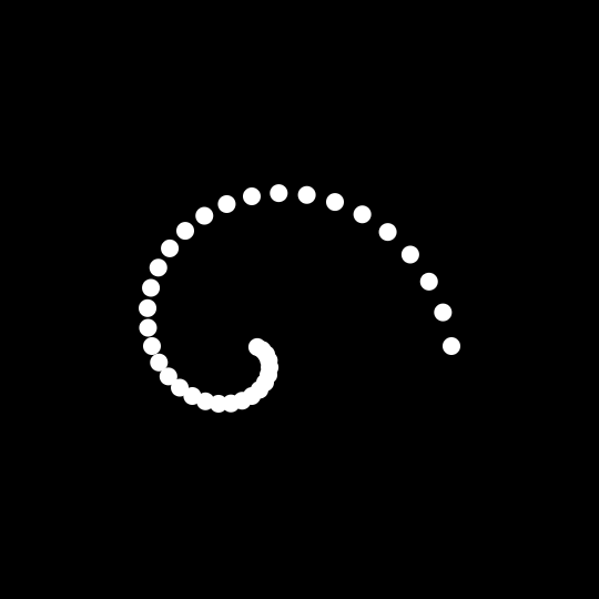
That little division? Is that the big thing I called “genuinely exciting”? Yes! Because this one little feature opens the door to a world of creative possibilities. Case in point: we can convert values from one data type to another and mathematically condition values of one type based on another, just like in the swirl example I demoed at the top.
So, to understand what is happening there, let’s look at a more simplified swirl:
I have a container<div> with 36 <i> elements in the markup that are arranged in a spiral with CSS. Each element has an angle relative to the center point, rotate(var(--angle)), and a distance from that center point, translateX(var(--distance)).
The angle calculation is quite direct. I take the index of each <i> element using sibling-index() and multiply it by 10deg. So, the first element with an index of 1 will be rotated by 10 degrees (1 * 10deg), the second by 20 degrees (2 * 10deg), the third by 30 degrees (3 * 10deg), and so on.
i { --angle: calc(sibling-index() * 10deg); }
As for the distance, I want it to be directly proportional to the angle. I first use typed arithmetic to divide the angle by 360 degrees: var(--angle) / 360deg.
This returns the angle’s value, but as a unitless number, which I can then use anywhere. In this case, I can multiply it by a <length> value (e.g. 180px) that determines the element’s distance from the center point.
This way, the ratio between the angle and the distance remains constant. Even if we set the angle of each element differently, or to a new value, the elements will still align on the same spiral.
The Importance of the Divisor’s Unit
It’s important to clarify that when using typed arithmetic this way, you get a unitless number, but its value is relative to the unit of the divisor.
In our simplified spiral, we divided the angle by 360deg. The resulting unitless number, therefore, represents the value in degrees. If we had divided by 1turn instead, the result would be completely different — even though 1turn is equivalent to 360deg, the resulting unitless number would represent the value in turns.
Let’s say we are working with a screen width of 1080px. If we divide the screen width (100vw) by 1px, we get the number of pixels that fit into the screen width, which is, of course, 1080.
calc(100vw / 1px) /* 1080 */
However, if we divide that same width by 1em (and assume a font size of 16px), we get the number of em units that fit across the screen.
calc(100vw / 1em) /* 67.5 */
The resulting number is unitless in both cases, but its meaning is entirely dependent on the unit of the value we divided by.
From Length to Angle
Of course, this conversion doesn’t have to be from a type <angle> to a type <length>. Here is an example that calculates an element’s angle based on the screen width (100vw), creating a new and unusual kind of responsiveness.
And get this: There are no media queries in here! it’s all happening in a single line of CSS doing the calculations.
To determine the angle, I first define the width range I want to work within. clamp(300px, 100vw, 700px) gives me a closed range of 400px, from 300px to 700px. I then subtract 700px from this range, which gives me a new range, from -400px to 0px.
Using typed arithmetic, I then divide this range by 400px, which gives me a normalized, unitless number between -1 and 0. And finally, I convert this number into an <angle> by multiplying it by -90deg.
Here’s what that looks like in CSS when we put it all together:
Of course, the resulting unitless number can be used as-is in any property that accepts a <number> data type, such as opacity. What if I want to determine the font’s opacity based on its size, making smaller fonts more opaque and therefore clearer? Is it possible? Absolutely.
In this example, I am setting a different font-size value for each <p> element using a --font-size custom property. and since the range of this variable is from 0.8rem to 2rem, I first subtract 0.8rem from it to create a new range of 0 to 1.2rem.
I could divide this range by 1.2rem to get a normalized, unitless value between 0 and 1. However, because I don’t want the text to become fully transparent, I divide it by twice that amount (2.4rem). This gives me a result between 0 and 0.5, which I then subtract from the maximum opacity of 1.
Notice that I am displaying the font size in pixel units even though the size is defined in rem units. I simply use typed arithmetic to divide the font size by 1px, which gives me the size in pixels as a unitless value. I then inject this value into the content of the the paragraph’s ::after pseudo-element.
Of course, the real beauty of using native CSS math functions, compared to other approaches, is that everything happens dynamically at runtime. Here, for example, is a small demo where I color the element’s background relative to its rendered width.
You can drag the bottom-right corner of the element to see how the color changes in real-time.
Here’s something neat about this demo: because the element’s default width is 50% of the screen width and the color is directly proportional to that width, it’s possible that the element will initially appear in completely different colors on different devices with different screens. Again, this is all happening without any media queries or JavaScript.
An Extreme Example: Chaining Conversions
OK, so we’ve established that typed arithmetic is cool and opens up new and exciting possibilities. Before we put a bow on this, I wanted to pit this concept against a more extreme example. I tried to imagine what would happen if we took a <length> type, converted it to a <number> type, then to an <angle> type, back to a <number> type, and, from there, back to a <length> type.
Phew!
I couldn’t find a real-world use case for such a chain, but I did wonder what would happen if we were to animate an element’s width and use that width to determine the height of something else. All the calculations might not be necessary (maybe?), but I think I found something that looks pretty cool.
In this demo, the animation is on the solid line along the bottom. The vertical position of the ball, i.e. its height, relative to the line, is proportional to the line’s width. So, as the line expands and contracts, so does the path of the bouncing ball.
To create the parabolic arc that the ball moves along, I take the element’s width (100cqi) and, using typed arithmetic, divide it by 300px to get a unitless number between 0 and 1. I multiply that by 180deg to get an angle that I use in a sin() function (Juan Diego has a great article on this), which returns another unitless number between 0 and 1, but with a parabolic distribution of values.
Finally, I multiply this number by -200px, which outputs the ball’s vertical position relative to the line.
And again, because the ball’s position is relative to the line’s width, the ball’s position will remain on the same arc, no matter how we define that width.
Wrapping Up: The Dawn of Computational CSS
The ability to divide one typed value by another to produce a unitless number might seem like no big deal; more like a minor footnote in the grand history of CSS.
But as we’ve seen, this single feature is a quiet revolution. It dismantles the long-standing walls between different CSS data types, transforming them from isolated silos into a connected, interoperable system. We’ve moved beyond simple calculations, and entered the era of true Computational CSS.
This isn’t just about finding new ways to style a button or animate a loading spinner. It represents a fundamental shift in our mental model. We are no longer merely declaring static styles, but rather defining dynamic, mathematical relationships between properties. The width of an element can now intrinsically know about its color, an angle can dictate a distance, and a font’s size can determine its own visibility.
This is CSS becoming self-aware, capable of creating complex behaviors and responsive designs that adapt with a precision and elegance that previously required JavaScript.
So, the next time you find yourself reaching for JavaScript to bridge a gap between two CSS properties, pause for a moment. Ask yourself if there’s a mathematical relationship you can define instead. You might be surprised at how far you can go with just a few lines of CSS.
The Future is Calculable
The examples in this article are just the first steps into a much larger world. What happens when we start mixing these techniques with scroll-driven animations, view transitions, and other modern CSS features? The potential for creating intricate data visualizations, generative art, and truly fluid user interfaces, all natively in CSS, is immense. We are being handed a new set of creative tools, and the instruction manual is still being written.
I’m inclined to take a few notes on Eric Bailey’s grand post about the use of inclusive personas in user research. As someone who has been in roles that have both used and created user personas, there’s so much in here
What’s the big deal, right? We’re often taught and encouraged to think about users early in the design process. It’s user’ centric design, so let’s personify 3-4 of the people we think represent our target audiences so our work is aligned with their objectives and needs. My master’s program was big on that and went deep into different approaches, strategies, and templates for documenting that research.
And, yes, it is research. The idea, in theory, is that by understanding the motivations and needs of specific users (gosh, isn’t “users” an awkward term?), we can “design backwards” so that the end goal is aligned to actions that get them there.
Eric sees holes in that process, particularly when it comes to research centered around inclusiveness. Why is that? Very good reasons that I’m compiling here so I can reference it later. There’s a lot to take in, so you’d do yourself a solid by reading Eric’s post in full. Your takeaways may be different than mine.
Traditional vs. Inclusive user research
First off, I love how Eric distinguishes what we typically refer to as the general type of user personas, like the ones I made to generalize an audience, from inclusive user personas that are based on individual experiences.
Inclusive user research practices are different than a lot of traditional user research. While there is some high-level overlap in approach, know the majority of inclusive user research is more focused on the individual experience and less about more general trends of behavior.
So, right off the bat we have to reframe what we’re talking about. There’s blanket personas that are placeholders for abstracting what we think we know about specific groups of people versus individual people that represent specific experiences that impact usability and access to content.
A primary goal in inclusive user research is often to identify concrete barriers that prevent someone from accessing the content they want or need. While the techniques people use are varied, these barriers represent insurmountable obstacles that stymie a whole host of navigation techniques and approaches.
If you’re looking for patterns, trends, and customer insights, know that what you want is regular user testing. Here, know that the same motivating factors you’re looking to uncover also exist for disabled people. This is because they’re also, you know, people.
Assistive technology is not exclusive to disabilities
It’s so easy to assume that using assistive tools automatically means accommodating a disability or impairment, but that’s not always the case. Choice points from Eric:
First is that assistive technology is a means, and not an end.
Some disabled people don’t use assistive technology at all.
Not everyone who uses assistive technology has also mastered it.
Disproportionate attention placed on one kind of assistive technology at the expense of others.
It’s entirely possible to have a solution that is technically compliant, yet unintuitive or near-impossible to use in the actual.
I like to keep in mind that assistive technologies are for everyone. I often think about examples in the physical world where everyone benefits from an accessibility enhancement, such as cutting curbs in sidewalks (great for skateboarders!), taking elevators (you don’t have to climb stairs in some cases), and using TV subtitles (I often have to keep the volume low for sleeping kids).
That’s the inclusive part of this. Everyone benefits rather than a specific subset of people.
Different personas, different priorities
What happens when inclusive research is documented separately from general user research?
Another folly of inclusive personas is that they’re decoupled from regular personas. This means they’re easily dismissible as considerations.
[…]
Disability is diversity, and the plain and honest truth is that diversity is missing from your personas if disability conditions are not present in at least some of them. This, in turn, means your personas are misrepresentative of the people in the abstract you claim to serve.
In practice, that means:
[…] we also want to hold space for things that need direct accessibility support and remediation when this consideration of accessibility fails to happen. It’s all about approach.
An example of how to consider your approach is when adding drag and drop support to an experience. […] [W]e want to identify if drag and drop is even needed to achieve the outcome the organization needs.
Thinking of a slick new feature that will impress your users? Great! Let’s make sure it doesn’t step on the toes of other experiences in the process, because that’s antithetical to inclusiveness. I recognize this temptation in my own work, particularly if I land on a novel UI pattern that excites me. The excitement and tickle I get from a “clever” idea gives me a blind side to evaluating the overall effectiveness of it.
Radical participatory design
Gosh dang, why didn’t my schoolwork ever cover this! I had to spend a little time reading the Cambridge University Press article explaining radical participatopry design (RPD) that Eric linked up.
Therefore, we introduce the term RPD to differentiate and represent a type of PD that is participatory to the root or core: full inclusion as equal and full members of the research and design team. Unlike other uses of the term PD, RPD is not merely interaction, a method, a way of doing a method, nor a methodology. It is a meta-methodology, or a way of doing a methodology.
Ah, a method for methodology! We’re talking about not only including community members into the internal design process, but make them equal stakeholders as well. They get the power to make decisions, something the article’s author describes as a form of decolonization.
Or, as Eric nicely describes it:
Existing power structures are flattened and more evenly distributed with this approach.
The term “model minority” describes a minority group that society regards as high-performing and successful, especially when compared to other groups. The narrative paints Asian American children as high-achieving prodigies, with fathers who practice medicine, science, or law and fierce mothers who force them to work harder than their classmates and hold them to standards of perfection.
It introduces exclusiveness in the quest to pursue inclusiveness — a stereotype within a stereotype.
Thinking bigger
Eric caps things off with a great compilation of actionable takeaways for avoiding the pitfalls of inclusive user personas:
Letting go of control leads to better outcomes.
Member checking: letting participants review, comment on, and correct the content you’ve created based on their input.
Take time to scrutinize the functions of our roles and how our organizations compel us to undertake them in order to be successful within them.
Organizations can turn inwards and consider the artifacts their existing design and research processes produce. They can then identify opportunities for participants to provide additional clarity and corrections along the way.
Several weeks ago, I participated in Front End Study Hall. Front End Study Hall is an HTML and CSS focused meeting held on Zoom every two weeks. It is an opportunity to learn from one another as we share our common interest in these two building blocks of the Web. Some weeks, there is more focused discussion while other weeks are more open ended and members will ask questions or bring up topics of interest.
Joe, the moderator of the group, usually starts the discussion with something he has been thinking about. In this particular meeting, he asked us about Sass. He asked us if we used it, if we liked it, and then to share our experience with it. I had planned to answer the question but the conversation drifted into another topic before I had the chance to answer. I saw it as an opportunity to write and to share some of the things that I have been thinking about recently.
Beginnings
I started using Sass in March 2012. I had been hearing about it through different things I read. I believe I heard Chris Coyier talk about it on his then-new podcast, ShopTalk Show. I had been interested in redesigning my personal website and I thought it would be a great chance to learn Sass. I bought an e-book version of Pragmatic Guide to Sass and then put what I was learning into practice as I built a new version of my website. The book suggested using Compass to process my Sass into CSS. I chose to use SCSS syntax instead of indented syntax because SCSS was similar to plain CSS. I thought it was important to stay close to the CSS syntax because I might not always have the chance to use Sass, and I wanted to continue to build my CSS skills.
It was very easy to get up and running with Sass. I used a GUI tool called Scout to run Compass. After some frustration trying to update Ruby on my computer, Scout gave me an environment to get up and going quickly. I didn’t even have to use the command line. I just pressed “Play” to tell my computer to watch my files. Later I learned how to use Compass through the command line. I liked the simplicity of that tool and wish that at least one of today’s build tools incorporated that same simplicity.
I enjoyed using Sass out of the gate. I liked that I was able to create reusable variables in my code. I could set up colors and typography and have consistency across my code. I had not planned on using nesting much but after I tried it, I was hooked. I really liked that I could write less code and manage all the relationships with nesting. It was great to be able to nest a media query inside a selector and not have to hunt for it in another place in my code.
Fast-forward a bit…
After my successful first experience using Sass in a personal project, I decided to start using it in my professional work. And I encouraged my teammates to embrace it. One of the things I liked most about Sass was that you could use as little or as much as you liked. I was still writing CSS but now had the superpower that the different helper functions in Sass enabled.
I did not get as deep into Sass as I could have. I used the Sass @extend rule more in the beginning. There are a lot of features that I did not take advantage of, like placeholder selectors and for loops. I have never been one to rely much on shortcuts. I use very few of the shortcuts on my Mac. I have dabbled in things like Emmet but tend to quickly abandon them because I am just use to writing things out and have not developed the muscle memory of using shortcuts.
Is it time to un-Sass?
By my count, I have been using Sass for over 13 years. I chose Sass over Less.js because I thought it was a better direction to go at the time. And my bet paid off. That is one of the difficult things about working in the technical space. There are a lot of good tools but some end up rising to the top and others fall away. I have been pretty fortunate that most of the decisions I have made have gone the way that they have. All the agencies I have worked for have used Sass.
At the beginning of this year, I finally jumped into building a prototype for a personal project that I have been thinking about for years: my own memory keeper. One of the few things that I liked about Facebook was the Memories feature. I enjoyed visiting that page each day to remember what I had been doing on that specific day in years past. But I felt at times that Facebook was not giving me all of my memories. And my life doesn’t just happen on Facebook. I also wanted a way to view memories from other days besides just the current date.
As I started building my prototype, I wanted to keep it simple. I didn’t want to have to set up any build tools. I decided to write CSS without Sass.
Okay, so that was my intention. But I soon realized that that I was using nesting. I had been working on it a couple of days before I realized it.
But my code was working. That is when I realized that the native nesting in CSS works much the same nesting in Sass. I had followed the discussion about implementing nesting in native CSS. At one point, the syntax was going to be very different. To be honest, I lost track of where things had landed because I was continuing to use Sass. Native CSS nesting was not a big concern to me right then.
I was amazed when I realized that nesting works just the same way. And it was in that moment that I began to wonder:
Is this finally the time to un-Sass?
I want to give credit where credit is due. I’m borrowing the term “un-Sass” from Stu Robson, who is actually in the middle of writing a series called “Un-Sass’ing my CSS” as I started thinking about writing this post. I love the term “un-Sass” because it is easy to remember and so spot on to describe what I have been thinking about.
Here is what I am taking into consideration:
Custom Properties
I knew that a lot about what I liked about Sass had started to make its way into native CSS. Custom properties were one of the first things. Custom properties are more powerful than Sass variables because you can assign a new value to a custom property in a media query or in a theming system, like light and dark modes. That’s something Sass is unable to do since variables become static once they are compiled into vanilla CSS. You can also assign and update custom properties with JavaScript. Custom properties also work with inheritance and have a broader scope than Sass variables.
I first used CSS Custom Properties when building two different themes (light and dark) for a client project. I also used them several times with JavaScript and liked how it gave me new possibilities for using CSS and JavaScript together. In my new job, we use custom properties extensively and I have completely switched over to using them in any new code that I write. I made use of custom properties extensively when I redesigned my personal site last year. I took advantage of it to create a light and dark theme and I utilized it with Utopia for typography and spacing utilities.
Nesting
When Sass introduced nesting, it simplified the writing of CSS code because you write style rules within another style rule (usually a parent). This means that you no longer had to write out the full descendent selector as a separate rule. You could also nest media queries, feature queries, and container queries.
This ability to group code together made it easier to see the relationships between parent and child selectors. It was also useful to have the media queries, container queries, or feature queries grouped inside those selectors rather than grouping all the media query rules together further down in the stylesheet.
I already mentioned that I stumbled across native CSS nesting when writing code for my memory keeper prototype. I was very excited that the specification extended what I already knew about nesting from Sass.
Two years ago, the nesting specification was going to require you to start the nested query with the & symbol, which was different from how it worked in Sass.
.footer {
  a { color: blue }
}
/* 2023 */
.footer {
  & a { color: blue } /* This was valid then */
}
But that changed sometime in the last two years and you no longer need the ampersand (&) symbol to write a nested query. You can write just as you had been writing it in Sass. I am very happy about this change because it means native CSS nesting is just like I have been writing it in Sass.
/* 2025 */
.footer {
  a { color: blue } /* Today's valid syntax */
}
There are some differences in the native implementation of nesting versus Sass. One difference is that you cannot create concatenated selectors with CSS. If you love BEM, then you probably made use of this feature in Sass. But it does not work in native CSS.
.card {
  &__title {}
  &__body {}
  &__footer {}
}
It does not work because the & symbol is a live object in native CSS and it is always treated as a separate selector. Don’t worry, if you don’t understand that, neither do I. The important thing is to understand the implication – you cannot concatenate selectors in native CSS nesting.
If you are interested in reading a bit more about this, I would suggest Kevin Powell’s, “Native CSS Nesting vs. Sass Nesting” from 2023. Just know that the information about having to use the & symbol before an element selector in native CSS nesting is out of date.
I never took advantage of concatenated selectors in my Sass code so this will not have an impact on my work. For me, nesting is native CSS is equivalent to how I was using it in Sass and is one of the reasons why to consider un-Sassing.
My advice is to be careful with nesting. I would suggest trying to keep your nested code to three levels at the most. Otherwise, you end up with very long selectors that may be more difficult to override in other places in our codebase. Keep it simple.
The color-mix() function
I liked using the Sass color module to lighten or darken a color. I would use this most often with buttons where I wanted the hover color to be different. It was really easy to do with Sass. (I am using $color to stand in for the color value).
background-color: darken($color, 20%);
The color-mix() function in native CSS allows me to do the same thing and I have used it extensively in the past few months since learning about it from Chris Ferdinandi.
I know that a lot of developers who use Sass make extensive use of mixins. In the past, I used a fair number of mixins. But a lot of the time, I was just pasting mixins from previous projects. And many times, I didn’t make as much use of them as I could because I would just plain forget that I had them. They were always nice helper functions and allowed me to not have to remember things like clearfix or font smoothing. But those were also techniques that I found myself using less and less.
I also utilized functions in Sass and created several of my own, mostly to do some math on the fly. I mainly used them to convert pixels into ems because I liked being able to define my typography and spacing as relative and creating relationships in my code. I also had written a function to covert pixels to ems for custom media queries that did not fit within the breakpoints I normally used. I had learned that it was a much better practice to use ems in media queries so that layouts would not break when a user used page zoom.
I did a little experiment for the use case I was using Sass functions for. I wanted to calculate em units from pixels in a custom media query. My standard practice is to set the body text size to 100% which equals 16 pixels by default. So, I wrote a calc() function to see if I could replicate what my Sass function provided me.
@media (min-width: calc((600 / 16) * 1em));
This custom media query is for a minimum width of 600px. This would work based on my setting the base font size to 100%. It could be modified.
Tired of tooling
Another reason to consider un-Sassing is that I am simply tired of tooling. Tooling has gotten more and more complex over the years, and not necessarily with a better developer experience. From what I have observed, today’s tooling is predominantly geared towards JavaScript-first developers, or anyone using a framework like React. All I need is a tool that is easy to set up and maintain. I don’t want to have to learn a complex system in order to do very simple tasks.
Another issue is dependencies. At my current job, I needed to add some new content and styles to an older WordPress site that had not been updated in several years. The site used Sass, and after a bit of digging, I discovered that the previous developer had used CodeKit to process the code. I renewed my Codekit license so that I could add CSS to style the content I was adding. It took me a bit to get the settings correct because the settings in the repo were not saving the processed files to the correct location.
Once I finally got that set, I continued to encounter errors. Dart Sass, the engine that powers Sass, introduced changes to the syntax that broke the existing code. I started refactoring a large amount of code to update the site to the correct syntax, allowing me to write new code that would be processed.
I spent about 10 minutes attempting to refactor the older code, but was still getting errors. I just needed to add a few lines of CSS to style the new content I was adding to the site. So, I decided to go rogue and write the new CSS I needed directly in the WordPress template. I have had similar experiences with other legacy codebases, and that’s the sort of thing that can happen when you’re super reliant on third-party dependencies. You spend more time trying to refactor the Sass code so you can get to the point where you can add new code and have it compiled.
All of this has left me tired of tooling. I am fortune enough at my new position that the tooling is all set up through the Django CMS. But even with that system, I have run into issues. For example, I tried using a mixture of percentage and pixels values in a minmax() function and Sass was trying to evaluate it as a math function and the units were incompatible.
This is not a huge pain point but it was something that I had to take some time to investigate that I could have been using to write HTML or CSS. Thankfully, that is something Ana Tudor has written about.
All of these different pain points lead me to be tired of having to mess with tooling. It is another reason why I have considered un-Sassing.
Verdict
So what is my verdict — is it time to un-Sass?
Please don’t hate me, but my conclusion is: it depends. Maybe not the definitive answer you were looking for.
But you probably are not surprised. If you have been working in web development even a short amount of time, you know that there are very few definitive ways of doing things. There are a lot of different approaches, and just because someone else solves it differently, does not mean you are right and they are wrong (or vice versa). Most things come down to the project you are working on, your audience, and a host of other factors.
For my personal site, yes, I would like to un-Sass. I want to kick the build process to the curb and eliminate those dependencies. I would also like for other developers to be able to view source on my CSS. You can’t view source on Sass. And part of the reason I write on my site is to share solutions that might benefit others, and making code more accessible is a nice maintenance enhancement.
My personal site does not have a very large codebase. I could probably easily un-Sass it in a couple of days or over a weekend.
But for larger sites, like the codebase I work with at my job. I wouldn’t suggest un-Sassing it. There is way too much code that would have to be refactored and I am unable to justify the cost for that kind of effort. And honestly, it is not something I feel motivated to tackle. It works just fine the way that it is. And Sass is still a very good tool to use. It’s not “breaking” anything.
Your project may be different and there might be more gains from un-Sassing than the project I work on. Again, it depends.
The way forward
It is an exciting time to be a CSS developer. The language is continuing to evolve and mature. And every day, it is incorporating new features that first came to us through other third-party tools such as Sass. It is always a good idea to stop and re-evaluate your technology decisions to determine if they still hold up or if more modern approaches would be a better way forward.
That does not mean we have to go back and “fix” all of our old projects. And it might not mean doing a complete overhaul. A lot of newer techniques can live side by side with the older ones. We have a mix of both Sass variables and CSS custom properties in our codebase. They don’t work against each other. The great thing about web technologies is that they build on each other and there is usually backward compatibility.
Don’t be afraid to try new things. And don’t judge your past work based on what you know today. You did the best you could given your skill level, the constraints of the project, and the technologies you had available. You can start to incorporate newer ways right alongside the old ones. Just build websites!
No feature is truly “the worst” in CSS, right? After all, it’s all based on opinion and personal experience, but if we had to reach a consensus, checking the State of CSS 2025 results would be a good starting point. I did exactly that, jumped into the awards section, and there I found it: the “Most Hated Feature,” a title no CSS should have bear…
This shocks me, if I’m being honest. Are really trigonometric functions really that hated? I know “hated” is not the same as saying something is “worst”, but it still has an awful ring to it. And I know I’m being a little dramatic here, since only “9.1% of respondents truly hate trigonometry.” But that’s still too much shade being thrown for my taste.
I want to eliminate that 9.1%. So, in this series, I want to look at practical uses for CSS trigonometric functions. We’ll tackle them in pieces because there’s a lot to take in and I find it easiest to learn and retain information when it’s chunked into focused, digestible pieces. And we’ll start with what may be the most popular functions of the “worst” feature: sin() and cos().
CSS Trigonometric Functions: The “Most Hated” CSS Feature
sin() and cos()(You are here!)
Tackling the CSS tan() Function(coming soon)
Inverse functions: asin(), acos(), atan() and atan2()(coming soon)
What the heck are cos() and sin() anyway?
This section is for those who cos() and sin() don’t quite click yet, or simply want a refresher. If you aced trigonometry quizzes in high school, feel free to skip ahead to the next section!
What I find funny about cos() and sin()— and also why I think there is confusion around them — is the many ways we can describe them. We don’t have to look too hard. A quick glance at this Wikipedia page has an eye-watering number of super nuanced definitions.
This is a learning problem in the web development field. I feel like some of those definitions are far too general and lack detail about the essence of what trigonometric functions like sin() and cos() can do. Conversely, other definitions are overly complex and academic, making them tough to grok without an advanced degree.
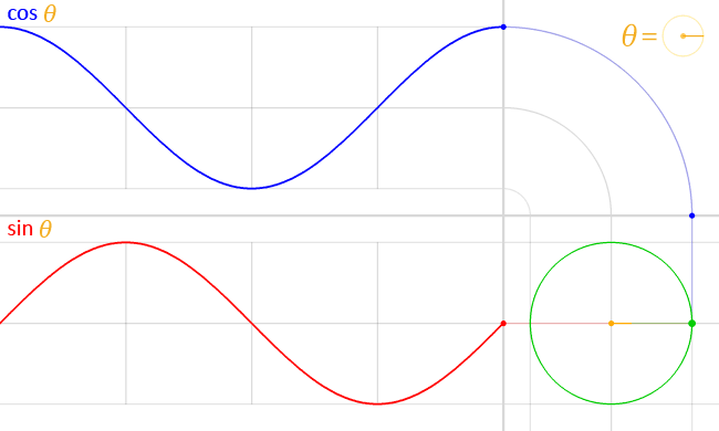
Let’s stick to the sweet middle spot: the unit circle.
Meet the unit circle. It is a circle with a radius of one unit:
Right now it’s alone… in space. Let’s place it on the Cartesian coordinate system (the classic chart with X and Y axes). We describe each point in space in Cartesian coordinates:
The X coordinate: The horizontal axis, plotting the point towards the left or right.
The Y coordinate: The vertical axis, plotting the point towards the top or bottom.
We can move through the unit circle by an angle, which is measured from the positive X-axis going counter-clockwise.
We can go in a clockwise direction by using negative angles. As my physics teacher used to say, “Time is negative!”
Notice how each angle lands on a unique point in the unit circle. How else can we describe that point using Cartesian coordinates?
When the angle is 0° the X and Y coordinates are 1 and 0 (1, 0), respectively. We can deduce the Cartesian coordinates for other angles just as easily, like 90°, 180° and 270°. But for any other angle, we don’t know where the point is initially located on the unit circle.
If only there were a pair of functions that take an angle and give us our desired coordinates…
You guessed it, the CSS cos() and sin() functions do exactly that. And they’re very closely related, where cos() is designed to handle the X coordinate and sin() returns the Y coordinate.
Play with the toggle slider in the following demo to see the relationship between the two functions, and notice how they form a right triangle with the initial point on the unit circle:
I think that’s all you really need to know about cos() and sin() for the moment. They’re mapped to Cartesian coordinates, which allows us to track a point along the unit circle with an angle, no matter what size that circle happens to be.
Let’s dive into what we can actually use cos() and sin() for our everyday CSS work. It’s always good to put a little real-world context to theoretical concepts like math.
Circular layouts
If we go by the unit circle definition of cos() and sin(), then it’s easy to see how they might be used to create circular layouts in CSS. The initial setup is a single row of circular elements:
Say we want to place each circular item around the outline of a larger circle instead. First, we would let CSS know the total number of elements and also each element’s index (the order it’s in), something we can do with an inline CSS variable that holds each order in the position:
Note: This step will become much easier and concise when the sibling-index() and sibling-count() functions gain support (and they’re really neat). I’m hardcoding the indexes with inline CSS variables in the meantime.
To place the items around the outline of a larger circle, we have to space them evenly by a certain angle. And to get that angle, we can divide 360deg (a full turn around the circle) by the total number of items, which is 8 in this specific example. Then, to get each element’s specific angle, we can multiply the angle spacing by the element’s index (i.e., position):
li {
  --rotation: calc(360deg / var(--total) * var(--i));
}
We also need to push the items away from the center, so we’ll assign a --radius value for the circle using another variable.
ul {
  --radius: 10rem;
}
We have the element’s angle and radius. What’s left is to calculate the X and Y coordinates for each item.
That’s where cos() and sin() come into the picture. We use them to get the X and Y coordinates that place each item around the unit circle, then multiply each coordinate by the --radius value to get an item’s final position on the bigger circle:
That’s it! We have a series of eight circular items placed evenly around the outline of a larger circle:
And we didn’t need to use a bunch of magic numbers to do it! All we provide CSS with is the unit circle’s radius, and then CSS does all the trigonometric gobbledygook that makes so many of us call this the “worst” CSS feature. Hopefully, I’ve convinced you to soften your opinions on them if that’s what was holding you back!
We aren’t limited to full circles, though! We can also have a semicircular arrangement by choosing 180deg instead of 360deg.
This opens up lots of layout possibilities. Like, what if we want a circular menu that expands from a center point by transitioning the radius of the circle? We can totally do that:
Click or hover the heading and the menu items form around the circle!
Wavy layouts
There’s still more we can do with layouts! If, say, we plot the cos() and sin() coordinates on a two-axis graph, notice how they give us a pair of waves that periodically go up and down. And notice they are offset from each other along the horizontal (X) axis:
Where do these waves come from? If we think back to the unit circle we talked about earlier, the value of cos() and sin() oscillate between -1 and 1. In other words, the lengths match when the angle around the unit circle varies. If we graph that oscillation, then we’ll get our wave and see that they’re sorta like reflections of each other.
⚠️ Auto-playing media
Can we place an element following one of these waves? Absolutely. Let’s start with the same single row layout of circular items we made earlier. This time, though, the length of that row spans beyond the viewport, causing overflow.
We’ll assign an index position for each item like we did before, but this time we don’t need to know the total number of items. We had eight items last time, so let’s bump that up to 10 and pretend like we don’t know that:
We want to vary the element’s vertical position along either a sin() or cos() wave, meaning translating each item’s position based on its order in the index. We’ll multiply an item’s index by a certain angle that is passed into the sin() function, and that will return a ratio that describes how high or low the element should be on the wave. The final thing is to multiply that result by a length value, which I calculated as half an item’s total size.
I’m using a 60deg value because the waves it produces are smoother than some other values, but we can vary it as much as we want to get cooler waves. Play around with the toggle in the next demo and watch how the wave’s intensity changes with the angle:
This is a great example to see what we’re working with, but how would you use it in your work? Imagine we have two of these wavy chains of circles, and we want to intertwine them together, kinda like a DNA strand.
Let’s say we’re starting with the HTML structure for two unordered lists nested inside another unordered list. The two nested unordered lists represent the two waves that form the chain pattern:
Pretty similar to the examples we’ve seen so far, right? We’re still working with an unordered list where the items are indexed with a CSS variable, but now we’re working with two of those lists… and they’re contained inside a third unordered list. We don’t have to structure this as lists, but I decided to leave them so I can use them as hooks for additional styling later.
To avoid any problems, we’ll ignore the two direct <li> elements in the outer unordered list that contain the other lists using display: contents.
.waves > li { display: contents; }
Notice how one of the chains is the “principal” while the other is the “secondary.” The difference is that the “secondary” chain is positioned behind the “principal” chain. I’m using slightly different background colors for the items in each chain, so it’s easier to distinguish one from the other as you scroll through the block-level overflow.
We can reorder the chains using a stacking context:
This positions one chain on top of the other. Next, we will adjust each item’s vertical position with the “hated” sin() and cos() functions. Remember, they’re sorta like reflections of one another, so the variance between the two is what offsets the waves to form two intersecting chains of items:
The next demo shows how the waves intersect at an offset angle of 60deg. Adjust the slider toggle to see how the waves intersect at different angles:
Oh, I told you this could be used in a practical, real-world way. How about adding a little whimsy and flair to a hero banner:
Damped oscillatory animations
The last example got me thinking: is there a way to use sin() and cos()‘s back and forth movement for animations? The first example that came to mind was an animation that also went back and forth, something like a pendulum or a bouncing ball.
This is, of course, trivial since we can do it in a single animation declaration:
This “back and forth” animation is called oscillatory movement. And while cos() or sin() are used to model oscillations in CSS, it would be like reinventing the wheel (albeit a clunkier one).
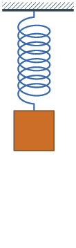
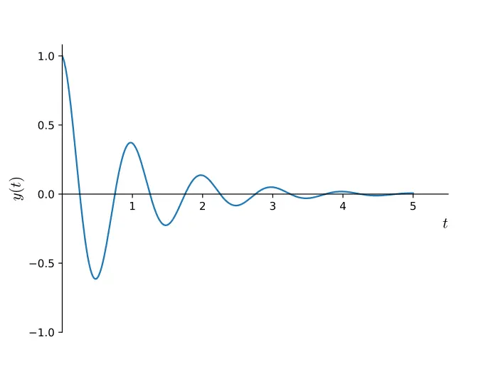
I’ve learned that perfect oscillatory movement — like a pendulum that swings back and forth in perpetuity, or a ball that never stops bouncing — doesn’t really exist. Movement tends to decay over time, like a bouncing spring:
⚠️ Auto-playing media
There’s a specific term that describes this: damped oscillatory movement. And guess what? We can model it in CSS with the cos() function! If we graph it over time, then we will see it goes back and forth while getting closer to the resting position1.
In general, we can describe damped oscillation over time as a mathematical function:
It’s composed of three parts:
e−γt: Due to the negative exponent, it becomes exponentially smaller as time passes, bringing the movement to a gradual stop. It is multiplied by a damping constant (γ) that specifies how quickly the movement should decay.
a: This is the initial amplitude of the oscillation, i.e., the element’s initial position.
cos(ωt−α): This gives the movement its oscillation as time passes. Time is multiplied by frequency (ω), which determines an element’s oscillation speed2. We can also subtract from time α, which we can use to offset the initial oscillation of the system.
Okay, enough with all the theory! How do we do it in CSS? We’ll set the stage with a single circle sitting all by itself.
We have a few CSS variables we can define that will come in handy since we already know the formula we’re working with:
:root {
  --circle-size: 60px;

  --amplitude: 200px; /* The amplitude is the distance, so let's write it in pixels*/
  --damping: 0.3;
  --frequency: 0.8;
  --offset: calc(pi/2); /* This is the same as 90deg! (But in radians) */
}
Given these variables, we can peek at what the animation would look like on a graph using a tool like GeoGebra:
From the graph, we can see that the animation starts at 0px (thanks to our offset), then peaks around 140px and dies out around 25s in. I, for one, won’t be waiting 25 seconds for the animation to end, so let’s create a --progress property that will animate between 0 to 25, and will act as our “time” in the function.
Remember that to animate or transition a custom property, we’ve gotta register it with the @property at-rule.
@property --progress {
  syntax: "<number>";
  initial-value: 0;
  inherits: true;
}

@keyframes movement {
  from { --progress: 0; }
  to { --progress: 25; }
}
What’s left is to implement the prior formula for the element’s movement, which, written in CSS terms, looks like this:
This gives a pretty satisfying animation by itself, but the damped motion is only on the x-axis. What would it look like if, instead, we applied the damped motion on both axes? To do this, we can copy the same oscillation formula for x, but replace the cos() with sin().
This is even more satisfying! A circular and damped motion, all thanks to cos() and sin(). Besides looking great, how could this be used in a real layout?
We don’t have to look too hard. Take, for example, this sidebar I recently made where the menu items pop in the viewport with a damped motion:
Pretty neat, right?!
More trigonometry to come!
Well, finding uses for the “most hated CSS feature” wasn’t that hard; maybe we should start showing some love to trigonometric functions. But wait. There are still several trigonometric functions in CSS we haven’t talked about. In the following posts, we’ll keep exploring what trig functions (like tan() and inverse functions) can do in CSS.
CSS Trigonometric Functions: The “Most Hated” CSS Feature
sin() and cos()(You are here!)
Tackling the CSS tan() Function(coming soon)
Inverse functions: asin(), acos(), atan() and atan2()(coming soon)
Also, before I forget, here is another demo I made using cos() and sin() that didn’t make the cut in this article, but it is still worth checking out because it dials up the swirly-ness from the last example to show how wacky we can get.
Footnotes
This kind of damped oscillatory movement, where the back and forth is more visible, is called underdamped oscillation. There are also overdamped and critically damped oscillations, but we won’t focus on them here. ↪️
In reality, the damped constant and the frequency are closely related. You can read more about damped oscillation in this paper. ↪️


