The article includes CodePen embeds that demonstrate how to use the REST API endpoints of popular WordPress form plugins to capture and display validation errors and submission feedback when building a completely custom front-end. The pens relied on a WordPress site I had running in the background. But during a forced infrastructure migration, the site failed to transfer properly, and, even worse, I lost access to my account.
Sure, I could have contacted support or restored a backup elsewhere. But the situation made me wonder: what if this had not been WordPress? What if it were a third-party service I couldn’t self-host or fix? Is there a way to build demos that do not break when the services they rely on fail? How can we ensure educational demos stay available for as long as possible?
Or is this just inevitable? Are demos, like everything else on the web, doomed to break eventually?
Parallels with software testing
Those who write tests for their code have long wrestled with similar questions, though framed differently. At the core, the issue is the same. Dependencies, especially third-party ones, become hurdles because they are outside the bounds of control.
Not surprisingly, the most reliable way to eliminate issues stemming from external dependencies is to remove the external service entirely from the equation, effectively decoupling from it. Of course, how this is done, and whether it’s always possible, depends on the context.
As it happens, techniques for handling dependencies can be just as useful when it comes to making demos more resilient.
To keep things concrete, I’ll be using the mentioned CodePen demos as an example. But the same approach works just as well in many other contexts.
Decoupling REST API dependencies
While there are many strategies and tricks, the two most common approaches to breaking reliance on a REST API are:
Mocking the HTTP calls in code and, instead of performing real network requests, returning stubbed responses
Using a mock API server as a stand-in for the real service and serving predefined responses in a similar manner
Both have trade-offs, but let’s look at those later.
Mocking a response with an interceptor
Modern testing frameworks, whether for unit or end-to-end testing, such as Jest or Playwright, offer built-in mocking capabilities.
However, we don’t necessarily need these, and we can’t use them in the pens anyway. Instead, we can monkey patch the Fetch API to intercept requests and return mock responses. With monkey patching, when changing the original source code isn’t feasible, we can introduce new behavior by overwriting existing functions.
Implementing it looks like this:
const fetchWPFormsRestApiInterceptor = (fetch) => async (
  resource,
  options = {}
) => {
  // To make sure we are dealing with the data we expect
  if (typeof resource !== "string" || !(options.body instanceof FormData)) {
    return fetch(resource, options);
  }

  if (resource.match(/wp-json\/contact-form-7/)) {
    return contactForm7Response(options.body);
  }

  if (resource.match(/wp-json\/gf/)) {
    return gravityFormsResponse(options.body);
  }

  return fetch(resource, options);
};

window.fetch = fetchWPFormsRestApiInterceptor(window.fetch);
We override the default fetch with our own version that adds custom logic for specific conditions, and otherwise lets requests pass through unchanged.
The replacement function, fetchWPFormsRestApiInterceptor, acts like an interceptor. An interceptor is simply a pattern that modifies requests or responses based on certain conditions.
Many HTTP libraries, like the once-popular axios, offer a convenient API to add interceptors without resorting to monkey patching, which should be used sparingly. It’s all too easy to introduce subtle bugs unintentionally or create conflicts when managing multiple overrides.
With the interceptor in place, returning a fake response is as simple as calling the static JSON method of the Response object:
Depending on the need, the response can be anything from plain text to a Blob or ArrayBuffer. It’s also possible to specify custom status codes and include additional headers.
For the CodePen demo, the response might be built like this:
const contactForm7Response = (formData) => {
  const submissionSuccess = {
    into: "#",
    status: "mail_sent",
    message: "Thank you for your message. It has been sent.!",
    posted_data_hash: "d52f9f9de995287195409fe6dcde0c50"
  };
  const submissionValidationFailed = {
    into: "#",
    status: "validation_failed",
    message:
      "One or more fields have an error. Please check and try again.",
    posted_data_hash: "",
    invalid_fields: []
  };

  if (!formData.get("somebodys-name")) {
    submissionValidationFailed.invalid_fields.push({
      into: "span.wpcf7-form-control-wrap.somebodys-name",
      message: "This field is required.",
      idref: null,
      error_id: "-ve-somebodys-name"
    });
  }

  // Or a more thorough way to check the validity of an email address
  if (!/^[^\s@]+@[^\s@]+\.[^\s@]+$/.test(formData.get("any-email"))) {
    submissionValidationFailed.invalid_fields.push({
      into: "span.wpcf7-form-control-wrap.any-email",
      message: "The email address entered is invalid.",
      idref: null,
      error_id: "-ve-any-email"
    });
  }

  // The rest of the validations...

  const body = !submissionValidationFailed.invalid_fields.length
    ? submissionSuccess
    : submissionValidationFailed;

  return Response.json(body);
};
At this point, any fetch call to a URL matching wp-json/contact-form-7 returns the faked success or validation errors, depending on the form input.
Now let’s contrast that with the mocked API server approach.
Mocked API server with serverless
Running a traditionally hosted mock API server reintroduces concerns around availability, maintenance, and cost. Even though the hype around serverless functions has quieted, we can sidestep these issues by using them.
And with DigitalOcean Functions offering a generous free tier, creating mocked APIs is practically free and requires no more effort than manually mocking them.
For simple use cases, everything can be done through the Functions control panel, including writing the code in the built-in editor. Check out this concise presentation video to see it in action:
To return the mocked response, it’s easier if we create a separate Function for each endpoint, since we can avoid adding unnecessary conditions. Fortunately, we can stick with JavaScript (Node.js), and starting with nearly the same base we used for contactForm7Response:
function main(event) {
  const body = {};

  return { body };
}
We must name the handler function main, which is invoked when the endpoint is called. The function receives the event object as its first argument, containing the details of the request. Once again, we could return anything, but to return the JSON response we need, it’s enough to simply return an object.
We can reuse the same code for creating the response as-is. The only difference is that we have to extract the form input data from the event as FormData ourselves:
function main(event) {
  // How do we get the FormData from the event?
  const formData = new FormData();

  const submissionSuccess = {
    // ...
  };
  const submissionValidationFailed = {
    // ...
  };

  if (!formData.get("somebodys-name")) {
    submissionValidationFailed.invalid_fields.push({
      // ...
    });
  }

  // Or a more thorough way to check the validity of an email address
  if (!/^[^\s@]+@[^\s@]+\.[^\s@]+$/.test(formData.get("any-email"))) {
    submissionValidationFailed.invalid_fields.push({
      // ...
    });
  }

  // The rest of the validations...

  const body = !submissionValidationFailed.invalid_fields.length
    ? submissionSuccess
    : submissionValidationFailed;

  return { body };
}
As far as converting the data, serverless functions typically expect JSON inputs, so for other data types an extra parsing step is required. As it happens, the forms in the CodePen demos are submitted as multipart/form-data.
Without any libraries, we can convert a multipart/form-data string into a FormData by taking advantage of the Response API’s capabilities:
async function convertMultipartFormDataToFormData(data) {
  const matches = data.match(/^\s*--(\S+)/);

  if (!matches) {
    return new FormData();
  }

  const boundary = matches[1];

  return new Response(data, {
    headers: {
      "Content-Type": `multipart/form-data; boundary=${boundary}`
    }
  }).formData();
}
The code is mostly focused on extracting the boundary variable. This is typically autogenerated, for example, when submitting a form in a browser.
The submitted raw data is available via event.http.body, but since it’s base64-encoded, we need to decode it first:
async function main(event) {
  const formData = await convertMultipartFormDataToFormData(
    Buffer.from(event?.http?.body ?? "", "base64").toString("utf8")
  );

  // ...

  const body = !submissionValidationFailed.invalid_fields.length
    ? submissionSuccess
    : submissionValidationFailed;

  return { body };
}
And that’s it. With this approach, all that’s left is to replace calls to the original APIs with calls to the mocked ones.
Closing thoughts
Ultimately, both approaches help decouple the demos from the third-party API dependency. In terms of effort, at least for this specific example, they seem comparable.
It’s hard to beat the fact that there’s no external dependency with the manual mocking approach, not even on something we somewhat control, and everything is bundled together. In general, without knowing specific details, there are good reasons to favor this approach for small, self-contained demos.
But using a mocked server API also has its advantages. A mocked server API can power not only demos, but also various types of tests. For more complex needs, a dedicated team working on the mocked server might prefer a different programming language than JavaScript, or they might opt to use a tool like WireMock instead of starting from scratch.
As with everything, it depends. There are many criteria to consider beyond what I’ve just mentioned.
I also don’t think this approach necessarily needs to be applied by default. After all, I had the CodePen demos working for four years without any issues.
The important part is having a way to know when demos break (monitoring), and when they do, having the right tools at our disposal to handle the situation.
Many CSS experts have weighed heavily on possible syntaxes for a new masonry layout feature last year. There were two main camps and a third camp that strikes a balance between the two:
Use display: masonry
Use grid-template-rows: masonry
Use item-pack: collapse
I don’t think they’ve came up with a resolution yet. But you might want to know that Firefox already supports the masonry layout with the second syntax. And Chrome is testing it with the first syntax. While it’s cool to see native support for CSS Masonry evolving, we can’t really use it in production if other browsers don’t support the same implementation…
So, instead of adding my voice to one of those camps, I went on to figure out how make masonry work today with other browsers. I’m happy to report I’ve found a way — and, bonus! — that support can be provided with only 66 lines of JavaScript.
In this article, I’m gonna show you how it works. But first, here’s a demo for you to play with, just to prove that I’m not spewing nonsense. Note that there’s gonna be a slight delay since we’re waiting for an image to load first. If you’re placing a masonry at the top fold, consider skipping including images because of this!
Anyway, here’s the demo:
What in the magic is this?!
Now, there are a ton of things I’ve included in this demo, even though there are only 66 lines of JavaScript:
You can define the masonry with any number of columns.
Each item can span multiple columns.
We wait for media to load before calculating the size of each item.
We made it responsive by listening to changes with the ResizeObserver.
These make my implementation incredibly robust and ready for production use, while also way more flexible than many Flexbox masonry knockoffs out there on the interwebs.
Now, a hot tip. If you combine this with Tailwind’s responsive variants and arbitrary values, you can include even more flexibility into this masonry grid without writing more CSS.
Okay, before you get hyped up any further, let’s come back to the main question: How the heck does this work?
Let’s start with a polyfill
Firefox already supports masonry layouts via the second camp’s syntax. Here’s the CSS you need to create a CSS masonry grid layout in Firefox.
Since Firefox already has native masonry support, naturally we shouldn’t mess around with it. The best way to check if masonry is supported by default is to check if grid-template-rows can hold the masonry value.
function isMasonrySupported(container) {
  return getComputedStyle(container).gridTemplateRows === 'masonry'
}
If masonry is supported, we’ll skip our implementation. Otherwise, we’ll do something about it.
Now, I want to preface this segment that I’m not the one who invented this technique.
I figured out this technique when I was digging through the web, searching for possible ways to implement a masonry grid today. So kudos goes to the unknown developer who developed the idea first — and perhaps me for understanding, converting, and using it.
The technique goes like this:
We set grid-auto-rows to 0px.
Then we set row-gap to 1px.
Then we get the item’s height through getBoundingClientRect.
We then size the item’s “row allocation” by adding the height the column-gap value together.
This is really unintuitive if you’ve been using CSS Grid the standard way. But once you get this, you can also grasp how this works!
Now, because this is so unintuitive, we’re gonna take things step-by-step so you see how this whole thing evolves into the final output.
Step by step
First, we set grid-auto-rows to 0px. This is whacky because every grid item will effectively have “zero height”. Yet, at the same time, CSS Grid maintains the order of the columns and rows!
Third, assuming there are no images or other media elements in the grid items, we can easily get the height of each grid item with getBoundingClientRect.
We can then restore the “height” of the grid item in CSS Grid by substituting grow-row-end with the height value. This works because each row-gap is now 1px tall.
When we do this, you can see the grid beginning to take shape. Each item is now (kinda) back at their respective positions:
We now need to restore the row gap between items. Thankfully, since masonry grids usually have the same column-gap and row-gap values, we can grab the desired row gap by reading column-gap values.
Once we do that, we add it to grid-row-end to expand the number of rows (the “height”) taken up by the item in the grid:
And, just like that, we’ve made the masonry grid! Everything from here on is simply to make this ready for production.
Waiting for media to load
Try adding an image to any grid item and you’ll notice that the grid breaks. That’s because the item’s height will be “wrong”.
It’s wrong because we took the height value before the image was properly loaded. The DOM doesn’t know the dimensions of the image yet. To fix this, we need to wait for the media to load before running the layout function.
We can do this with the following code (which I shall not explain since this is not much of a CSS trick 😅):
containers.forEach(async container => {
  // ...
  try {
    await Promise.all([areImagesLoaded(container), areVideosLoaded(container)])
  } catch(e) {}

  // Run the layout function after images are loaded
  layout({ items, colGap })
})

// Checks if images are loaded
async function areImagesLoaded(container) {
  const images = Array.from(container.querySelectorAll('img'))
  const promises = images.map(img => {
    return new Promise((resolve, reject) => {
      if (img.complete) return resolve()
      img.onload = resolve
      img.onerror = reject
    })
  })
  return Promise.all(promises)
}

// Checks if videos are loaded
function areVideosLoaded(container) {
  const videos = Array.from(container.querySelectorAll('video'))
  const promises = videos.map(video => {
    return new Promise((resolve, reject) => {
      if (video.readyState === 4) return resolve()
      video.onloadedmetadata = resolve
      video.onerror = reject
    })
  })
  return Promise.all(promises)
}
Voilà, we have a CSS masnory grid that works with images and videos!
Making it responsive
This is a simple step. We only need to use the ResizeObserver API to listen for any change in dimensions of the masonry grid container.
When there’s a change, we run the layout function again:
containers.forEach(async container => {
// ...
const observer = new ResizeObserver(observerFn)
observer.observe(container)

function observerFn(entries) {
  for (const entry of entries) {
    layout({colGap, items})
  }
}
})
This demo uses the standard Resize Observer API. But you can make it simpler by using the refined resizeObserver function we built the other day.
To do that, install the helper library and add the necessary code:
# Installing the library
npm install @splendidlabz/styles
/* Import all layouts code */
@import '@splendidlabz/layouts';
// Use the masonry script
import { masonry } from '@splendidlabz/styles/scripts'
masonry()
One last thing: I’ve been building a ton of tools to help make web development much easier for you and me. I’ve parked them all under the Splendid Labz brand — and one of these examples is this masonry grid I showed you today.
If you love this, you might be interested in other layout utilities that makes layout super simple to build.
Now, I hope you have enjoyed this article today. Go unleash your new CSS masonry grid if you wish to, and all the best!
Do we invent or discover CSS tricks? Michelangelo described his sculpting process as chiseling away superfluous material to reveal the sculpture hidden inside the marble, and Stephen King says his ideas are pre-existing things he locates and uncovers “like fossils in the ground.” Paragraph one is early for me to get pretentious enough to liken myself to those iconic creative forces, but my work on CSS-Tricks feels like “discovering,” not “inventing,” secret synergies between CSS features, which have been eyeing each other from disparate sections of the MDN web docs and patiently waiting for someone to let them dance together in front of the world.
Matchmaking for CSS features
A strategy for finding unexpected alliances between CSS features to achieve the impossible is recursive thinking, which I bring to the CSS world from my engineering background. When you build recursive logic, you need to find an escape hatch to avoid infinite recursion, and this inception-style mindset helps me identify pairings of CSS features that seem at odds with each other yet work together surprisingly well. Take these examples from my CSS experiments:
What if view-timeline took control of the thing that triggers view-timeline? This led to a pairing between view-timeline and position: fixed. These two features are like a bickering yet symbiotic “odd couple” at the heart of my web-slinger.css library for scroll-triggered animations in pure CSS.
Indeed, Mark Twain thought new ideas don’t exist — he described them as illusions we create by combining ideas that have always existed, turning and overlaying them in a “mental kaleidoscope” to “make new and curious combinations.” It doesn’t mean creating is easy. No more than a safe can be cracked just by knowing the possible digits.
This brings back memories of playing Space Quest III as a kid because after you quit the game, it would output smart-aleck command-line messages, one of which was: “Remember, we did it all with ones and zeros.” Perhaps the point of the mock inspirational tone is that we likely will not be able to sculpt like Michelangelo or make a bestselling game, even if we were given the same materials and tools (is this an inspirational piece or what?). However, understanding the limits of what creators do is the foundation for cracking the combination of creativity to open the door to somewhere we haven’t been. And one truth that helps with achieving magic with CSS is that its constraints help breed creativity.
Embracing limitations
Being asked “Why would you do that in CSS when you could just use JavaScript?” is like if you asked me: “Why would you write a poem when it’s easier to write prose?” Samuel Coleridge defined prose as “words in their best order,” but poetry as “the best words in the best order.” If you think about it, the difference between prose and poetry is that the latter is based on increased constraints, which force us to find unexpected connections between ideas.
Similarly, the artist Phil Hansen learned that embracing limitation could drive creativity after he suffered permanent nerve damage in his hand, causing it to jitter, which prevented him from drawing the way he had in the past. His early experiments using this new mindset included limiting himself to creating a work using only 80 cents’ worth of supplies. This dovetails with the quote from Antoine de Saint-Exupéry often cited in web design, which says that perfection is achieved when there is nothing left to take away.
Embracing nothingness
The interesting thing about web design is how much it blends art and science. In both art and science, we challenge assumptions about whether commonsense relationships of cause and effect truly exist. Contrary to the saying in vernacular that “you can’t prove a negative,” we can. It’s not necessarily harder than proving a positive. So, in keeping with the discussion above of embracing limitations and removing the superfluous until a creation reveals itself, many of my article ideas prove a negative by challenging the assumption that one thing is necessary to produce another.
Maybe I can impart web dev wisdom on CSS-Tricks without including CSS at all, by sharing the “source code” of my thought process to help make you a better developer and a better person.
Going to extremes
Sometimes we can make a well-worn idea new again by taking it to the extreme. Seth Godin coined the term “edgecraft” to describe a technique for generating ideas by pushing a competitive advantage as far to the edge as the market dares us to go. Similarly, sometimes you can take an old CSS feature that people have seen before, but push it further than anyone else to create something unique. For example:
CSS-Tricks covered checkbox hacks and radio button hacks back in 2011. But in 2021, I decided to see if I could use hundreds of radio button hacks using HTML generated with Pug to create a working Sudoku app. At one point, I found out that Chrome dev tools can display an infinite spinner of death when you throw too much generated CSS at it, which meant I had to limit myself to a 4×4 Sudoku, but that taught me more about what CSS can do and what it can’t.
The :target selector has existed since the 2000s. But in 2024, I took it to the extreme by using HAML to render the thousands of possible states of Tic Tac Toe to create a game with a computer opponent in pure CSS. At one point, CodePen refused to output as much HTML as I had asked it to, but it’s a fun way for newcomers to learn an important CSS feature; more engaging in my opinion than a table of contents demo.
Creating CSS outsider art
Chris Coyier has written about his distaste for the gatekeeping agenda hidden behind the question of whether CSS is a programming language. If CSS isn’t deemed as “real” programming, that can be used as an excuse to hold CSS experts in less esteem than people who code in imperative languages, which leads to unfair pay and toxic workplace dynamics.
But maybe the other side always seems greener due to the envy radiating from the people on that side, because as a full-stack engineer who completed a computer science degree, I always felt left out of the front-end conversations. It didn’t feel right to put “full stack developer” on my résumé when the creation of everything users can see in a web app seemed mysterious to me.
And maybe it wasn’t just psychosomatic that CSS made my head hurt compared to other types of coding because research indicates if you do fMRIs on people who are engaged in design tasks, you see that design cognition appears to involve a unique cognitive profile compared to conventional problem-solving, reflected in the areas of the brain that light up on the fMRIs. Studies show that the brain’s structure changes as people get better at different types of jobs. The brain’s structural plasticity is reminiscent of the way different muscles grow more pronounced with different types of exercise, but achieving what some of my colleagues could with CSS when my brain had been trained for decades on imperative logic felt about as approachable as lifting a car over my head.
The intimidation I felt from CSS started to change when I learned about the checkbox hack because I could relate to hiding and showing divs based on checkboxes, which was routine in my work in the back of the front-end. My designer workmate challenged me to make a game in one night using just CSS. I came up with a pure text adventure game made out of radio button hacks. Since creative and curious people are more sensitive to novel stimuli, the design experts on my team were enthralled by my primitive demo, not because it was cutting-edge gameplay but because it was something they had never seen before. My engineering background was now an asset rather than a hindrance in the unique outsider perspective I could bring to the world of CSS. I was hooked.
The hack I found to rewire my brain to become more CSS-friendly was to find analogies in CSS to the type of problem-solving I was more familiar with from imperative programming:
The :target selector in CSS is like client-side routing in a single-page application.
The min() and max()functions in CSS can be used to simulate some of the logical operations we take for granted in imperative programming.
So if you are still learning web development and CSS (ultimately, we are all still learning), instead of feeling imposter syndrome, consider that the very thing that makes you feel like an outsider could be what enables you to bring something unique to your usage of CSS.
Finding the purpose
Excited as I was when my CSS hacking ended up providing the opportunity to publish my experiments on CSS-Tricks, the first comment on the first hack I published on CSS-Tricks was a generic, defeatist “Why would you do that?” criticism. The other comments popped up and turned out to be more supportive, and I said in a previous article that I’ve made my peace with the fact that not everybody will like my articles. However, this is the second article in which I’ve brought up the critical comment from back in 2021. Hmm…
Surely it wasn’t the reason I didn’t write another CSS-Tricks article for years. And it’s probably a coincidence that when I returned to CSS-Tricks last year, my first new article was a CSS hack that lends itself to accessibility after the person who left the negative comment about my first article seemed to have a bee in their bonnet about checkbox hacks breaking accessibility, even in fun CSS games not intended for production. Then again, limiting myself to CSS hacking that enables accessibility became a source of inspiration. We can all do with a reminder to at all times empathize with users who require screen readers, even when we are doing wacky experimental stuff, because we need to embrace the limitations not just of CSS but of our audience.
I suppose the reason the negative comment continues to rankle with me is that I agree that clarifying the relevance and purpose of a CSS trick is important. And yet, if I’m right in saying a CSS trick is more like something we discover than something we make, then it’s like finding a beautiful feather when we go for a walk. At first, we pick it up just because we can, but if I bring you with me on the journey that led to the discovery, then you can help me decide whether the significance is that the feather we discovered makes a great quill or reveals that a rare species of bird lives in this region.
It’s a journey versus destination thing to share the failures that led to compromises and the limitations I came up against when pushing the boundaries of CSS. When I bring you along on the route to the curious item I found, rather than just showing you that item, then after we part ways, you might retrace the steps and try a different fork in the path we followed, which could lead you to discover your own CSS trick.
Brad Frost introduced the “Atomic Design” concept wayyyy back in 2013. He even wrote a book on it. And we all took notice, because that term has been part of our lexicon ever since.
It’s a nice way to divide web designs into separate layers of concern, leaning into biology terms to help scope their context by size:
Atoms
Molecules
Organisms
Templates
Pages
Atoms are part of molecules, which are part of organisms, which make up templates, which become full-blown pages. It’s composable design that’s centered on consistency, reusability, and maintainability. Beautiful.We’ve covered this a bunch over the years.
Want to get fully versed in how it works? If so, you’re in luck because Brad and his brother, Ian, are in the process of publishing an entire online course about Atomic Design. It’s in presale for $50 (with discounts for teams).
Normally, I like to jump into a course and check it out before sharing it. But this is Brad and all he does is wonderful things. For example:
He inspires folks to live creatively and authentically with his Wake Up Excited! podcast.
There’s another podcast where he encourages designers and developers to Open Up! about their careers and what drives them. I get to participate in that one!
Oh, and his newsletter is pretty awesome, too. And I’m sure I’m leaving out more things he has floating around the web, but you get the point: he’s incredibly knowledgeable on the topic, is a highly-effective educator and speaker, and most importantly, has an infectious positive posture about him.
I know the Atomic Design course will be just as awesome. Preordered!
Chrome 139 is experimenting with Open UI’s proposed Interest Invoker API, which would be used to create tooltips, hover menus, hover cards, quick actions, and other types of UIs for showing more information with hover interactions. The Interest Invoker API makes these components declarative and hover-triggered, meaning that you create them with HTML, and then the web browser handles the mouseenter and mouseleave events for you, sans JavaScript.
It’s not stated anywhere that they must be declared as popovers, but they do bake the right accessibility hints in.
I want to spend a little time looking at the pieces of this feature, how they‘re used as currently proposed, and offer a few thoughts based on my experience playing with them.
Ready to dive in?
The interest trigger
The trigger is what the user will hover (or long-press on touchscreen devices) to reveal the interest target. I’d call it an “invoker,” but to avoid confusing it with the Invoker Commands API (which is kind of similar), I’ll stick with “trigger” or “interest trigger” for now.
The interest trigger can be:
a link (<a>),
a button (<button>), or
an image map area (<area>).
And it should have the interestfor attribute whose value should reference the id of the interest target. Here are examples for each supported element:
If the interest target is a popover (like it is in the examples above), then the interestfor attribute replaces the popovertarget attribute that’s normally required for declarative popovers. So, instead of this:
The interest target is what’s revealed when the user hovers (or long-presses) the interest trigger. Again, this should be a popover, and it’s important to use the right type of popover because they have different functional and accessibility behaviors.
popover attributes that are valueless, empty, or use the auto keyword can be dismissed lightly, i.e., using the esc key, or by clicking outside of the popover. When opened, these popovers close all hint and other auto popovers (at least, the ones that aren’t nested).
<div id="target-id" popover>Interest target</div>

<!-- Equivalent to -->
<div id="target-id" popover="">Interest target</div>

<!-- Equivalent to -->
<div id="target-id" popover="auto">Interest target</div>
hint popovers (the newest type of popovers) can also be dismissed lightly, but only close other hint popovers when opened:
manual popovers do their own thing. They can’t be dismissed lightly, don’t tell other popovers what to do, and we can have more than one of them open at a time. They’re suuuper chill.
However, Open UI’s explainer and Chrome’s current implementation suggest that interest targets disappear on mouseleave regardless of the type of popover we’re working with. But redefining popover behavior in this context (or any context) feels wrong to me. If the interest target’s popover attribute is set to manual, for example, shouldn’t it persist after mouseleave?
Open UI discusses browsers baking the accessibility in depending on the popover type, which justifies interest invokers building off of popovers, but I think accessibility should depend on the content (unless overwritten using ARIA attributes) rather than the popover type.
In short, it seems like interest invokers are designed to be used with popovers but for all the wrong reasons (in my opinion anyway). That said, it’s early days still. Interest invokers are very experimental and it’s certainly possible that I’m overlooking something.
They’re otherwise straightforward, which is on-brand for Open UI (look at the Customizable Select, after all). They take commonly-used JavaScript-powered components (such as exclusive accordions, invoker commands, and yes, popovers) and make them possible with declarative HTML.
That said, there are some JavaScript events that we can use, too. Let’s take a look at those.
Interest invoker JavaScript events
While I imagine that you’d only need to listen for the interest and loseinterestevents for certain edge cases, JavaScript events for these new declarative HTML features are fairly standard, and they’re there should you need them:
interestTrigger.addEventListener("interest", () => {
  /* User showed interest */
});

interestTrigger.addEventListener("loseinterest", () => {
  /* User lost interest */
});
But what does “interest” mean, exactly? That’s worth digging into next.
Interest delay (and the CSS of it all)
You’ve probably noticed that when you show or lose interest, there’s a short delay in the popover showing or hiding itself. This is extremely annoying at first, but when you actually start to build with interest invokers, you realize how necessary it is.
Here’s the demo again, so you can try it out (in Chrome 139 or Canary for now):
One problem is that if you accidentally mouseleave the interest trigger and the target (which can be very easy to do when the target is too small), then it all disappears. This is even more annoying, but luckily the hide delay allows you some recovery time. Similarly, the show delay offers keyboard and screen reader users the opportunity to skip the interest target, while also preventing it from being triggered accidentally with a mouse pointer.
Having said that, if the interest target is unobtrusive, then removing the show delay shouldn’t cause any harm. You could also remove the hide delay for keyboard and screen reader users, who aren’t likely to “lose interest” accidentally. We can do this by setting two new CSS properties, interest-show-delay and interest-hide-delay, to 0. The default is 0.5s and is set on the interest trigger (but not the interest target):
/* If unobtrusive */
.unobtrusive[interestfor] {
  interest-show-delay: 0;
}

/* If keyboard-focused on a trigger */
[interestfor]:focus-visible {
  interest-hide-delay: 0;
}

/*
  If keyboard-focused within a target of interest,
  or target of partial interest (these are always keyboard-triggered),
  the interest trigger that currently has interest
  or partial interest has the hide delay removed
*/
body:has(:target-of-interest :focus-visible, :target-of-partial-interest) [interestfor]:where(:has-interest, :has-partial-interest) {
  interest-hide-delay: 0;
}
Note: Interest delays are currently buggy, especially with unitless values. Sometimes they work, sometimes they don’t.
About those pseudo-selectors, though…
Basically, when navigating to an interest trigger using a keyboard or screen reader whose target contains more focusable elements, this is referred to as showing “partial” interest. (I would’ve gone with “potential interest” personally, but I digress.) When this happens, the interest target’s focusable elements actually aren’t focusable (making it easy to skip them, if needed) unless the user hits the option+up/alt+up keyboard shortcut or equivalent screen reader hotkey.
There’s even a message that we can customize by targeting :target-of-partial-interest::after:
:target-of-partial-interest::after {
  content: "Press ⌥↑ to activate.";
}
While you probably shouldn’t change the message content (since it displays the correct keyboard shortcut for the user’s device by default), we can style it by selecting this way.
The not-keyboard-focusable value is new, and prevents the keyboard focus (like tabindex="-1" but for CSS, which is super interesting in its own right).
A full breakdown because, frankly, that was a lot:
:has-interest: Triggers with “mouse interest”
:has-partial-interest: Triggers with “keyboard interest”
:target-of-interest: Targets with mouse interest
:target-of-partial-interest: Targets with keyboard interest
:target-of-partial-interest::after: The message displayed when targets have keyboard interest
interest-show-delay: The <time> before which the interest target appears
interest-hide-delay: The <time> before which the interest target disappears
interest-delay: Shorthand for interest-show-delay and interest-hide-delay
It works with anchors, too
Nothing really new here as far as what we’ve already discussed, but I find it cool that we can use anchor elements declaratively just like interest invokers:
Conclusion
On the surface, interest invokers are simply hover-triggered popovers, but touchscreen devices have never handled hovering well. In addition, hovering is susceptible to human-error, and we certainly don’t want to force keyboards and screen readers to tab into a minefield of focusables. There’s a lot to consider, and Open UI have done a wonderful job of ensuring that user agents do the lion’s share of it.
And, as we’ve discussed, there’s a lot for us to consider, too, such as those delay timings and how interest invokers should be styled. What should interest triggers and targets look like when they have interest? What about the hotkey instruction? We’re talking about some new concepts here, that might require new UX conventions.
Honorable mention: We’re also getting interactivity: not-keyboard-focusable out of this, which could help us to build keyboard-friendlier components with CSS.
There’s a lot to love here, and I just know that people are going to create incredible tooltips and hover cards and more with this.
Focus trapping is a term that refers to managing focus within an element, such that focus always stays within it:
If a user tries to tab out from the last element, we return focus to the first one.
If the user tries to Shift + Tab out of the first element, we return focus back to the last one.
This whole focus trap thing is used to create accessible modal dialogs since it’s a whole ‘nother trouble to inert everything else — but you don’t need it anymore if you’re building modals with the dialog API (assuming you do it right).
Anyway, back to focus trapping.
The whole process sounds simple in theory, but it can quite difficult to build in practice, mostly because of the numerous parts to you got to manage.
Simple and easy focus trapping with Splendid Labz
If you are not averse to using code built by others, you might want to consider this snippet with the code I’ve created in Splendid Labz.
The basic idea is:
We detect all focusable elements within an element.
We manage focus with a keydown event listener.
import { getFocusableElements, trapFocus } from '@splendidlabz/utils/dom'

const dialog = document.querySelector('dialog')

// Get all focusable content
const focusables = getFocusableElements(node)

// Traps focus within the dialog
dialog.addEventListener('keydown', event => {
  trapFocus({ event, focusables })
})
The above code snippet makes focus trapping extremely easy.
But, since you’re reading this, I’m sure you wanna know the details that go within each of these functions. Perhaps you wanna build your own, or learn what’s going on. Either way, both are cool — so let’s dive into it.
Selecting all focusable elements
I did research when I wrote about this some time ago. It seems like you could only focus an a handful of elements:
a
button
input
textarea
select
details
iframe
embed
object
summary
dialog
audio[controls]
video[controls]
[contenteditable]
[tabindex]
So, the first step in getFocusableElements is to search for all focusable elements within a container:
export function getFocusableElements(container = document.body ) {

  return {
    get all () {
      const elements = Array.from(
        container.querySelectorAll(
          `a,
            button,
            input,
            textarea,
            select,
            details,
            iframe,
            embed,
            object,
            summary,
            dialog,
            audio[controls],
            video[controls],
            [contenteditable],
            [tabindex]
          `,
        ),
      )
    }
  }
}
Next, we want to filter away elements that are disabled, hidden or set with display: none, since they cannot be focused on. We can do this with a simple filter function.
export function getFocusableElements(container = document.body ) {

  return {
    get all () {
      // ...
      return elements.filter(el => {
        if (el.hasAttribute('disabled')) return false
        if (el.hasAttribute('hidden')) return false
        if (window.getComputedStyle(el).display === 'none') return false
        return true
      })
    }
  }
}
Next, since we want to trap keyboard focus, it’s only natural to retrieve a list of keyboard-only focusable elements. We can do that easily too. We only need to remove all tabindex values that are less than 0.
export function getFocusableElements(container = document.body ) {
  return {
    get all () { /* ... */ },
    get keyboardOnly() {
      return this.all.filter(el => el.tabIndex > -1)
    }
  }
}
Now, remember that there are two things we need to do for focus trapping:
If a user tries to tab out from the last element, we return focus to the first one.
If the user tries to Shift + Tab out of the first element, we return focus back to the last one.
This means we need to be able to find the first focusable item and the last focusable item. Luckily, we can add first and last getters to retrieve these elements easily inside getFocusableElements.
In this case, since we’re dealing with keyboard elements, we can grab the first and last items from keyboardOnly:
export function getFocusableElements(container = document.body ) {
  return {
    // ...
    get first() { return this.keyboardOnly[0] },
    get last() { return this.keyboardOnly[0] },
  }
}
We have everything we need — next is to implement the focus trapping functionality.
How to trap focus
First, we need to detect a keyboard event. We can do this easily with addEventListener:
Since we’re only handling the Tab key, we can use an early return statement to skip the handling of other keys.
container.addEventListener('keydown', event => {
  if (event.key !== 'Tab') return

  if (isTab(event)) // Handle Tab
  if (isShiftTab(event)) // Handle Shift Tab
  /* ... */
})
We have almost everything we need now. The only thing is to know where the current focused element is at — so we can decide whether to trap focus or allow the default focus action to proceed.
We can do this with document.activeElement.
Going back to the steps:
Shift focus if user Tab on the last item
Shift focus if the user Shift + Tab on the first item
Naturally, you can tell that we need to check whether document.activeElement is the first or last focusable item.
container.addEventListener('keydown', event => {
  // ...
  const focusables = getFocusableElements(container)
  const first = focusables.first
  const last = focusables.last

  if (document.activeElement === last && isTab(event)) {
    // Shift focus to the first item
  }

  if (document.activeElement === first && isShiftTab(event)) {
    // Shift focus to the last item
  }
})
The final step is to use focus to bring focus to the item.
container.addEventListener('keydown', event => {
  // ...

  if (document.activeElement === last && isTab(event)) {
    first.focus()
  }

  if (document.activeElement === first && isShiftTab(event)) {
    last.focus()
  }
})
That’s it! Pretty simple if you go through the sequence step-by-step, isn’t it?
Final callout to Splendid Labz
As I resolve myself to stop teaching (so much) and begin building applications, I find myself needing many common components, utilities, even styles.
Since I have the capability to build things for myself, (plus the fact that I’m super particular when it comes to good DX), I’ve decided to gather these things I find or build into a couple of easy-to-use libraries.
Just sharing these with you in hopes that they will help speed up your development workflow.
Thanks for reading my shameless plug. All the best for whatever you decide to code!
A while back, our man Geoff Graham treated us to a refresher on the CSS initial-letter property, but how can you style drop and initial caps to reflect a brand’s visual identity and help to tell its stories?
Here’s how I do it in CSS by combining ::first-letter and initial-letter with other unexpected properties, including border-image, and clip-path.
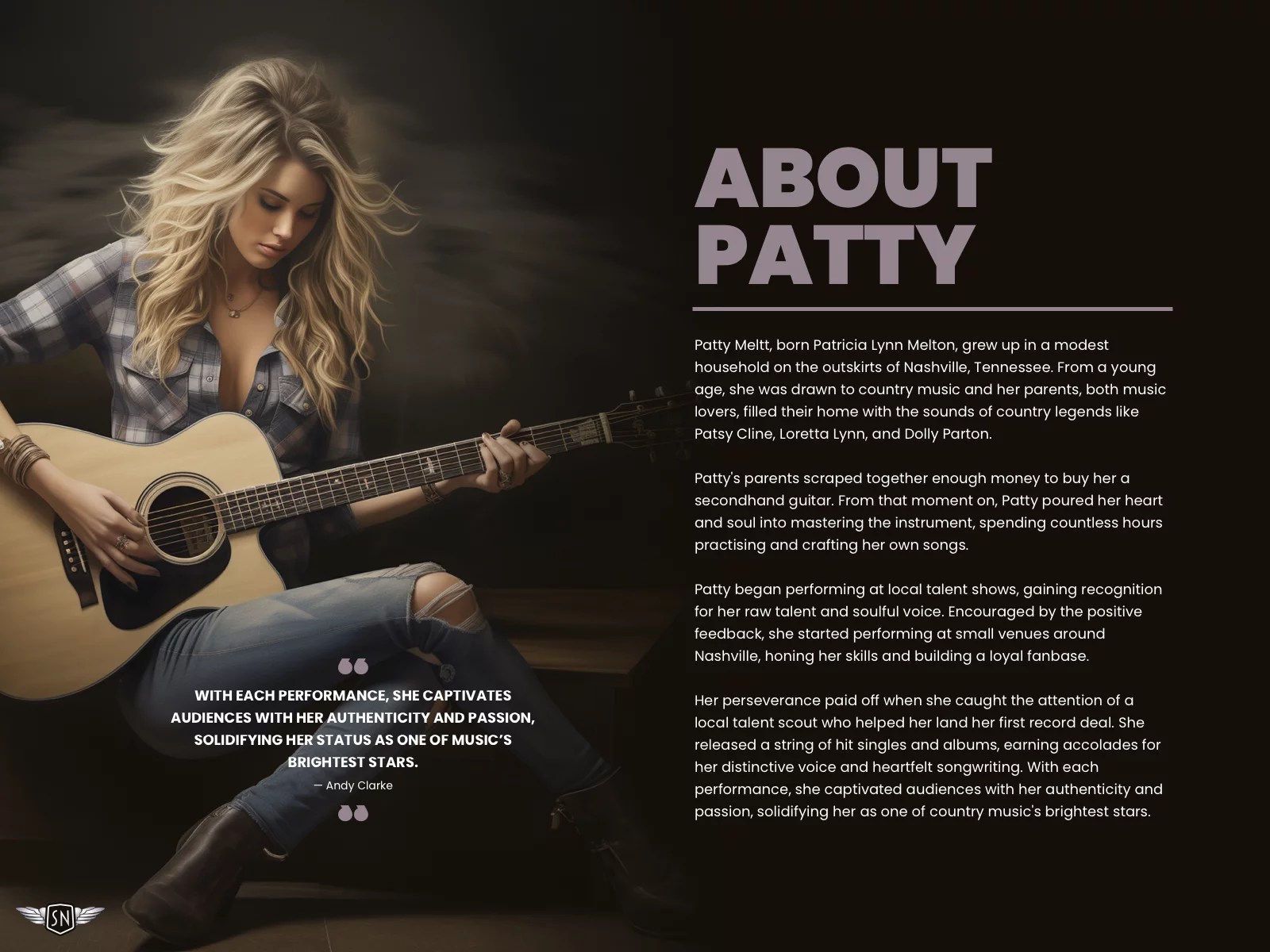
Patty Meltt is an up-and-coming country music sensation.
My brief: Patty Meltt is an up-and-coming country music sensation, and she needed a website to launch her new album. She wanted it to be distinctive-looking and memorable, so she called Stuff & Nonsense. Patty’s not real, but the challenges of designing and developing sites like hers are.
First, a drop cap recap. Chris Coyier wrote about drop caps several years ago. They are a decorative letter at the beginning of a paragraph, often spanning several lines of text. It’s a typographic flourish found in illuminated manuscripts and traditional book design, where it adds visual interest and helps guide a reader’s eye to where they should begin.
Study manuscripts from the Middle Ages onwards, and you’ll find hand-decorated illuminated capitals. The artists who made these initial letters were fabulously called “illuminators.” These medieval versals went beyond showing someone where to start reading; historiated letters also illustrated the stories, which was especially useful since most people in the Middle Ages couldn’t read.
A basic drop cap
On the web, drop caps can improve readability and reflect a brand’s visual identity.
A brief refresher on properties and values
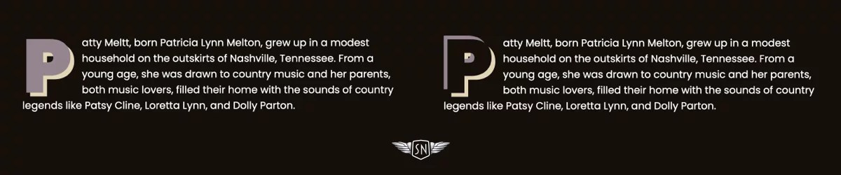
In CSS, drop caps are created using the ::first-letter pseudo-element in combination with initial-letter. As you might expect, ::first-letter targets the very first letter of a block of text, enabling you to style it independently from the rest of a paragraph. The first number sets how many lines tall the letter appears, and the second controls its baseline alignment — that is, which line of text the bottom of the cap sits on.
Because browser support still varies, it’s common to include both the unprefixed and -webkit- prefixed properties for maximum compatibility. And speaking of browser support, it’s also sensible to wrap the initial-letter property inside an @supports CSS at-rule so we can check for browser support and provide a fallback, if needed:
The initial-letter property automatically calculates the font size to match the number of lines a drop cap spans. On its own, this can make for quite a first impression. However, drop caps really start to come to life when you combine initial-letter with other CSS properties.
When I want to lift a drop cap off the page, I can add a single text-shadow. Shadows can be colourful and don’t have to be black. I created a full live demo you can check out.
Examples showing unstyled, single text shadow, and two text shadows (live demo)
Strokes
A text shadow applied to a first letter (live demo)
The text-stroke property — shorthand for text-stroke-width and text-stroke-color — adds an outline to the centre of the text shape. It’s a Baseline feature and is now widely available. I can make the cap text transparent or colour it to match the page background.
Background images and a background clipped to text
Things become even more interesting by clipping a bitmap, gradient, or vector background image to the text while setting its colour to transparent. Now, the image will only appear inside the text space (demo).
Two examples of borders applied to first letters, one square and one rounded
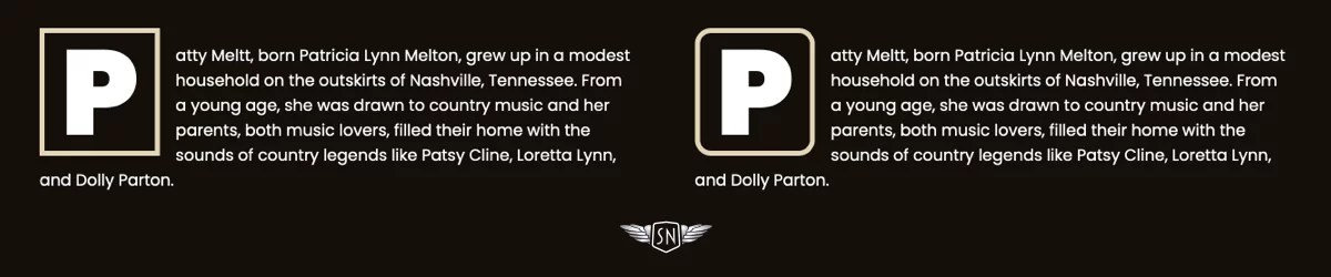
You might think borders are boring, but there’s plenty you can do to make them look interesting. I could start by applying a solid border to surround the cap box (demo).
A border radius applied to the first letter, where the top-left and bottom-right edges are rounded (live demo)
And then there’s the border-image property, a powerful, yet often overlooked CSS tool. By slicing, repeating, and outsetting images, you can create intricate borders and decorative drop caps with minimal code.
A CSS border image applied to a first letter (live demo)
You can insert a bitmap or vector format image, or drop a CSS gradient into the border space:
The clip-path property lets you define a custom shape that controls which parts of an element are visible and which are hidden. Instead of always showing a rectangular box, you can use clip-path to crop elements into circles, polygons, or even complex shapes defined with SVG paths. It’s an effective way to create visual effects like this right-facing arrow. Clipping the drop cap into an arrow shape isn’t just decorative — it reinforces direction and hierarchy, literally pointing readers to where the story begins. Here’s a demo of the following example.
And with a little trial and error to arrive at the correct values, you could even flow the remaining paragraph text around the cap using the shape-outside property (demo):
Drop caps don’t just help guide a reader’s eye to where they should begin; they also set the tone for what follows. A well-designed drop cap adds visual interest at the start of a block of text, drawing attention in a way that feels intentional and designed. Because it’s often the first element the reader sees, caps can carry a lot of visual weight, making them powerful tools for expressing a brand’s identity.
Designing for Patty Meltt
Patty Meltt wanted a website packed with design details. Every element added to a design is an opportunity to be expressive, and that includes her drop caps.
Her biography page is presentable, but we felt a focus on where someone should start reading was lacking.
Patty Meltt’s biography without a drop cap
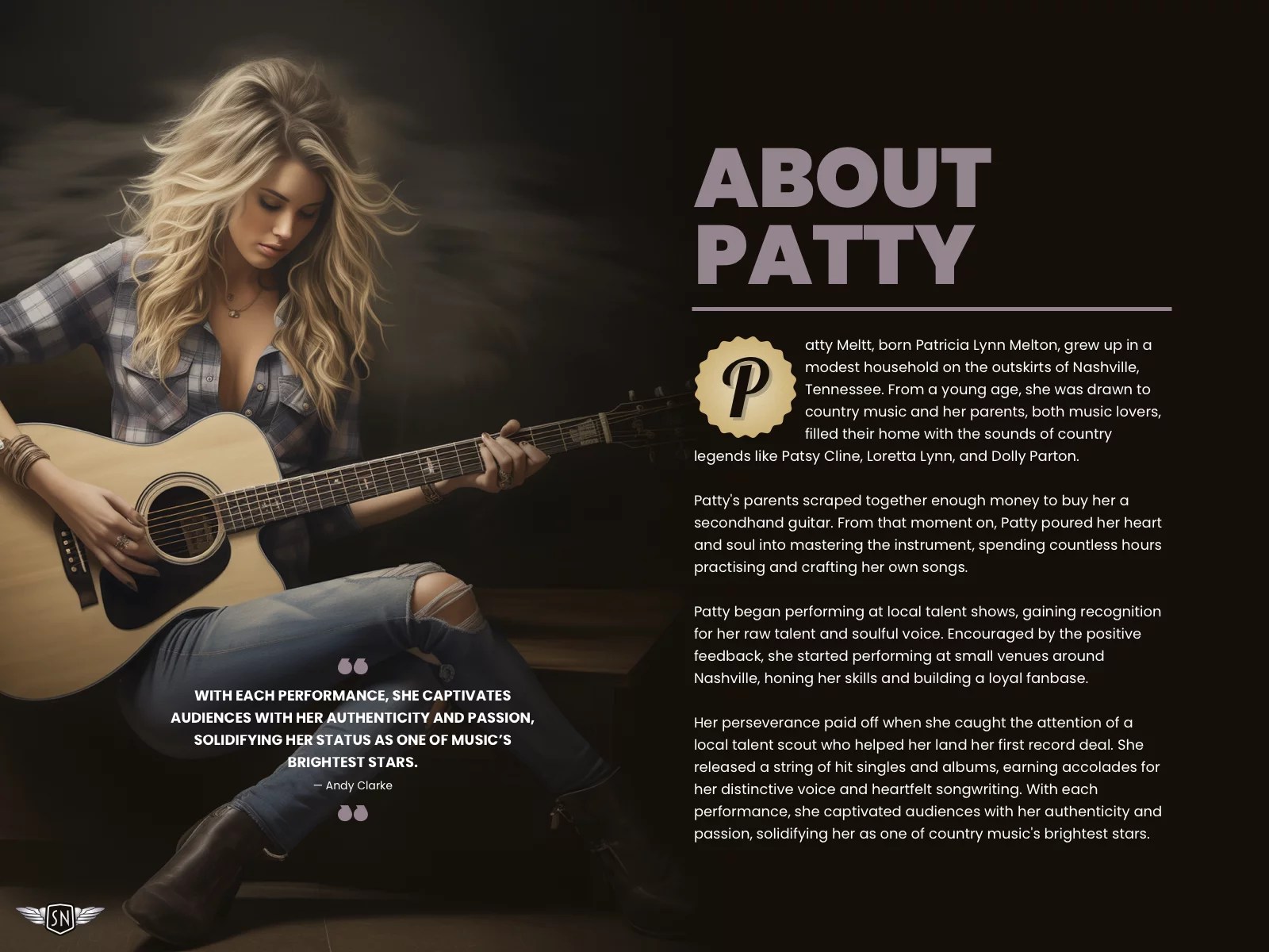
From the selection of designs I showed her, she felt the sticker-style cap best suited her brand.
To implement it, first, I added a cursive typeface which matches her branding and contrasts with the rest of her typographic design:
Patty Meltt’s biography with a stylsh new drop cap (demo)
The result is a drop cap that’s as stylish as cut-off jeans and a pair of gator-skinned boots.
Conclusion
Styling drop caps isn’t just about decoration — it’s about setting a tone, drawing readers in, and using every detail to express a brand’s voice. CSS has the tools to go beyond the default: gradients, textures, borders, and even complex shapes all help transform first letters into statements. So don’t waste the opportunities that drop caps give you. Make ’em sing.
